Since the end of the web-safe fonts era, there are now literally thousands of custom web fonts available. With so many choices, it’s important to know where to purchase quality fonts, how to specify fonts for your site, and other typographic considerations like readability, personality, and font pairing.
Typography 101
Any good craftsperson has a firm grasp of the basics of their trade, and usually a good appreciation for its history as well. An understanding of typography basics is helpful when selecting web fonts. You don’t have to become a type genius, but learning some of the terminology will allow you to make intelligent font choices.
Serif vs. Sans-Serif
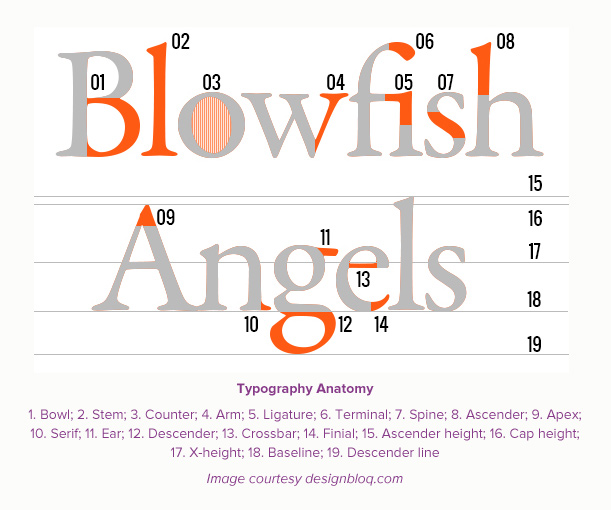
A serif is the flare or terminating flourish at the end of a letterform’s strokes. The age-old argument about whether serif fonts (i.e Times Roman, Georgia, Rockwell) are more readable than sans-serif (i.e. Helvetica, Futura, Verdana) is one best left to typography geeks to hash out. More important than serif vs. sans-serif is making sure whatever font you choose — and your treatment of it — is legible and readable so your readers can digest the content easily and comfortably. Butterick’s “Typography in Ten Minutes” is a great guide for creating readable content.
Line Height and Letter Spacing
Line height is also known as leading in typography, and letter spacing (or tracking) is known as kerning. Both of these typographic adjustments play an important role in creating readable text. Letter spacing is, as you might expect, the spaces between letters in a word, and how loose or tight you set the letter spacing is determined by the font choice and the size at which it is being displayed. Line height (leading) is the vertical space between lines of text, and the same parameters apply as with letter spacing. You can use Butterick’s guide (link above) for a quick, practical application of line height and letter spacing or check out Design Instruct’s “The Basics of Typography” for a bit more in-depth explanation. If you have a touch of type geek in you, there’s a glossary of typography terms on Creative Bloq’s website.
These are just a few of the typographic basics you should be familiar with, but you can dive deeper on FontShop’s education site, which is packed with instructional PDF files like, “WebFonts: A Designer’s Guide,” “Seven Rules for Better Typography,” and “The Right Font For The Job.”
Design considerations
From a design perspective, working with web fonts is no different than working with fonts for print. Here are a few things to keep in mind in when specifying fonts and designing a web page.
The Right Type Personality
Type personality (also referred to as voice) is about matching the tone of your content with the personality of the font. A handwritten script font would be inappropriate for a tech website, just as a heavy block font would look out of place on a wedding invitation. Type designer Eben Sorkin has a great piece on type personality over on the typecast.com site.
A related consideration to personality is matching pairs of fonts for headlines and body copy. I recommend limiting the number when mixing fonts; simplicity is the key. Sometimes using a different weight and larger size of the body copy font is enough to create a suitable headline. However, you can mix distinctively different fonts to create an “opposites attract” look for headlines and body copy. Check out Daniel Eden’s “Just My Type” page for a great collection of type pairings. “Type Connection” is a fun, dating-game style site that helps you pair fonts as well as understand their unique personality.

Legibility vs. Readability
Legibility refers to the clarity of individual letters and whether, at a particular size, you can distinguish one letterform from another. For example, can you tell the difference between the “o” and the “a”, or, is the dot on a lowercase “i” so close to its accompanying stroke that it looks like a lowercase “l”? Some fonts are not designed to be set at small sizes because their letterforms were created for display use, such as headlines. Make sure to test out your selected font at different sizes for legibility.
Readability refers to the clarity of longer passages of text, basically anything longer than a sentence or two. Most web font vendors have categories of fonts labeled as suitable for either text (body copy) or display (headlines) and provide sample text of that font set in several paragraphs at different sizes. Readability is also affected by letter spacing (kerning) and the vertical distance between lines of text (line height).
Both readability and legibility are part of a larger design discipline known as user experience (UX), which involves a person’s behaviors, attitudes, and emotions about using a particular product, system, or service. Mikael Cho has written a great post on the science behind fonts and how they contribute to user experience here.
Responsive Web Design
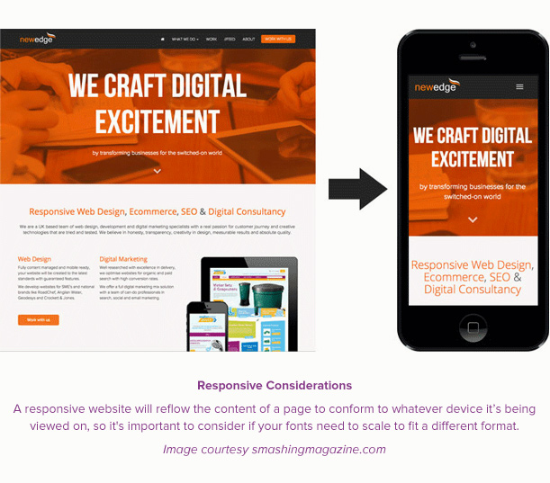
A website that’s built to be responsive will reflow the content of a page to conform to whatever device it’s being viewed on so it’s important to consider if your fonts need to scale to fit a different format. The large headline font size you specified on a 30-inch monitor may stack on four separate lines when viewed on a small tablet. Or the 12-point text that looked fine on a laptop may need to be scaled up when viewed on an iPhone. Make sure to test your design on a couple different mobile devices to determine if you need to set different font parameters for smaller screens.
Sources for Good Web Fonts
There are many sources for quality web fonts. I recommend shying away from sites with “1001 Free Web Fonts!” in their description because the old maxim “you get what you pay for” applies here just as it does with most marketed goods. Most of the free web fonts are custom (or display) fonts, not suitable for long passages of text. Fonts offered by reputable type foundries are well-designed, optimized for on-screen use, and come with a full character set as well as alternate characters. However, some web font vendors will offer a limited number of free fonts, chosen from larger collections.
Currently there are three different pricing models for web fonts: free, one-time purchase, and subscription-based. Which option works best for you will depend on your comfort level working with font files and knowledge of web development, as well as each project’s needs.
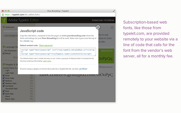
Web fonts (either free or one-time purchase) that are downloaded directly to your computer will require you (or your developer) to put all the bundled font files (.woff, .eot, .ttf, .svg, css, html) in their proper place in your website’s file directory. Different web browsers require different files to properly render the fonts on-screen. Subscription-based web fonts are provided remotely to your website via a line of code that calls for the font from the vendor’s web server, all for a monthly fee.
Free
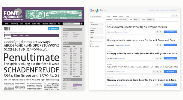
High-quality free fonts are available from Google, Font Squirrel and The League of Moveable Type. Google has over 600 font families available and also offers printer versions of each font you can install for use in Photoshop or a text editor. Font Squirrel offers “hand-picked, high-quality, commercial-use fonts” sourced from reputable type designers. The League of Moveable Type is not just a font vendor but a group of talented type designers that offer a handful of beautifully designed web fonts.
One-time Purchase
Vendors that offer web fonts for one-time purchase include: FontSpring, FontShop, and MyFonts. Simply select the font you want to purchase and download it along with all its associated files. Prices vary depending on the font and whether you will need just a single font (i.e. Proxima Nova Regular) or an entire font family with all its variations (semi-bold, bold, italic, condensed, etc.).
Subscription-based
The subscription-based model is quickly becoming the standard for web fonts due to its ease of use and cost-effectiveness compared to purchasing individual fonts. For a monthly fee, you have access to a vendor’s entire web font collection (which can easily reach into the thousands). Some of the more popular subscription-based vendors are Typekit (which is owned by Adobe), Fonts.com, WebType, and Hoefler&Co.
Type Tools & Resources
Here are a few of my favorite web font and typography resources.
Typecast
A browser-based tool for styling type and seeing real-time results as you try different fonts, adjust sizes and letter spacing, and other common text styling. I’ve written an entire love letter post about this great type specification tool here.
 WhatFont
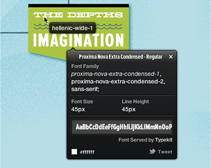
See a great-looking font on a website and want to know what it is? Chengyin Liu’s WhatFont browser extension allows you to click on a sample piece of web text and reveal the font’s name, size, line height, color, and even a link where you can purchase the font.
If you’re overwhelmed by the thousands of web font choices and don’t know where to begin, check out the following two sites for inspiration. Both have many samples of great web fonts and pairings.
Typespiration
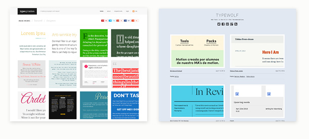
Typespiration is a curated site of designer-contributed examples each displaying a page of sample text, a list of what fonts and colors were used, and CSS code for cutting/pasting into your own site.
Type Wolf
Type Wolf is a collection of beautiful type sampled from the web, with a list of the fonts used and a link to the sampled site.
