
We used to joke around the office that our work amounted to an unending cycle; “Another day, another rectangle,” we’d say. And in some ways, that still works. After all, new devices are popping into existence all the time; each one with its own unique, glowing, rectangular screen into which will eventually be squeezed the information we create. The trouble is with over-thinking the rectangle part. We used to get as specific as possible about the dimensions of our designs, doing our best Bob Villa impressions just short of pulling out our tape measures to frame up just how wide, exactly, this thing is going to be. Today, that’s a quaint approach. As if we can really know for sure.
As far as context is concerned, we’re at a point that is far beyond individual devices—or even screen dimensions specifically. Think of it more like playing baseball without the field. How much of the game would work without being grounded—literally—with all the hard edges and linear cues that players and spectators are used to? In baseball, the game is the content; the trappings of the game—the field, the equipment, the lights, and the stands—are all parts of the container. The question is, does the game exist outside of the container? Some might say no, but then what of fantasy baseball, a thriving virtual league that exists unconfined by the field in computers, on pieces of paper, and in minds of enthusiasts. This is exactly what is happening on the web. Our game—content—is being released from its field. Rather than see this as a shocking catastrophe, one that sends us sprawling to catch every last worm spilling from the proverbial can, we should instead take note of the opportunity before us. We no longer have to design the container! Instead, we can focus on designing resilient, flexible, and scalable content.
This is all very interesting, but what you’re really concerned about is mobile, right? After all, that’s where all of this stuff becomes real—on a phone, or on a tablet. If it were not for these devices, we wouldn’t be having this conversation.
Perhaps. But I’m not about to advocate for a “mobile first” approach either, nor one that starts on the desktop and then retrofits its design for mobile later (though that is a fine approach for getting a bit more life out of an existing design, and one I’ve advocated for). Through experimenting with both approaches, we’ve learned that each focuses a bit too much on the container and not enough on the content. Truly embracing mobile—for whatever that word means today and will mean tomorrow—is actually about embracing content. The devices and platforms will come and go, meanwhile content remains the consistent thread joining all this flux.
Yet this isn’t just a job for the master packer, either, who finds new ways to put the same old content into new kinds of pages. It’s a job for the person who understands what it means to consume content: At a desk, at the bus-stop, on the couch, or the countless in-betweens. Mandy Brown nailed it in her first article for the newly born Contents Magazine, when she wrote:
“Publishing in a dynamic format requires a different editorial workflow and approach than publishing in a static one. And therein lies a lot of bathwater: concern for only one context (say, the desktop) without care for others (a phone or tablet); software that imposes the needs of print on natively digital content; and publishing cycles that presume content comes to an end after it’s published.”
Responsive Web Design
If that’s true of writing and editing (and it is), you had better believe it’s also true of design. A content-focused design will far exceed any device-specific design in terms of its flexibility and scalability. It will anticipate a change of context, and grow as you become more creatively prolific. Unfortunately, content isn’t exactly a solid basis for a design method. Because content means many things to many people—bringing to mind a variety of types including long-form articles, blogs, tweets, even audio or video presentations—a strictly content-focused method would be just too ambiguous to become truly standardized. This issue—the desire to create designs suitable for content and the shifting terrain of contexts—has largely been answered by the responsive design method, which was first introduced to me by Ethan Marcotte in an article—simply titled Responsive Web Design—published in A List Apart back in 2010. In it, he wrote hopefully:
“This is our way forward. Rather than tailoring disconnected designs to each of an ever-increasing number of web devices, we can treat them as facets of the same experience. We can design for an optimal viewing experience, but embed standards-based technologies into our designs to make them not only more flexible, but more adaptive to the media that renders them. In short, we need to practice responsive web design.”
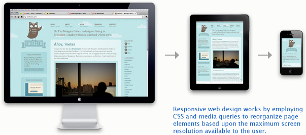
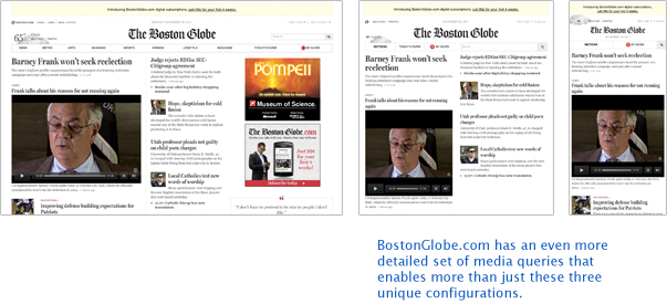
Marcotte goes on to explain how media queries—ways of specifying different functionality options for a variety of display conditions within a web page’s CSS—can be used to adapt a web page’s template in response to its context. This is the functional core of responsive design, which, honestly, is more efficiently shown than described. But in short, a media query allows you, for instance, to differ the styling, size, position, or content (or all of the above) of a specific class—say a sidebar widget or even a navigation menu—depending upon whether the page is displayed on a screen as small as 480 pixels wide or larger. In fact, you can get much more specific. Your queries could call for adjustments depending upon ranges of screen real estate, which is a pretty common approach, or a series of specific dimensions. Owltastic.com is beautiful example of this, as is the BostonGlobe.com. Open them up and drag the edges of your browser back and forth and watch as the page responds to your tweaking. It’s almost magical.
However extensive your approach, the idea is to preserve the consistency of content while creating a container that responds to its context. Ethan Marcotte has gone on to write a book on this method, again simply titled Responsive Web Design, which I recommend for anyone interested in trying it out.
Workflow
While Marcotte has lead a movement with no shortage of help on how to implement responsive techniques, my sense is that designers still have many questions about teamwide workflow. Now that we know how to do it, we need to know how to get it done—a subtle but critical difference. Clearly, designing for specific devices was problematic enough in terms of efficiency and workflow to merit the new approach Marcotte found in responsive design. Matt Chadburn, blogging at Responsive News, makes that comparison quite well in his post, “Traffic”:
“Do you split your investment (and team) across each one thereby reducing your velocity on each individual platform? Or do you linearise your projects and stagger their delivery across a year or two?
Sure, companies can outsource or temporarily expand their teams to build things in parallel, which isn’t free, but when the money dries up you’ll have twice or thrice the amount of code to maintain and extend, which also isn’t free or sustainable. You’ll be chasing your tail whatever you pick unless you’ve got enough developers to build & maintain a few versions of everything, but that is really hard.
Responsive design solves the traffic problem by focusing development effort on a single interface, your internal teams all become feature oriented, not platform specialists.”
Right: There’s no sense in turning one project into several. But I’m still curious about how moving from a phased approach to design and development—which I know many shops (like ours) have taken for years—to one that is more iterative will affect timelines and budgets. But know that they will. There will be lessons to be learned. An appropriately cautious entry would probably be experimental, using one project as a process laboratory and counting the cost in terms of its isolated profitability. If you’re not already following an agile process, attempting to transition your entire company workflow at once could be catastrophic. Though the continually changing nature of this technology may create the impression that things are uniquely volatile now and likely to settle later—this is certainly debatable—do not let this convince you that the best course of action is to wait for the dust to settle before making process changes. At that point, you may be too far behind to make the stretch.
The Big Picture
If mobile is important, it is because the use of mobile devices will change content, not just because their screen dimensions make our designs obsolete. For now, responsive design is a method that helps us bridge the gap between today’s content paradigm and tomorrow’s. The main distinction, I expect, will be that future content will be created for a persona in motion—users on the move—rather than those in stasis, whether at a desk, on the couch, or elsewhere. And if mobile will change content, then it will change advertising and marketing too. We won’t be doing the same old thing just squeezed into new places. We’ll be doing a new thing. Are you ready to explore what that is?