I spend a lot of time in my job helping people make decisions. Sometimes, that’s directly with my firm’s clients, helping them plan for complex interactive projects and then nurture them over the years to come after they launch. And sometimes that’s behind the scenes, with our designers, developers, and client services team, helping them to lead our clients step by step through those projects. No matter what the case, though, I rarely am able to offer good advice without having first gathered, analyzed, and interpreted data to back it up. What’s amazing is how often I’ve run in to the idea that measurement and analysis is someone else’s job. I hear things like, “I’m not really a data person,” or “I’m not an analyst.” Well, the truth is, not only can you be an analyst, you should be.
What I’d like to do is offer you a simple analytics routine that you can run through on a regular basis. This routine is by no means comprehensive — Google Analytics offers a huge amount of tools and information that you could spend years learning. This routine is pared down to the essentials: It’s designed to answer 5 specific questions you should be asking about your websites in 3 steps. But before we get into the specifics of the routine, we need to first establish a foundation of understanding of measurement upon which to build it. We need a clean slate, and I think this simple statement will help us with that:
Data does nothing by itself.
— Christopher Butler (@chrbutler) September 13, 2012
Yep, I tweeted it. KA-POW!
We’ve got to step way back and think about what we’re doing when we’re using analytics tools. And the best way to do that is to relieve ourselves of the notion that data — particularly in numeric form — is a helpful endpoint.
Numbers don’t lead to conclusions. It’s the interpretation of them that does.
Sometimes numbers can be helpful answers to questions, but if you don’t ask the right questions, you won’t get the right answers, and without the right answers, you will be lead to the wrong actions. Whether we’re designers, developers, marketers, project managers, strategists, or whatever, action is what we’re working toward.
Getting this wrong is what makes typical measurement procedures a repetitive action with no results. We gather numbers, marvel at them, and then do it again. But we don’t get very far doing that. Does this sound familiar to you? I can’t tell you how often I discover that measurement is being treated this way. In fact, let me show you a real example:
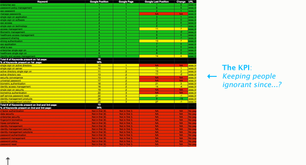
This is a KPI report — KPI stands for key performance indicators. It’s typically a document that aggregates a variety of metrics for review. This is an actual KPI report that one of my clients purchased from an analytics consultant a few years ago. Now, this thing has big problems, and not just because it’s very, very ugly! It’s because it’s leading people in the wrong direction.
It’s not that there’s nothing of value here, but after 92 pages — and seriously, that’s how long this thing is — anyone would tune out. Why? Well, for one thing, volume creates the illusion of answers. We think, wow, there’s a lot here. It must be important stuff. Good thing someone else put this all together. Answers will be there if I need them.
The other reason is that if you were to actually dig in to this report, you’d find that instead of telling you the story you need to hear, it delivers a confusing mystery to sort out. When you’ve got a grid of numbers without something to help you interpret them you’ve got, well, a grid of numbers. What good is that?
How do you know if something is too high or too low? How do you know if that even matters? Numbers aren’t good enough on their own. #measure
— Christopher Butler (@chrbutler) September 14, 2012
What we’ve got here is a broken form of measurement.
Here are a few other reasons why its brokenness should matter to you:
- Unsolved mysteries are a no-no.
You are curious, right? That’s what makes you good at your job. If a 92-page grid of data doesn’t provoke questions, then you’re not paying attention. - “I don’t know” is a call to action.
The last thing you want to say when you’re asked to explain your decisions is that “you don’t know.” But measurement like the KPI will only make that more likely. Why? Because you assumed answers were stuffed in there somewhere, but you never really bothered to find out. So you went with your gut (more on that in a moment). Really, key performance indicators is not an accurate descriptor. We ought to be calling them keeping people ignorant. - Without empirically grounded stories, all we have are hunches.
An important part of design is telling a compelling story — why something doesn’t work, how it could be done better, what we can offer as a better solution. Clients act with that kind of info, but they don’t usually buy on hunches. - We need to connect action to defensible outcomes.
That’s our responsibility as designers/developers/strategists! We may have gotten away with winging it in the past (aka “going with your gut”), but that’s just not a sustainable, long-term strategy for success. - Strategic positioning rests upon measurement and analysis.
Long term, a strong grounding in measurement will better position you, no matter what you do. It will prevent you from inheriting unhelpfully data-glutted reports, and it will prevent you from being held accountable to someone else’s vague interpretation of them. And by the way, that interpretation almost always happens in hindsight. That means change orders, expectation-management, and every other annoyance that can stymie progress. - Lasting trust is more important than immediate credibility.
You could build trust with your clients without measurement and analysis, but it’s actually more important that the primary purpose of data be to ground your vision in reality, rather than to build credibility with your clients. Let me explain that: We definitely want our clients to trust our judgement, but our measurement processes should lead them to the same conclusions we’ve made even if they were to do it themselves. In that way, if we’re acting in response to sound measurement, measurement should verify what we do. So we use it to inform us first, then shape our actions around it. It’s solid action over the long haul that builds trust with clients, not just one smartypants win at one meeting.
Focus on questions, not numbers. The answers will follow. #measure
— Christopher Butler (@chrbutler) September 14, 2012
There is a better way!
Yes, that means using a tool like Google Analytics. But it also means using it intelligently, rather than just aggregating numbers from it into a KPI report.
By intelligently, I mean focusing on specific questions, not numbers.
You should be asking:
- Who is using my site?
- Where are they coming from?
- What content are they consuming?
- How are they engaging with that content?
- What can I do to make their experience better?
Beyond these questions, I’m honestly not sure what else we’d really need to know.
The answers to these questions all have something interesting in common: They aren’t numbers! We use numbers to answer them, and Google Analytics will help provide the numbers we need in the right context.
Sorry, concentration-breaking note: We can answer some of these questions — like 1-4 — with Google Analytics. And we can extrapolate answers to Question 5, as well. But there are other things we can and should be doing, like usability testing, to gain a deeper understanding of Questions 4 and 5 that, for now, I’ll have to redirect you (here and here) to learn more about.
Now that we’ve got our principles in order, we can put together a routine. So for the rest of our time together, we’re going to be looking at a three-step approach to Google Analytics.
YOUR 3-STEP ANALYTICS ROUTINE
- First, we’ll look at visitor statistics — these correspond to our first question, “who is using my site?”
- Second, we’ll review our traffic sources — which correspond to our second question, “where are they coming from?”
- Third, we’ll take a look at our content reports — these help answer our third and fourth questions, “what content are they consuming?” and “how are they engaging with that content?”
After those three steps, I’ll also review a few other tips and tricks that will help you connect the dots between them. The best way to do this is to actually look at Google Analytics. I’ll be using the Google Analytics account for this website — Newfangled.com — for all of my examples.
Many screenshots await you, my friends…
Google Analytics in 3 Steps
STEP ONE: Visitors
What we’re looking at below is the Visitors Overview, which is the first report that Google loads up when you log in to your analytics account.
There’s definitely a lot to see here — By default, Google is showing us the last month’s worth of activity, and displaying it in a line graph across the top. As you can see, our website tends to get a pretty good amount of weekday traffic — typically somewhere between 900 and 1000 visitors.
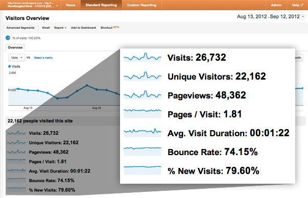
Beneath the line graph, Google displays the basic “health” stats of the website. I think it would be helpful to take a few moments just to explain what each of these means, even though I imagine that will be review for at least some of you reading. (If so, feel free to skip down to “Step Two.” But c’mon, we’re having a good time. Stick around!)
- Visits
A visit is not a “hit.” You may remember the term “hits” from the early days of the web — a hit was what people used to use as a unit of popularity for their sites, as in, “my site gets a thousand hits a day” or something like that. The thing is, as websites became more complex, a hit became less valuable. This is because a hit, technically, is simply a request to a database for a file. If a webpage is just one html file with text, loading it in the browser registers one hit. But if a webpage is more than that — say, loaded up with images, CSS files, javascript, video, etc., every single file that loads with the page registers one hit. So all of the sudden, one page load might register hundreds of hits on its own. So, when Google Analytics launched, it replaced the “hit” with the “visit,” which is a very real, practical unit. It represents one single user’s session on your website. - Unique Visits
These visits are differentiated from “visits” because Google is trying to show you what your traffic looks like once you’ve taken into account individuals that make repeat trips to view your website. So if your Mom hits up your blog every day this month, she’ll log 31 visits, but only one unique visit. In our site’s case, the numbers are fairly close, which means that the majority of its traffic is coming from people who haven’t been here before. - Pageviews & Pages/Visit
A Pageview is our next unit of measure. It represents exactly what it says: a view of a single page. So, one visit might have many pageviews, assuming the user is engaged with the website’s content. Here, we can see that the pageviews are around twice the number of unique visits, and as the next stat points out, averages to just under 2 pages per visit. - Avg. Visit Duration
This one is also pretty self-explanatory: Average Visit Duration means the average time a user spends browsing the site in one session — meaning from when they first arrive to when they leave. If they come back the next day, they start a new session. So, if your Mom is hanging out on your blog for two minutes every single day, she’s not skewing your average. Nice! - Bounce Rate
We’ll come back to this one because I have quite a bit to say about it. I promise! - % New Visits
Finally, the percentage of new visits refers back to that unique visits metric. I mentioned that because the unique visits number and the visits number were close, we could conclude that the majority of this website’s visitors were seeing it for the first time. That’s what this number measures exactly — that almost 80% of this website’s visitors are new.
In reviewing these numbers, we’ve learned a bit about the volume of traffic that comes to this website, but we haven’t actually learned much yet about how this site is being used. So, after I’ve given these basic health stats a once-over and glanced at the main traffic graph to make sure there are no significant drops or spikes in traffic that I can’t explain, I’m ready to move on to Step Two and look at the sources of all these visits.
STEP TWO: Traffic Sources
In Step Two, I’m going to open up the Traffic Sources Overview report. Again, Google is showing the same traffic line graph at the top, but beneath it, the data has changed to reflect some general categories of sources.
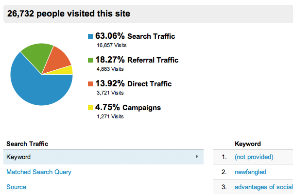
From the pie chart displayed above, we can see that the majority of this site’s traffic is comprised of search traffic — visitors that arrive at our site after clicking a link to it from a search engine results page.
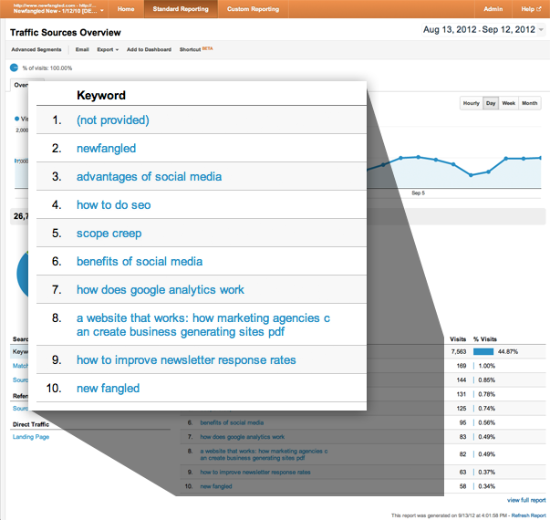
If I glance a bit further down at the keywords list (shown above), I can see that we’ve got a healthy mix of “branded” — a search query that includes the name of the company or its actual URL — and “unbranded” — one that doesn’t — terms. By far, though, the largest listing here is “(not provided),” which is comprised of search queries made by users who were logged in to their Google accounts, so their search activity has been encrypted for their privacy. (More on (not provided) here.)
From the point of view of search engine optimization, it’s worth pointing out that our site is doing pretty well at generating traffic from users who don’t yet know about our company and its services. That’s exactly what your focus should be when it comes to SEO, by the way: creating content that describes your expertise for those who are using Google to search for it, but don’t yet know about you specifically. Being #1 on Google for your own name is not nearly as useful to your business as being #1 on Google for a phrase that describes what your business does! This is one of those “what can I do to improve my users’ experience” answers, too. SEO isn’t just about boosting traffic from search engines. It’s about connecting people with information they need. If your website contains information about a service that people are searching for, your job is to try to match their search intent with information that you have. That is done by framing site content for search, and not relying upon name recognition to connect you with new prospects.
I didn’t want you to miss that point, but as far as our routine is concerned, I don’t want to get too hung up on keywords right now. Instead, I’d like to dig a bit further into sources, so I’m going to click into a new report, which is a list of All Traffic Sources.
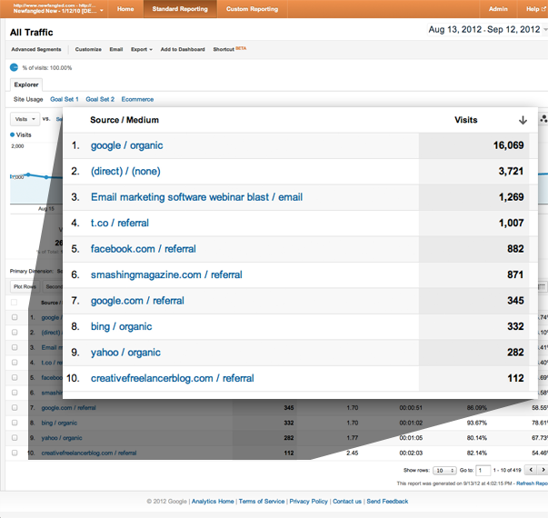
Like the previous screens, the above report also displays the visits graph at the top. Eye candy. Nice. But the main attraction is below that, in the list of all the unique referrers of traffic to the site. What’s useful here is that instead of just aggregating all the different search engine traffic into one, generic category, we now get to see each one listed individually.
For example, we can see that Google organic search — organic means traffic generated by search queries, not by paid search like Google AdWords — refers more traffic to the site than direct traffic (those visitors who entered our URL manually into their browser’s address bar), our email marketing blasts, social media, or other search engines.
Once I’ve started to get a little more familiar with this list of sources, what I really want to know is how to evaluate them. Which ones generate traffic that is more valuable?
Well, one way to determine this is to find out which sources generate conversions. A conversion is any touchpoint on your site where a user gives you information. It could be a general contact form, or a sign-up form that subscribes them to a newsletter or blog, an event registration form, an asset download, or even a purchase. Any of those are touch points that can and should be measured.
Google Analytics lets you track events like that, which they call “goals.” Once you have set up the specific goals you want to track (here’s how to do that), they will appear in your analytics reports. Then you can use them to create filters for any of the reports contained in Google Analytics. These filters are called “Advanced Segments.”
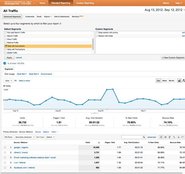
So, to answer my original question about which sources generate the most conversions, I’m going to apply an advanced segment to this report by expanding the “Advanced Segments” menu at the top of the page, choosing “Visits with Conversions” and hitting “Apply.” (As shown above.) This refreshes the report, and instead of displaying the total visits per source, it displays the number of conversions that resulted from a source’s traffic. (As shown below.)
Pretty handy, right?
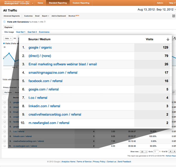
This underscores an important principle that you should etch on your brain — or at least write down on a post-it and put somewhere where you’ll see it all the time:
Traffic is meaningless; action is everything.
— Mark O’Brien (@NewfangledMark) September 14, 2012
That’s a direct quote from Mark’s book, A Website that Works, which is all about what it means to create a conversion-focused website. If you’re interested in that subject, you should probably order it.
STEP THREE: Content
Next, we’re going to move on to Step Three and dig in to the Content Reports. I’m going to start with the “All Pages” report (and remember to remove that Advanced Segment I just applied to the Traffic Sources report in Step Two). This report displays a list of the website’s pages in order of the amount of views each one received.
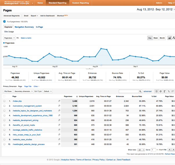
If we choose a particular page from the list — “Web Development Pricing,” for example, as shown below — we can see how many views this page has received, how many of them were unique (this accounts for repeat views by the same visitor), and the average time a visitor spends on this page (a little over 1 minute). All good stuff to know.
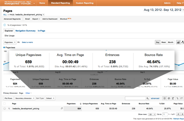
But the metric that tends to stand out the most is the bounce rate. For this page, it’s almost 50%.
So, what is bounce rate? The bounce rate measures the number of visitors that come to a website and then leave without viewing any other pages than the one they landed on. That’s why a website can have a site wide bounce rate, as well as individual rates for each page — because a website’s homepage is not always it’s “front door” for visitors. Often, they enter a site from a sub-page that has been referred by a link from someplace else. What this means is that 46.64% of users that enter this website on this particular page about our pricing leave without going any further. It doesn’t mean that 46.64% of users that view this page leave without going further.
In fact, if we compare the number of unique views this page received — 659 — with the number of entrances it had — just 238 — we can see just how different an impression the bounce rate can make depending upon whether we think about it properly. It’s 46.64% of the 238 visitors that landed on this page — 111 people — that go no further, not 46.64% of this page’s 659 unique visitors — around 307 people. That’s a big enough difference to matter. I can’t tell you how many times I’ve witnessed people overreact to the bounce rate, whether site wide or for an individual page, because they’ve done the wrong math in their head.
Now all of that said, bounce rate isn’t something we should ignore. It is a measure of a user’s interest, and therefore something to take seriously.
But let’s consider the purpose of my example page for just a moment…
Our pricing page gets pretty specific about what it costs to work with us. That, by its nature, will rule some people out, either because we’re too expensive or, for some, too cheap. Pricing is positioning, after all. Those visitors are likely to leave the site after concluding that Newfangled is not a good fit for their needs. If they entered our site on this page, they’d register a bounce.
Now, it’s probably not the case that all the bounces were registered by users concluding from our pricing that we’re not a good fit. It’s possible; we can’t know that for sure. But even as a possibility, it softens the blow of the bounces — which really aren’t that high anyway — and reminds us of what this page is for: filtering out possible leads that wouldn’t be qualified anyway.
So, we’ve learned a couple of important things:
- Never stop at just noting a bounce rate value. Dig further and try to explain it.
- Don’t assume that a bounce is a bad thing. In this case, users possibly doing exactly what this page was designed to motivate them to do could register a bounce! This is another example of how we can extrapolate an answer to our question about what we can do to improve our users’ experience on our websites from simple analytics data.
Before we wrap up with our three-step routine, I wanted to share a couple of additional points about bounce rate. (If you’ve had enough, feel free to skip down to “Extra Tips & Tricks.”)
For websites that either generate revenue by selling advertising on content pages or by selling products, that bounce rate has a very real value proposition. If they’re not sticking around, they’re either not proving value to advertisers, or they’re not buying.
But for sites that do content marketing — which means to use content like blogs, articles, video, etc. to generate interest in a service and create leads — an increasing bounce rate is pretty unavoidable. Statistically, the more content you have on your site, the more likely it is for the overall bounce rate to increase. But if you are generating conversions, that may not be a big problem. A content marketing website, no matter how tightly positioned its message, still casts a wide net by virtue of existing on the internet. Its ability to convert traffic will require an exponential increase in content.
Something that this bounce rate issue highlights is that data is just as likely to mislead you as it is to empower you. The trick is in interpreting it properly. Being mindful of the relationship between metrics and the conclusions we can derive from them is essential to avoiding what I call “analytics myopia” — just the sort of thing that can lead to a meltdown over mistakenly applying bounce rate to the wrong traffic number.
OK, that’s a brain-full, isn’t it? We’re almost done.
EXTRA TIPS & TRICKS
Mobile
I’ve been amazed by how often people are unaware of how many visitors are accessing their websites using mobile devices. Instead of just telling them, “hey, mobile’s the future,” I find that showing them the data is much more compelling. So, I can easily do that by looking at the mobile report provided by Google within the Audience section, as shown below.
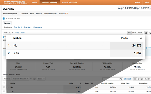
Now that I have these stats, I don’t have to wing it! What’s even more interesting is to see which devices these visitors are using. If I click down to the “Devices” report (shown below), I’m surprised to find out that the most commonly used device for our audience over the past month is the iPad. For most of the sites I’ve looked at, it’s been the iPhone.
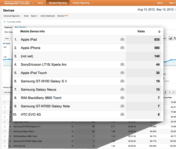
Here’s the takeaway from the mobile report: If you’re planning on designing anything for the web, you need to look into these stats to make sure you’re designing it the right way for your actual audience. There are global device trends that we need to pay attention to, but then there are micro-trends related to our specific audience. A good design approach is a synthesis of them both.
Date Range
I’ve been noting for most of these reports that they’re showing data for the last month. This range of time is configurable, though. In fact, the date range can be changed on every single screen of Google Analytics. You can change it to display a deeper or shallower span of time — say, just a day or two, or all the way out to the past year — but what’s even more interesting is that you can compare one range of time to another one.
For instance, what I’d like to do is see how traffic in July this year compared to traffic in July last year. So, I’m going to enter those date ranges and then hit “apply.”
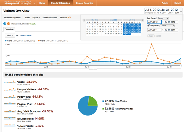
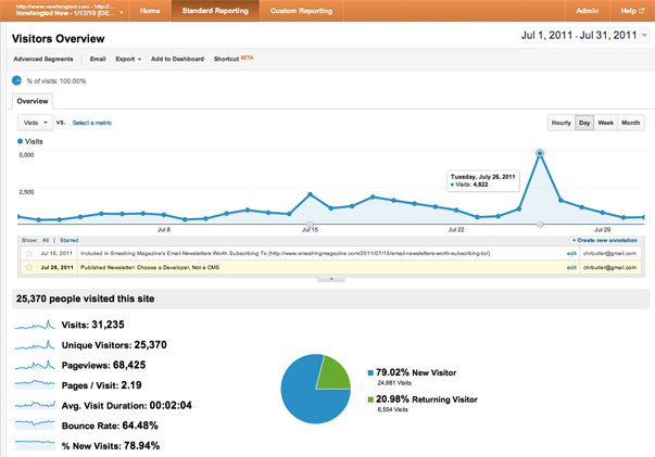
Once the report reloads (shown above), I can see that last year is displayed in orange, and this year is displayed in blue. That makes it much easier to see that, generally, this site got more traffic last July than it did this year. In fact, I can see a pretty big spike on July 26th.
Annotations
I’d love to explain that spike, and I’ll be able to if I was smart enough to add an annotation last year. Annotations were actually next on my agenda, anyway. I’m going to change the date range to show only last July and reload this report. Now, I can see a small icon beneath that July 26th spike. If I click on it, I can see that I left myself a note last July showing that I’d published an article about choosing a CMS on the 26th. That’s what generated all that traffic to my site. Annotations are essential for keeping track of traffic spikes and trends and connecting them to events that may not otherwise be visible in your Analytics reports.
Real-Time
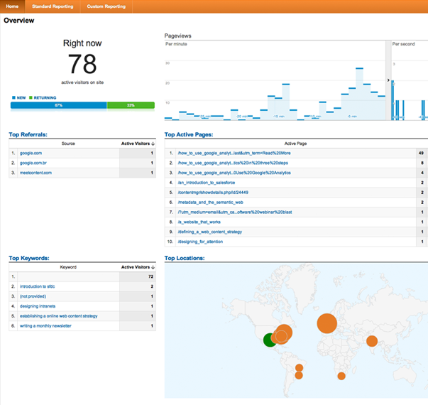
OK, one last thing. Google Analytics recently released a real-time report that is still in BETA (shown above). I can get to it by clicking “Home” and then choosing “Real-Time” and then “Overview.” This is showing me the number of visitors on my the site right now (at the time of this writing, of course), and which pages they are viewing. It’s a bit of a novelty, and it doesn’t go as far as telling you exactly who these visitors are — that would be a bit creepy, wouldn’t it? — but it sure is neat. It’s especially interesting to look at when you publish something new, or when someone else starts sending traffic to your site. Whenever someone links to our site or we launch a newsletter campaign, I open up this real-time report and watch the numbers spike.
Let’s Review
What’s more important to me than taking a how-to approach to every bit of functionality that Google Analytics has to offer — and like I said, there’s so much I haven’t covered here — is that we establish a foundation for measurement that starts with questions, pursues answers, and supports action.
Our routine was in three steps:
- STEP ONE was to review general visitor data, paying attention to traffic drops and spikes and the overall big picture of who is coming to the site.
- STEP TWO was to dig into the sources of that traffic, and then evaluate those sources on the basis of which generate the most value to you, which we measure in terms of conversions.
- STEP THREE was to take a close look at site content and learn how to evaluate it on the basis of bounce rate. (Though we also learned to do that carefully and avoid falling victim to a false impression of what that bounce rate really means.)
In these three steps, we’ve reduced our measurement routine to a pretty simple concept of linking core metrics: Traffic Sources and Content, understood in light of Conversions and Bounce Rate, respectively.
Reducing complicated measurements to meaningful questions and pursuing answers to them through simplified analytics procedures is all about one thing: Producing the right action. Don’t wait to be handed someone else’s number-heavy and insight-light report. Making measurement a part of your repertoire today will help you find the answers you need to take action.
Next Steps
Now, if you’re interested in learning more about web measurement, it just so happens that I devoted an entire chapter to it in my new book, The Strategic Web Designer, which has just come out from HOW Books. If you’ll forgive me for the shameless self-promotion, you can find it here, on MyDesignShop.com, or on Amazon.com!


