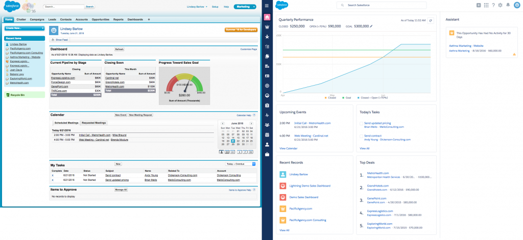
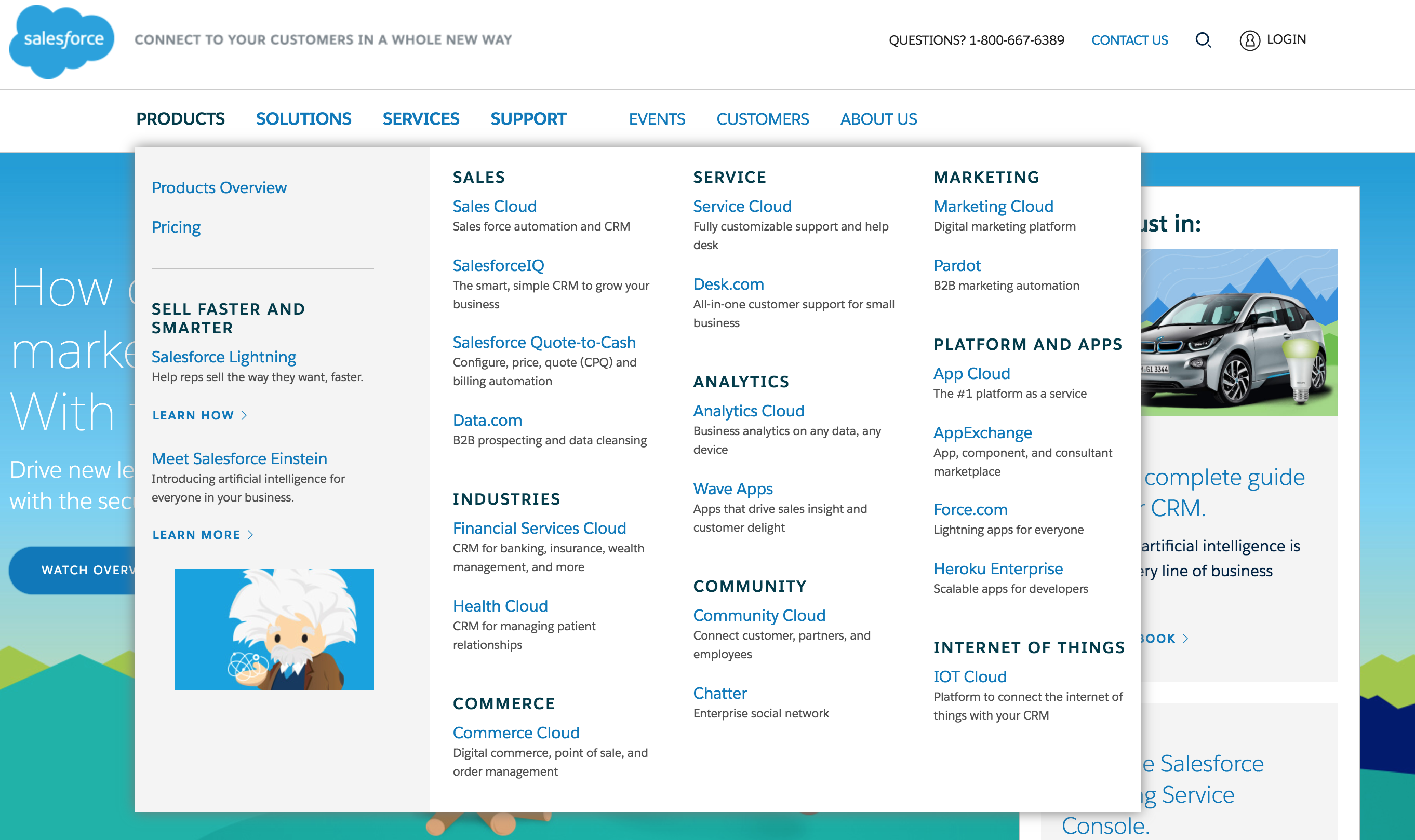
Whether you’re an active Salesforce user or not, you’re probably at least somewhat familiar with the Salesforce user interface, in all its boxy, turquoise, early 2000s glory. I’ve never met anyone who likes the Salesforce UI. I’ve even heard it cited as a reason for choosing a different CRM. While I believe the benefits of its functions far outweigh the ugliness of its form, it’s more than fair to say that the Salesforce design has been badly in need of an update for years.
Thankfully, Salesforce has finally delivered with Lightning Experience!
What is Lightning Experience?
Lightning Experience is the new, modern user experience and interface for using Salesforce. It’s not just a faster, prettier version of Salesforce; it’s also an entirely new way of interacting with your org. If you’re a Salesforce1 user, you’ll probably recognize many of the elements from the mobile experience. The Lightning Experience technology has been in development for a few years, and it was used to build the latest mobile apps.
Lightning Experience for desktop is still very much a work-in-progress. The core elements of Salesforce (standard and custom objects, reports and dashboards), as well as many other features, have been redesigned. However, not every feature is supported yet. Because of this, the interface you’re used to – now called Salesforce Classic – is still available, and users can switch between Lightning Experience and Salesforce Classic with ease. Your entire org does not need to implement Lightning Experience at the same time. Certain users can enable Lightning Experience, while others can continue using Salesforce Classic.
The current supported feature set is focused on better supporting sales and the sales process. Salesforce is adding new features with every release and expanding the experience to other areas of Salesforce.
What’s different?
Aesthetically, the Lightning Experience interface is more modern, with a focus on using visual elements to display information and a more intuitive and effective use of screen space.
A minimized header and a left-hand menu concentrate attention on the work at hand, and free up precious screen real estate, which is especially helpful when using a smaller display like a laptop.
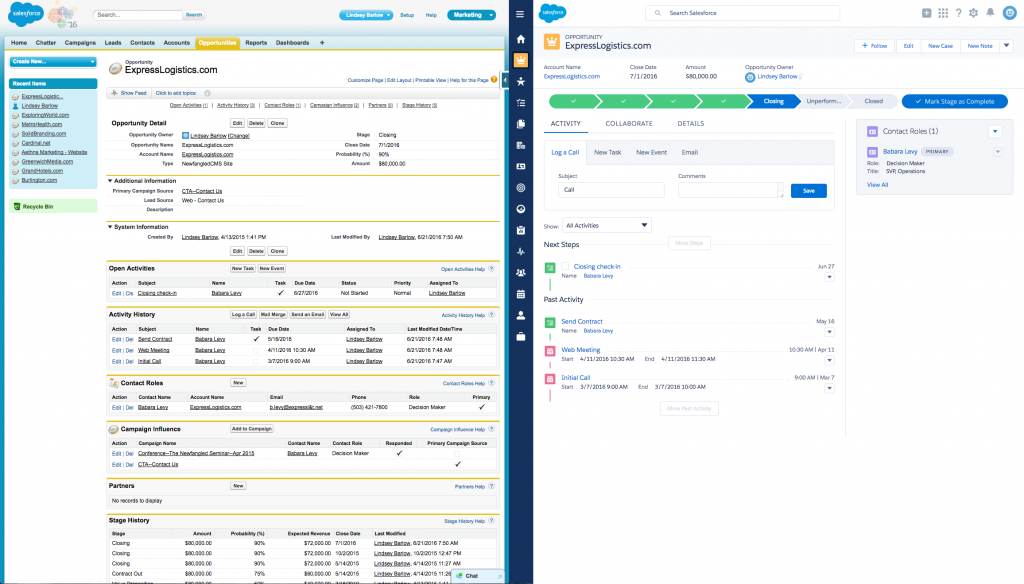
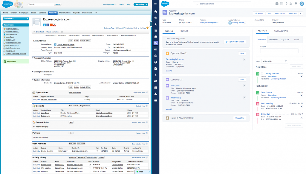
Record layouts are not only prettier but also significantly more usable. Salesforce Classic’s uniform layouts with stacked boxes of text in columns and rows are hard to scan, and give a false impression of data hierarchy by only using vertical space. Lightning Experience’s layouts make use of both horizontal and vertical space to display elements, and use different shapes and colors to call out important information and highlight differences between types of elements. Just as each standard object has a different function, each object’s layout is slightly different, emphasizing what users most often need to do with those records.
Here’s a side-by-side comparison of the same Opportunity record in both UIs:
And the same Account record:
The most noteworthy difference is how dynamic the new interface is. In Salesforce Classic, you’re almost always looking at a static HTML page. Saving updated data requires a full page refresh, and editing things like list views or dashboards requires loading an entire separate editing interface, and then saving and reloading to view your updates. Lightning Experience is built entirely differently. Saving updated data doesn’t require refreshing an entire page, and saving data in one element can update data in other elements immediately and seamlessly. The user experience is much more engaging. Tasks can be completed more efficiently and in more intuitive ways.
The enhanced responsiveness of Lightning Experience can be seen clearly in the new list view experience. Here’s how easy it is to create, edit, and interact with an Account list view:
The main reason we recommend Salesforce to our clients is because it is the most customizable and versatile CRM out there. Every business is different, and every business’ Salesforce install is different. You can add to your database, creating new objects and fields. You can install apps or build your own. The only piece of Salesforce that was missing that flexibility and customizability was the user interface. Lightning changes that. Along with Lightning Experience, Salesforce has also introduced the Lightning App Builder and the Lightning Design System, which allow you to leverage the underlying design system of Lightning Experience to easily create apps or enhance user experience. Customizing and redesigning users’ experiences based on your company’s goals and expectations, rather than what’s possible within a strict, outdated framework, will undoubtedly lead to improved adoption rates, data quality, and sales efficiency.
Should you switch?
Let’s come back down to earth for a second. Lightning Experience definitely has some amazing possibilities, but the unfortunate reality is that in order to realize any of them, your org and your users are going to have to make a big change. And a big change in Salesforce often translates to a big pain in the neck for your team.
It’s a pain in the neck you’re going to have to confront at some point, though, because Lightning Experience will eventually be the default Salesforce user experience. It’s going to take years to get to that point, but the longer you wait to start embracing Lightning Experience, the more pain you’re guaranteeing yourself in the future.
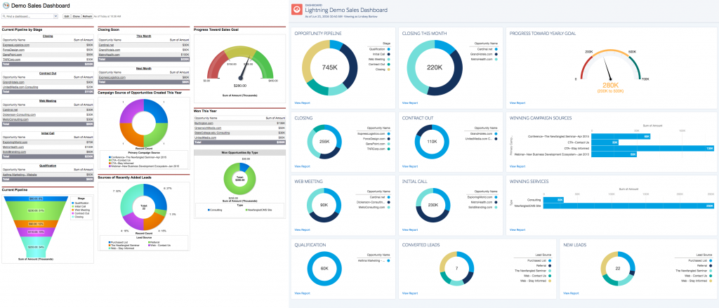
If you’ve been too intimidated to even preview Lightning Experience, I suggest test driving it by completing a specific task. I decided to try it out by rebuilding our dashboard in Lightning, and that experience was really rewarding. I was able to adjust to the new look while doing something productive. Also, if you start with a task you’re familiar with, you’ll be able to feel your way through doing it the new way and consult help if you get stuck, instead of having to follow a list of instructions.
Here’s a comparison of our normal dashboard in Classic and the revamped version I built in Lightning:
You can preview Lightning Experience without actually enabling it from the Lightning Experience page in the Force.com menu. If you choose to enable it for your org, you have to opt yourself and any other users in. So don’t worry about users logging in and freaking out about the new interface. If you do choose to opt in, you can switch back to Classic with a click.

Since the current feature set is sales-focused, I think sales users will see a lot of immediate value from using Lightning Experience. Depending on which features your sales team currently uses, it may or may not be possible to switch at this time. Here’s a helpful list of the sales features that aren’t yet available in Lightning. If your users are only using the basic Sales functionality, then there’s a good argument to be made for switching now. Especially since there are some great new sales features that don’t exist in Classic.
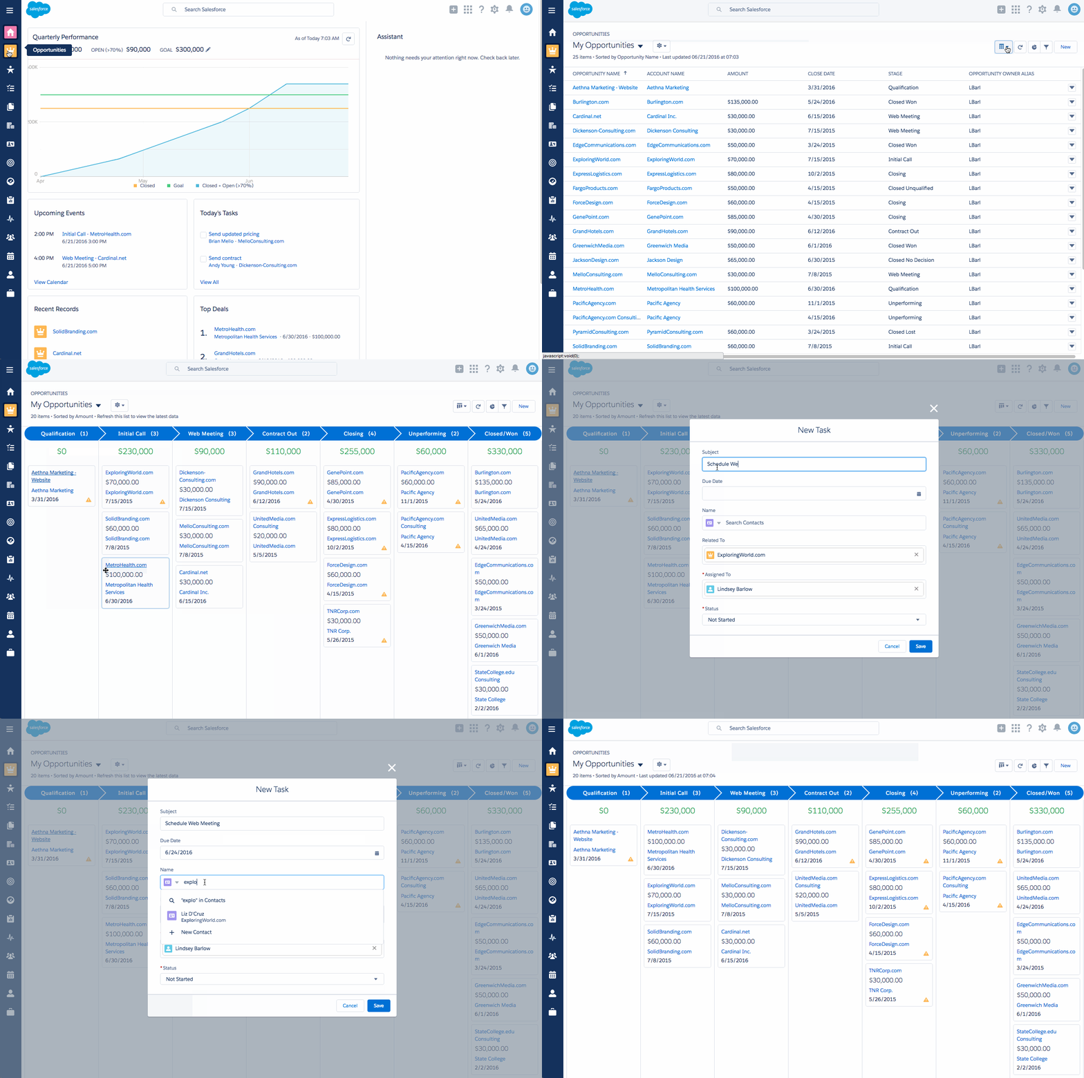
One of those features is the Opportunity Kanban, which is a visual summary of opportunities in the pipeline, grouped by stage. The Kanban view is available for any opportunity list view. Users can drag and drop opportunities between stages and create activities without leaving the page.
Just skimming through the release notes for the Summer ‘16 release reveals even more new features, like the ability to send email directly from Salesforce through your Gmail or Office 365 account.
So should you switch? Yes, definitely. Eventually. If you’re not ready to dive in completely, but want to make sure you won’t sink when you are ready, you should have at least one user (ideally your admin, if you have one) begin using Lightning Experience now. They can then recommend the ideal time to roll out the new experience to other users and provide training and support. But I also wouldn’t hesitate to roll this out to other users now, especially those who already know their stuff. It’s a bit of an adjustment at first, but once you get your bearings, the experience is quite delightful.
