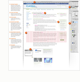
Because Newfangled has done so much work with agencies over the past fifteen years, I have learned a lot about the print to web transition. While I have written about this topic and given many lectures on it around the country, I do not intend to rehash all of the print to web design rules here. There are a few basic points I will cover in the context of this book, however.
It’s a Website, Not a Magazine Ad
The most common mistake agencies make when approaching web design is that they cannot seem to help but treat it like a print design piece. I believe that good agencies and good designers have all the skills they need to be good web designers, but they need to have a different approach.
As Chris Butler wrote in one of our newsletters on design, “Print design is like classical composition, and web design is like jazz.” Classical composers meticulously place every note for every instrument in an intentional spot. The pieces are faithfully reproduced by well-trained musicians (think: printers) time and time again. Compositions created hundreds of years ago are still performed with little variance today. Print also works this way. You design the perfect ad, send it over to the printer, review the details, get a spec version, approve it, and then ten thousand copies appear on your doorstep a few weeks later, never to be changed.
In terms of process and expectations, web design could not be more different from print. The web, after all, is like jazz. Even the most brilliant jazz composers almost never set out to craft every note every musician would play. In fact, most jazz songs are never played the same way twice. The band leader sets a musical melody or motif, and then the band gathers around that motif for a few measures. From there, each musician gets a solo section during which they impart their own character, the band comes back together at the end to voice the motif again, and the song is done. This is a bit of a simplification, but, essentially, that is how it goes.
Much like a jazz song, the web is never the same way twice, and this is a fact you must be cognizant of, play to, and design in harmony with. The main thing to focus on is relinquishing control. A web page’s design cannot be successfully micromanaged. Even if you do create the perfect design where every element is in perfect harmony, what happens when the client logs in to the CMS to add two more paragraphs and three new images to the page? What happens when fourteen people add blog comments to the bottom of the page? What happens when a visually impaired person ratchets up the font size of the browser to read the page?
These are questions better answered pre-design than post-design. Consider the user. Consider the medium. Be confident in your design skill, and leave your need for complete control at the door.
Whenever you try to impose your print designer’s will on a web page, you undoubtedly create a page that is not as user-friendly or successful as it ought to be. Sorry for the tough love here, but you will not create a design that is so amazing that it will change the way everyone uses the web. The best thing you can do to create noteworthy web designs and to be an expert web designer is to play to the well-established truths of web design. Discovering and designing to the limitations of any medium is the hallmark of a great artist. In most cases, even those artists who do break the rules do so only after developing a masterful understanding of what the rules were in the first place. Web design is evolving, for sure, but the people who push the boundaries are those who understand the medium well, not print designers who try to apply their knowledge of one medium to another. Experienced users can spot those people from a mile away, and you do not want to be put in that category. Here are a few common pitfalls to avoid.
This post is an excerpt from my book, “A Website That Works.”
#macro:blognav,24154,24158#

