
Dave and I were invited to present on mobile at UNC’s Wilson Library, sponsored by the Carolina Adobe User Group. It was a nice event (with impressive door prizes, by the way!) and included some good questions at the end. Here are my slides (also a set on Flickr) and a writeup of my portion of our presentation. (Note: Now that I read back over this post, I’m realizing that I was a bit “punchy” when I wrote it. Apologies…)
Clarifying the Mobile Opportunity
Since Dave and I teamed up to give this presentation, we agreed that I would focus on the big-picture issues of mobile technology: the background, the cultural forces driving it, and of course, the possible future. Dave followed up by getting in to more detail on how we implement our mobile strategy.
My point of view on this is probably biased by many issues, but here are a couple of requisite caveats: First and foremost, my discussion assumes a focus on adapting non-monetized content for mobile. What I mean by that is I’m not exactly addressing mobile from the point of view of someone creating content for the purpose of selling it (i.e. most publishing or entertainment oriented content). Were I to address mobile from that angle, I’d probably do so very differently. I’m also coming at mobile from the clearly biased point of view of a web development company, as apposed to an application development company. That bias will be clear in my “case against apps” section. Just sayin’.
One last introductory point I made before digging in was probably the most important one. Over the years, I’ve noticed that many people view things like search engine optimization as this esoteric knowledge that they cannot access without help. But most of the time, I want to remind them that they actually have more knowledge of SEO than they think. After all, they’re usually very well versed in using Google for themselves, but just need a little bit of help connecting their own practical knowledge with anticipating other searchers’ queries when creating meta data for their web content. The same is true with mobile. It really should be no more of a mystery to anyone who owns and uses mobile devices than it is to me (or anyone else who works with them “professionally”).
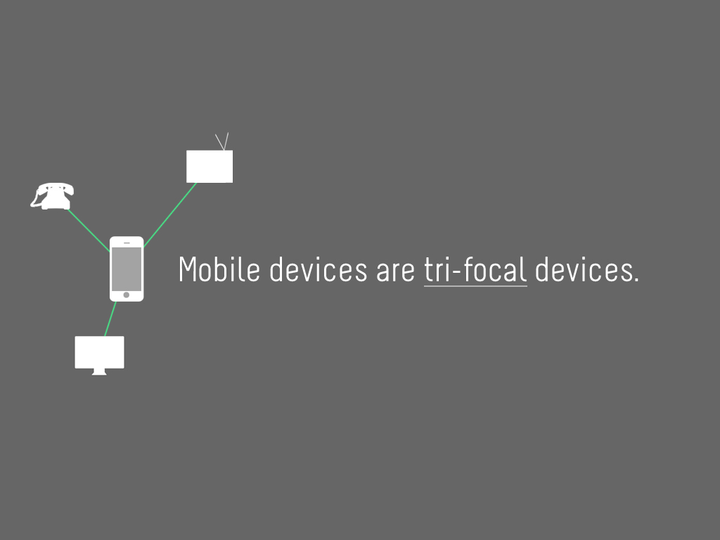
Mobile = Tri-focal Devices
This is an obvious point, but I think there’s some value in going through it just to underscore the significance of what these devices really are. Mobile devices are phones—allowing us to communicate via voice, text and video—televisions—allowing us to consume media, like video clips, audio clips, shows and movies—and computers—powerful productivity devices. They’re not just fancy phones, nor are they just small computers. They’re a new fusion of at least three distinct devices that we’ve spent most (if not all) of our lives using.
“Obviously,” you say. Riiight. Moving on…
Mobile Devices Consolidate the Content Experience
What I’m referring to here is that the different kinds of content from those three devices are now being funnelled through one. Your phone calls, texts, video chats, blogs, video clips, TV shows, movies, podcasts, music, etc. are all being pulled through the small screen you keep in your pocket. That is having a huge impact on how we think about all of that content. But it’s also exposing the fractured nature of the experience. One website is optimized to adapt to the small screen, while another is not. One video plays, the other doesn’t.
Mobile Devices Create a User Feedback Loop
This is the opportunity that mobile device experiences are presenting to us right now: raw, actionable feedback. When we recognize the fractured nature of the content experience through our use of mobile devices, we immediately think, “It should work this way, instead.” We know right away how to fix the problems we encounter, and often how they could apply to the original content, too, not just the mobile-optimized versions. We should be taking notes!
The Case Against Apps
So far, I haven’t really mentioned apps. That’s intentional, because for the most part, apps aren’t something I’m that enthusiastic about. It’s not because all apps are bad, of course. In fact, there are some apps that are quite good. But the best apps are those that are not drawing upon content that either is or should be accessible via the web and fundamentally transforming it in a way that compromises its accessibility (more on that shortly). Goldilocks, a series of movies shot on the iPhone 4, edited on the iPad 2 and released as an app in the iTunes app store, is a great example of app worthy content—content made for that format that wouldn’t be radically enhanced by existing elsewhere. And for you junkies out there, all those games like Angry Birds and Words with Friends are examples of legit apps, too.
But here are the three main charges in my case against apps:
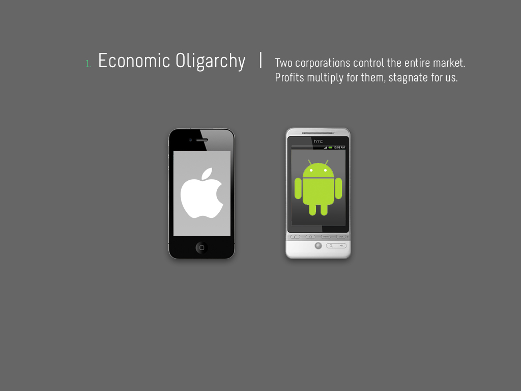
Economic Oligarchy
This is, admittedly, more of a political issue I have with the apps marketplace setup. There are two companies that control almost the entirety of app-related commerce—Apple and Google. And while most app developers I know are excited about their 70% cut of the revenue from the sales of their apps, the economic conditions will always remain drastically in favor of the verrrrry tippy top. See, there are 400,000 unique apps available today. Since the launch of the app marketplaces, there have been over 10,000,000,000 downloads (yes, billion). That is a massive amount of activity, and an even more massive amount of revenue. So all the app devs must be doing great, right? Well, not exactly. The average price of an app is only $1.65. So, unless you are incredibly prolific, an individual has a much lower number to hope for than the owner of the entire marketplace. Add to that the fact that Apple and Google have tight control over what makes it into their inventory and you have a system that is not exactly an innovation breeding ground. The real innovation has already happened—the creation of the marketplace itself. The next likely source of game-changing innovation is much more likely to come from outside the app marketplace, like the web, where less control and economic control factors are in place.
(By the way, I’ve exceeded my use-of-the-word-innovation quota. I promise I won’t use it again for a while.)
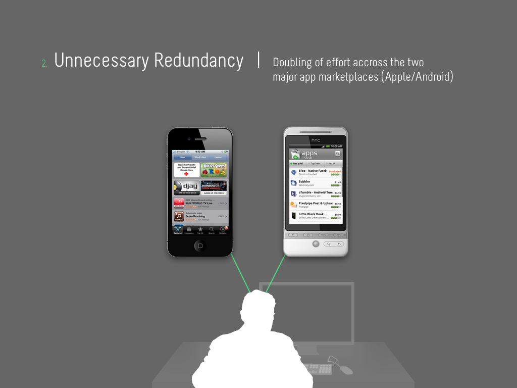
Unnecessary Redundancy
If you’re a developer, this should resonate with you. Because of the platform division of the two major app marketplaces, you have to build your apps twice if you want to make them available to the largest number of potential users. Economic competition is the only real reason for this, which isn’t a good enough one in my mind to validate the resulting inefficiency. If I was paying for an app to be made, I’d be pretty annoyed to have to pay for essentially the same thing twice.
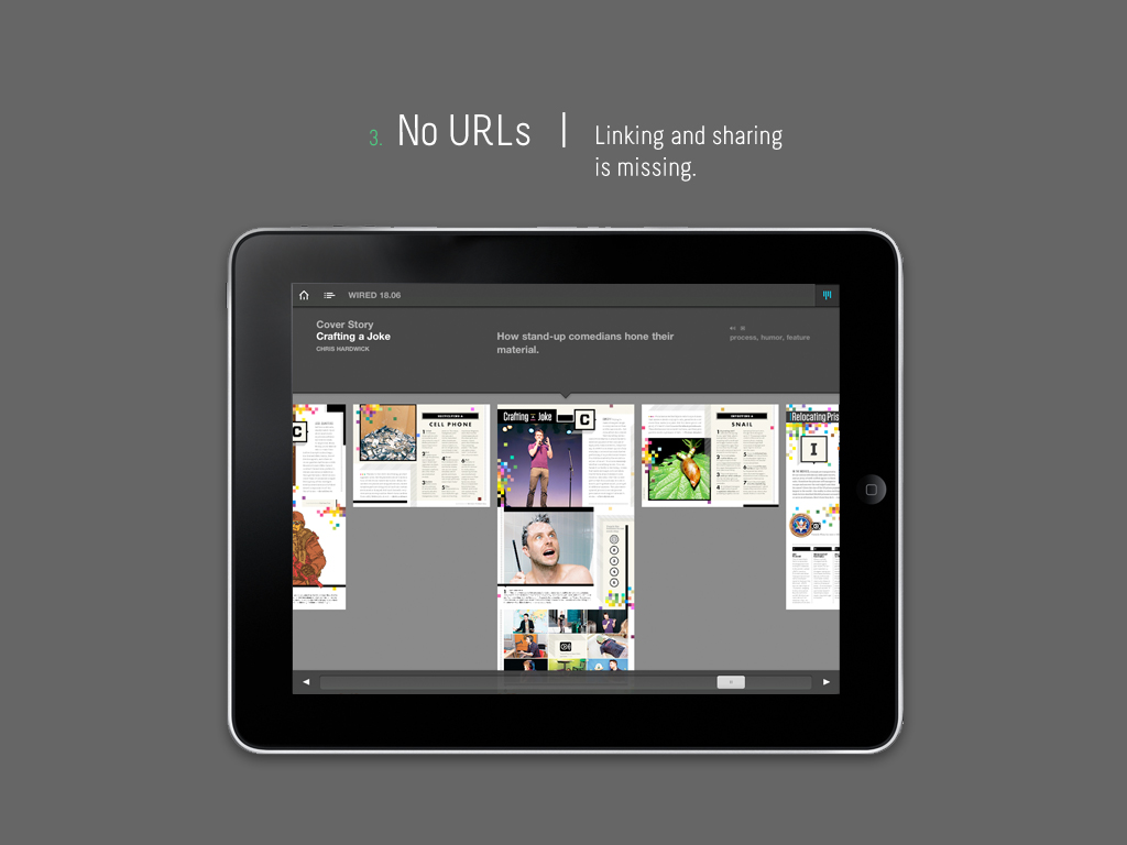
No URLs
This is my biggest problem with apps. As an example, I’m showing an image of the WIRED magazine app, which I eagerly anticipated after seeing many demo videos and generally buying in to the hype that preceeded it. As soon as it launched, I downloaded it and paid the $3.99 for the first iPad-friendly issue. I immediately experienced the kind of disappointment that you deny for a while because of the accompanying sting of you-actually-bought-the-hype shame. Yes, I thought it was going to be wonderful. No, it wasn’t. Here’s why:
Let’s say I read the center article in the “timeline” interface above (a cool UI idea, to be fair) and now wanted to share it with a friend. I really can’t do that; the article doesn’t have an address of it’s own. It’s just an undifferentiated piece of the 500mb glorified PDF that we’re calling an “app” here. (This, in fact, did happen to me with that first iPad issue I bought.) So, I went to WIRED.com, found the article and then sent the link to my friend. About a second or two after clicking “Send,” I thought, why didn’t I just start here in the first place? …On the web. Where the exact_same_content is available for free. Right.
This is my central objection to “appified” versions of content that have a more natural, flexible, indexable incantation on the web. It’s all being crammed into an impenetrable shell. If you searched for information that would best be supplied by content in the app, you wouldn’t find it with Google. And sadly, you definitely wouldn’t find it with Apple’s iTunes store search tool (not the greatest engine in the world).
Between the economic factors, the inefficiency, and the lack of URLs, apps are currently subject to a system that almost seems intent on stunting their potential. Of course, looking at the sales numbers, you wouldn’t think anything was wrong. Maybe that makes me a pedantic grouch, but I’m only pointing out a lack of the things that make the web great. Which is why, from a mobile standpoint, I think we should focus on the web—making its content more accessible in mobile contexts…
Focus on the Web
Yay! Back to the web! Here are three principles for having a web-focused approach to mobile:
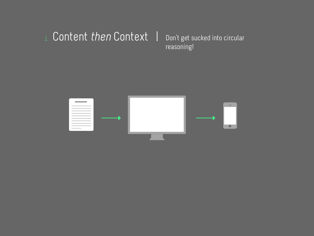
Content then Context
Most of the conversations we have with our clients about mobile involve optimizing existing web content for mobile device access. The key point here is that the content has already proven itself and there is an evident demand to extend its accessibility accross a broader context. But invariably, as we work on mobile versions of web content, we start getting requests to build new types of unique content for the mobile versions of these websites. That’s where it gets circular—why are we all of the sudden talking about creating new, unique content for mobile when the whole conversation started around optimizing existing content for mobile? If we were to take that route (for which there could be good reasons), the new content would be untested. But the existing content has already met the demand test.
By the way, this principle extends to particular technologies, as they can become a barrier, too. For instance, video, which might generally be accessible on the web implemented with flash-based players, won’t work on most mobile devices. The solution isn’t to create all new video content. It’s to facilitate the same accessibility by choosing the right technology that works in all contexts (YouTube is a great solution for this, by the way).
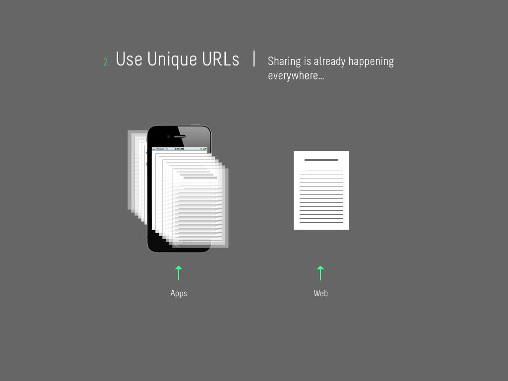
Use Unique URLs
I already made clear (I think) why a lack of URLs is a weakness of apps. On the web, the question of where a piece of content exists is almost always relevant—to the humans that search for it, interact with it, share it, and save it for later, as well as to the search engine bots that crawl the web looking for it. Addresses matter. Imagine if you went to visit a friend at an apartment building but didn’t have their apartment number? The best you could do would be to knock on every door until you found your friend. We take this for granted on the web, but that would be the kind of situation I would have been in had there not been a web-version of the WIRED article I wanted to share in their iPad app version.
Matthew Ingram, a writer for GiagaOM, was interviewed for a recent episode (#35) of the Spark podcast about this very issue and had this to say:
“…apps as individual, controlled experiences are good for some things. I’m pretty convinced it’s not the best thing for things that have to do with media, with content. The whole lifeblood of content is the sharing, the linking. Whether it’s apps or websites, if you look at the ones that don’t do that I think you quite quickly come to the realization that they’re missing something fundamental.”
I completely agree…
Seamless Experiences
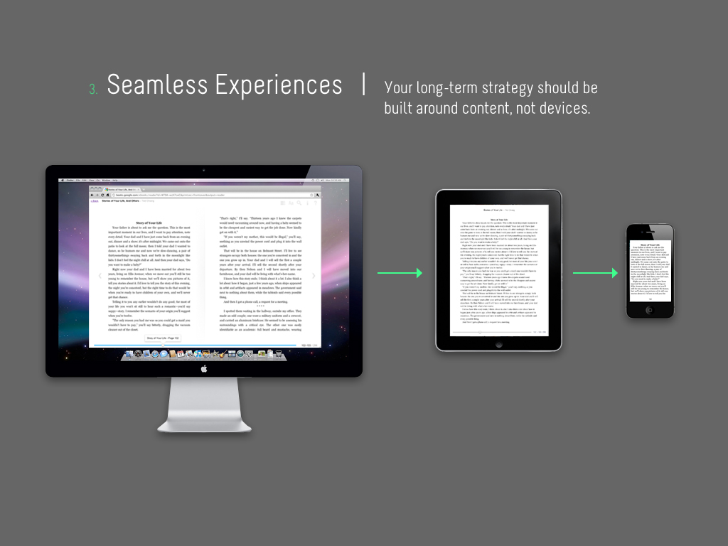
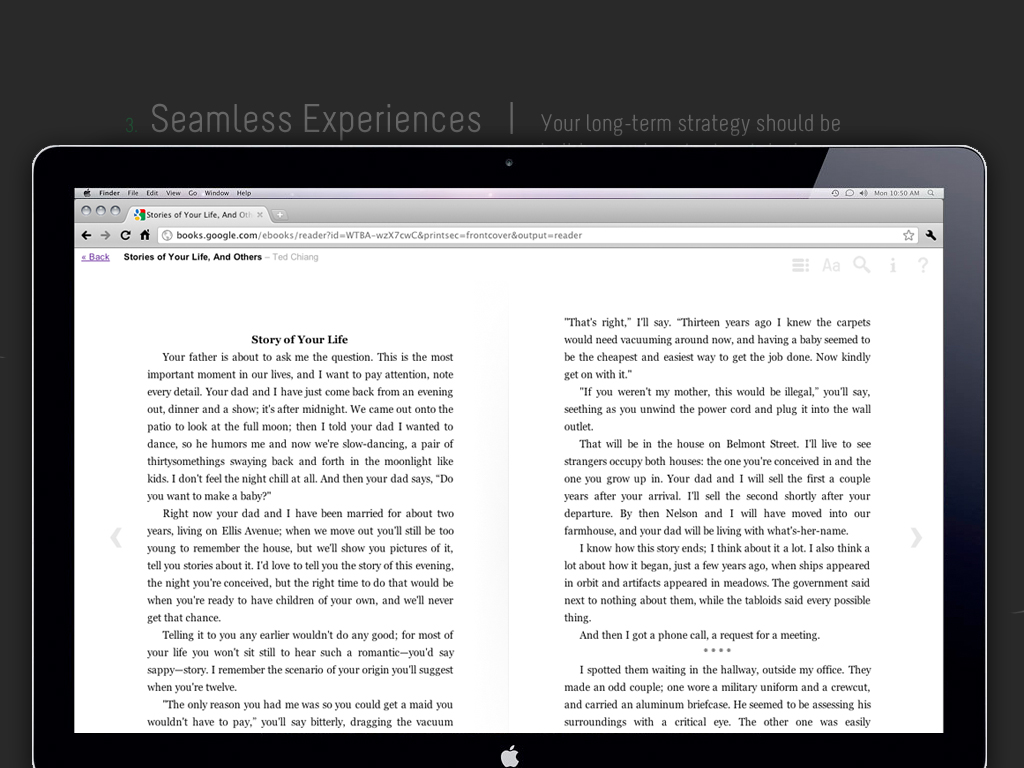
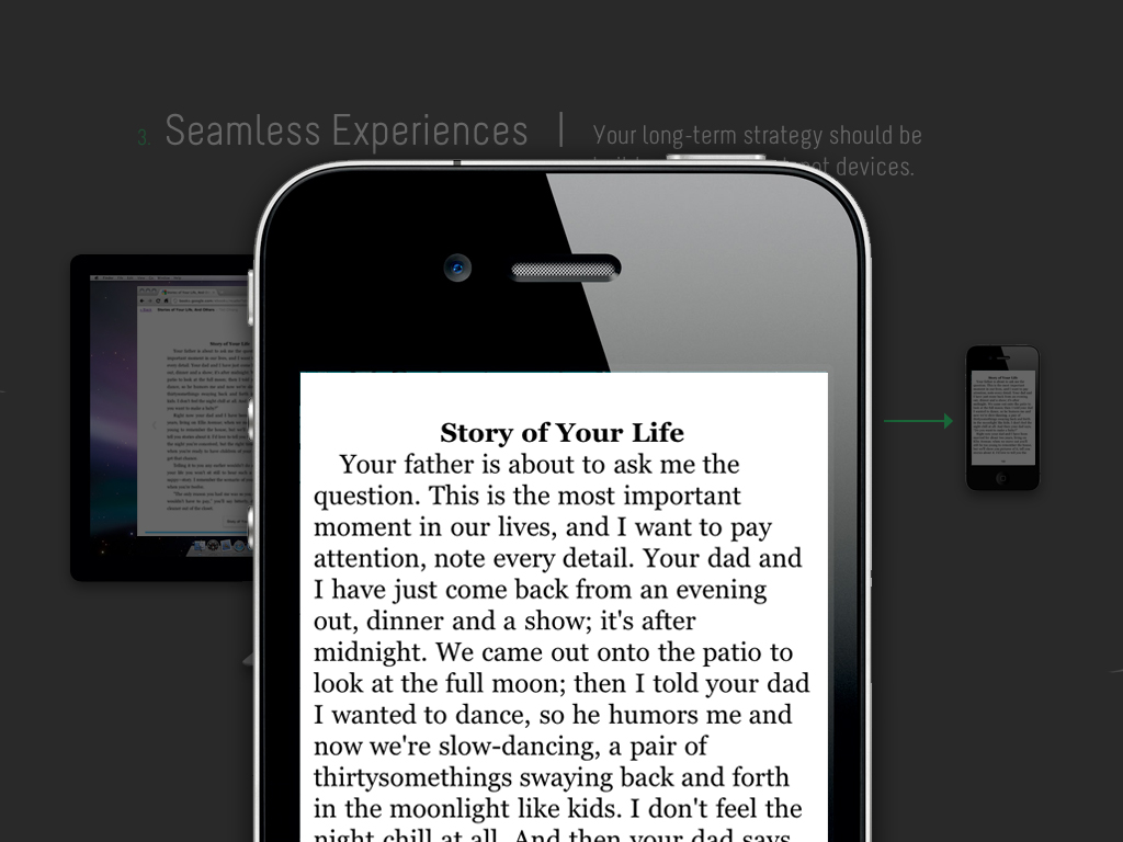
This should be our #1 priority for creating content in general, and making it accessible no matter what the context. A great example of this comes from Google Books (I elaborated on this in a recent blog post), which preserves the reading experience wonderfully regardless of whether you are reading on your desktop, tablet, or phone. In the three images below, I’m trying to show how incredible that really is—that I can read some on my desktop, pick up exactly where I left off on my tablet, and then again on my phone, without having to do any bookmarking or give any thought at all to saving my place. Google has made that functionality innate to their books experience.
Of course, the book itself is kind of like an app in that it’s one file without a URL (or distinct addresses for each of its pages). But, it serves as a great example to strive for in terms of a seamless web experience. We’ll get there someday…

The Mobile Web is a Work in Progress
This is my mantra for all things web, so it’s not going to be any different with mobile. As I said, we’re not quite at the level of seamlessness that Google Books offers, but I think it’s possible and certainly a decent thing to strive for in our approach to content. Dave’s presentation will go in to all the detail on how we’re currently approaching mobile website development, which is very much focused on using basic web techniques to make existing conent more accessible. I’ll link to that as soon as he posts it…


