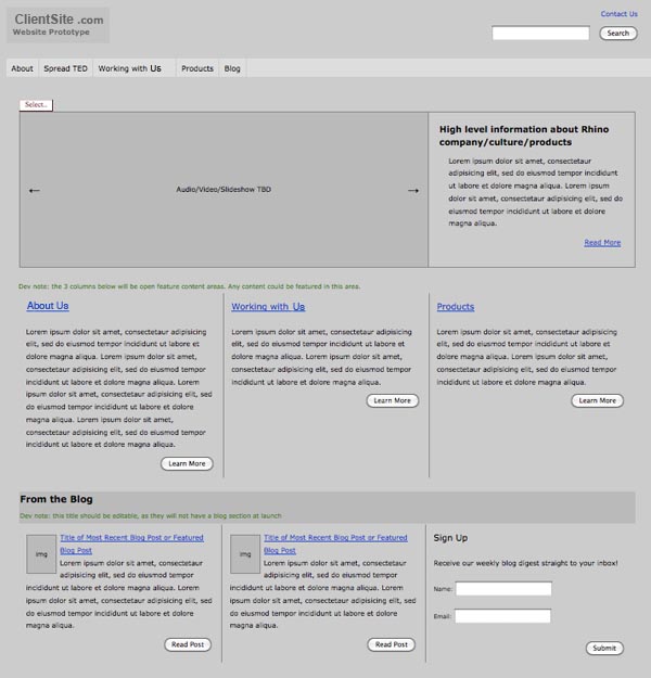
The first step most companies take when trying to build a new site is to create some sort of rough site map or wireframe to depict their information architecture. They do this to help figure out how the site will function and where different sections and pages will be located. However, trying to capture something as intricate and complex as a website on paper can be very difficult. There are often many things that get missed in a wireframe simply because it is on paper.
Newfangled utilizes the approach of building an interactive prototype, which we call a “grayscreen,” because it gives us an opportunity to plan out the functionality of a website using the web instead of a pen and paper. This allows our clients the ability to click through and navigate the pages exactly as they do on a website.

When entering the prototyping phase, a lot of the emphasis should be not only on the functionality of the website and individual pages, but on how the site will be navigated by the end user. Information architecture should be the fundamental concept to which every decision in the prototype is held accountable. You should always keep in mind how your target audience will be interacting with the site, not just how you want it to function.
Information architecture is a principle that should be addressed prior to looking into page-specific functionality and business logic. When considering the information architecture of your website, there are a few things you should keep in mind.
Houses in the Web
First off, despite the word “architecture,” planning your information architecture isn’t really like planning to build a house, for a few reasons. Yes, this is your blue print that will help convey how you want everything to interact on your final site, but there are a few restrictions you have in building a house that you don’t have on the web.
Building a website is more like building a house in a zero-gravity environment where people can walk through walls and transport from one room to another instantaneously. Try making a blueprint of that! Just another reason that we always prototype.
Mark O’Brien makes some great points about this. He is quick to point out that every page is your home page. Unlike a house, users can enter your site at any location. Often we use a google search for specific information and end up landing on a page deep within a site before we ever even see the home page.
Imagine the impression your house guests would get by walking right into your bedroom instead of through the front door. If you’re like me, then they might be tempted to walk right back out after seeing the piles of laundry on the floor. However, this is exactly what happens on the web, and it is why you want to keep the dirty laundry off of all of your pages.
For this reason, when mapping out your information architecture, you have to make sure that when a person lands deep into your site, they are able to orient themselves and know how to move around the site from where they are. Each page needs to have navigation that clearly shows the user where they are and gives them a quick way to any other section of your site, just in case the first page they land on is not exactly what they are looking for.
As you enter (or continue) your website building process, make sure that you don’t forget about this very important piece of the puzzle. Take the time necessary to think critically about your users and how they will be using your site. The information architecture can make the difference in a visit turning into a conversion/lead or a bounce.