I like to think of myself as above average. I graduated magna cum laude from college, was always on the honor roll in high school, and even received the Presidential Physical Fitness Award several consecutive years in grade school—my name is still emblazoned on the gymnasium walls of Summerfield Elementary. However, I think in this new web savvy world to which I now belong, I am utterly mediocre—at least for now. Apparently the Web doesn’t care how fast I did the shuttle run; and believe me, it was fast. But this reality has its upside: I have an inside track to the mind of who we’re designing our websites for: the average user.
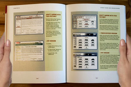
According to Steve Krug, author of “Don’t Make Me Think: A Common Sense Approach to Web Usability” understanding how people really use the Web is crucial to designing effective websites. The average user doesn’t read pages; he scans them. The average user doesn’t look for the best choice; he looks for the first reasonable option. The average user doesn’t read instruction manuals or analyze the intent of the designer; he “muddles” through and makes it work. Krug notes the harsh reality that while we’re often thinking “great literature”, the user’s experience is much closer to “billboard going by at 60 miles an hour.” Unfortunately, most people are going to spend far less time looking at the pages we design than we’d like to think. So what’s a girl to do? Design great billboards, of course.

Krug highlights some basic principles we can use to ensure our websites appeal to the average user.
- Create a clear visual hierarchy
Making important items prominent and accurately portraying relationships between items on a page create visual cues for the user and make pages easy to grasp. - Use conventions
Conventions only become conventions if they work; they offer a sense of familiarity for the user and help make our sites self-explanatory. - Break pages up into clearly defined areas
When scanning a page, this allows users to quickly identify areas of interest. - Make it obvious what’s clickable
Keep in mind that users bring a limited reservoir of patience and goodwill with them when they visit your site, so give them mindless choices whenever possible. - Minimize noise
A busy site with lots of background noise can be extremely distracting.
Usability means making sure something works well—that a person of average, or even below average, ability and experience can use it for its intended purposes without getting hopelessly frustrated. Sounds like common sense (hence the subtitle). Of course we want our websites to work well and of course we want our users to have a pleasant experience. Sometimes we just have to be reminded what that means for us practically—especially when those doing the designing tend to be above average.


