So you’ve developed a content strategy for your site and written some great copy. Now what?
How that content looks on the page is as important as the content itself. Things are more fluid on the web than in print— the way someone will view your content will vary depending on the operating system, browser and viewing device (desktop, tablet, smartphone). But you still should take time to properly style your content; not only for the sake of good communication in a single newsletter or blog post, but also to make sure your site-wide content doesn’t conflict with the look and feel of your site.
A great deal of time and effort is spent planning, prototyping, designing and developing a website and it’s a shame when the content styling works against the site rather than acting in harmony with it. A well-developed marketing website costs tens of thousands of dollars to develop with the goal of enhancing your organization’s image, reputation and bottom line. So why would you populate the pages of your site with poorly styled content? It’s like buying a $70,000 Mercedes and replacing the calfskin leather seats with plastic lawn chairs.
Here are three things to consider when styling your content:
Use good quality photos or illustrations that balance and complement the written content
There’s nothing worse than a well designed site with bad quality photos. Quality can relate to the physical reproduction of an image: blurry because it was enlarged beyond 100% of the original or containing noise artifacts because it was optimized incorrectly. If your product photography was snapped on the conference room table by someone with their iPhone, consider spending the money to hire a professional photographer or contract with a third or fourth year photography student from a design school.
 Image quality can also relate to the subject matter. If your business is service-based, you may need to use stock photography or illustration to enhance your content. There are too many good sources for stock images that you don’t have to resort to ones that are dated or cliché. And for heaven’s sake, stay away from the clip-art that came bundled with your word processing program. Sites such as Masterfile and Getty Images offer good-quality, affordable, royalty-free stock photography. iStockphoto and Veer have a great selection of royalty-free stock illustrations and vector art. Paul Boag, co-founder of web design agency Headscape, has written an informative blog post on alternatives to stock photography clichés.
Use text styling that is attractive and establishes a clear hierarchy of content
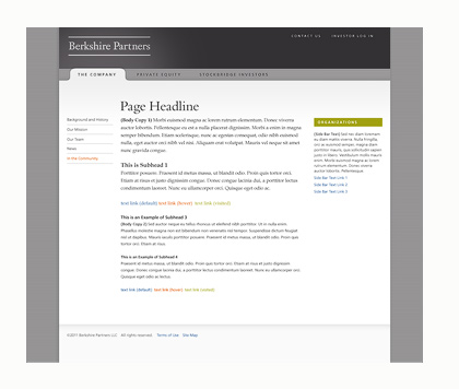
Your web designer has spent many hours creating an appropriate look for your site which includes carefully selected typography. At Newfangled, we use CSS (Casscading Style Sheets) to apply styles to the site, including the text. Page titles, paragraph titles, body copy, pull quotes and captions are all assigned a specific size, weight and color based on the approved designs. As you can see in the example below, this visual hierarchy of content works in harmony with the site’s look and feel (click image to see full size). CSS is also used to style some of the imagery of the site, adding a border or drop shadow to a photo where appropriate.

Because we give our clients as much control over their site’s content as possible, it’s important they use the custom text styles we build into the CMS for each site. These styles are created to make the content fit well within the design of the site. Importing styles by cutting and pasting from another site or word processing document, or creating custom font tags will cause the text to look disjointed and inconsistent— as you can see from this example.
Make sure the design elements you insert into your site compliment the look and feel
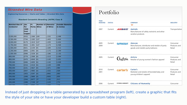
Including charts and graphs is a great way of visually reinforcing your written content. But again, be mindful of importing tables and other chart graphics that don’t fit your site’s look and feel or are just visually dull. You may want to ask your web developer to set up a table to match your site’s style; a worthwhile investment, especially if the data is going to live on your site for awhile. Keep in mind that every piece of content on your site speaks about who you are and affects how you appear to potential clients.