I’m not a fly. I’m just putting that out there. Not that there’d be anything wrong with it if I was. I mean, I’d be able to see across an almost complete 360 degrees! Sure, I’d have massive, grotesque, compound mirror-ball eyes, and sure, I’d probably get picked up by G-men and spend the rest of my days in a government lab, but I’d be able to focus on more than one thing at a time! Actually, I’d be the ideal web user. I could read an article while simultaneously reading all the other information on the page. I could divide my attention ten ways if I wanted. That’d be nice. But I’m not a fly, website designers, I’m a human! I only have two eyes, ok? I can only focus on one thing at a time. And you know what, I’m ok with that. I really am. I’m glad I can walk down the street without having to worry about scaring innocent children. So I just want to clear that up. I’m not a fly. I’m not even a “fly-person.” I’m just a person. So, here’s my question: Why are most web pages designed for fly-people?
Designers, seriously, let’s make today the last day we create pages for fly-people. Instead of continuing to create confused, unclear and unfocused pages—pages that include more information than is necessary and in a way that undercuts their core purpose—let’s adopt a new standard, following a very simple rubric: enabling attention. Most of the ways in which we go about getting attention ensure that we will fail at keeping it.
![]()
See, we’ve been adept at stealing the attention of viewers (ultimately from ourselves, mind you)—that eye-catching graphic, the moving advertisement, the blinking text, the many, many links to click—but we’re now learning that stolen attention never stays long. Lasting attention must be earned, and in order to earn attention, we must first respect it.
In designing for attention, there are two particular issues that we need to be concerned with: the “readability” of our pages, and the distance we expect web users to cross to reach information. Let’s get into it…
First, Let’s Consider Reading
Just about every other day, I hear (or, *gasp* read) something along the lines of, “nobody reads anymore.” Sadly, this has been said too often by intellectuals of high repute, much in the way of a cultural ice-breaker confession, the kind meant to lead the rest of us to similar “awakening” and, hopefully, communal reform. This sort of “I’m broken, I’ve accepted it, come with me” type of paen to the future is typically followed by pseudo-analysis of reading “data”—that more text is being read than ever before, the majority of which delivered in tiny bursts and read on tiny screens, that bits of scattered chatter are our contemporary form, and that skimming all else, once a necessary evil of time-strapped readers with good intentions, is now, like it or not, the new normal. I reject all of that, and so should you.
While time, in its scarcity, is certainly a considerable factor among others that handicap our reading, perhaps we should also consider that we might spend more of our time reading—yes, on screens, even—if quality written content were more accessible. I’m willing to accept that reading traditional books—made of paper—is, in 2010, irreversably on the wane (though analysis of past data seems to show otherwise), but that should not mean, necessarily, that reading long-form content is also passe. It remains to be seen whether the book will successfully complete a metamorphosis from bark to bytes, but between 140-character messages and A Tale of Two Cities are countless pieces of writing—some even intended for publication on the web—that may never really be read if we accept what the post-book digerati claim is our future. One way that we can improve the chance that long-form writing will survive is to ensure that we design page templates that enable readers to focus their attention for longer periods of time. (Time, of course, as I began this paragraph, is a commodity claimed to be in more demand than ever before, but I believe we make time for what we value. I remain optimistic that people still value reading yet need the support of designers who respect their attention.)
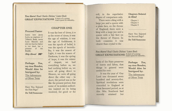
If book designs disrespected attention as much as websites do, they’d probably look like this.
For thousands of years, books have been printed—whether by hand on scrolls and codices, or by machine—with a clear focus on one thing: the story. Fiction and non-fiction alike are written to tell a story, and in book format there are no intentional distractions from cover to cover. So why, when we publish on the web, do we intentionally introduce distractions? Why do we fill our pages with more opportunites to move away from our stories when what readers really need is encouragement to stay? Just imagine, for a moment, what a reading a book designed like a website might be like: The narrative squeezed into a narrow column of text, surrounded and bullied by advertisements and suggestions of other things you might read instead. Sounds schizophrenic, doesn’t it? If you managed to finish a book like that, you would be unique indeed. So, if we’re doing most of our reading online today (let’s table the moral argument about that for now), no wonder we’ve lost our focus! It’s not simply because we’re fickle, or because our brains are being “re-wired,” but because we are doing everything possible to interrupt our own attention.
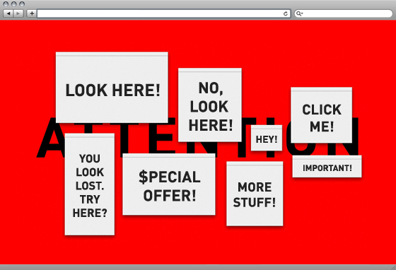
Readable and Unreadable Templates
An obvious web analogue to the story-focused example of books would be to publish only the story—with no advertisements, related-content, social media widgets or calls to action of any kind to tempt readers away from the point of the page. But I realize that in the economy of the web, this level of minimalism would be unlikely, and perhaps even defeat the purpose of the content strategy from which web articles emerge. Somewhere, though, between the overloaded templates that we’ve all grown used to and the austere page I just described, is something “just right.” So what would that look like? The content column itself would both be of an ideal width for reading while also having design priority on the page, two things, by the way, which can often be in conflict. Here are some examples to illustrate the spectrum from too much to perhaps too little:
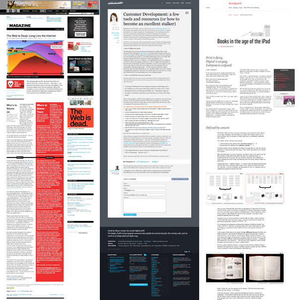
From left are articles from Wired, Made by Many, and Craig Mod.
I’ve truncated each article in the image above in order to show all the notable page elements without requiring the image itself to reach a length over 1000 pixels—which it would given the length of these examples. (You can view each one by clicking the links in the caption.) At this reduced size, however, the elements that distract are much more apparent. In fact, I’ve placed them in order, from left to right, of “respect for attention.”
The Wired article, shown on the left, is rife with distractions. When I open a page like this, my first thought tends to be, “what, exactly, do you want me to read here?” The header is crowded with navigation tools and advertisements. A third of the page is occupied with peripheral content—more advertisements, links to related content, etc. Even the main article content itself is divided in half, with two separate articles presented side by side. While I’ve learned to “tune out” the sidebar distractions, I found the division of the content column immensely distracting. Which was I meant to read first? Surely I’m not supposed to toggle back and forth, right? But that’s exactly what I found myself doing, despite my best intentions to read one then scroll back up to read the second. Finally, the red column does seem to shout, “I’m more important!” But is this really true? All in all, this page is a perfect example of design that distracts in such a powerful way that readers are unlikely to be able to focus their attention on the main content in any meaningful way.
In the center is a blog post from a UK firm, Made by Many. Unlike Wired, which is primarily a purveyor of content, Made by Many is not forced to crowd its page with advertisements. So, the absence of them alone makes the page more focused. But notice how the designers have devoted their entire content column to the article. All the peripheral content is placed at the bottom of the page. I find this to be a courtesy to the reader; out of respect for their attention, links to other content and calls to action have been placed in a location readers will see once they’ve finished reading.
Finally, I included the third article, written by designer Craig Mod, on the right to show the beauty of a fully-focused page. Other than one tiny advertisement on the top right, beneath the “chapter navigation,” Mod, a book designer who clearly puts a lot of thought into how to best craft content to be read on the web, takes full advantage of the entire page width to lay out the information in a way that is conducive to focused reading. From top to bottom, there are no other distractions to speak of. I do realize that a design like this may not be possible—nor a good idea—for all sites, but I think that including it gives us an example of focus to move toward, if not necessarily match.
What About Calls to Action?
We certainly don’t want to eliminate or hide the calls to action that are critical to our pages. In the examples above, the Wired article represents well a trend I’ve been observing of automating the inclusion of calls to action, which tends, first, to lead to the inclusion of too many of them, and second, the inclusion of calls to action that are not quite related to the content. This is probably not too much of a problem for a magazine, but for the marketing of a particular product or service, choosing the most appropriate call to action for a page’s content is important to ensuring that a reader will actually take action, rather than grow confused and abandon the page. So, being selective with calls to action is imperative. But what about giving some more thought to where calls to action are located?
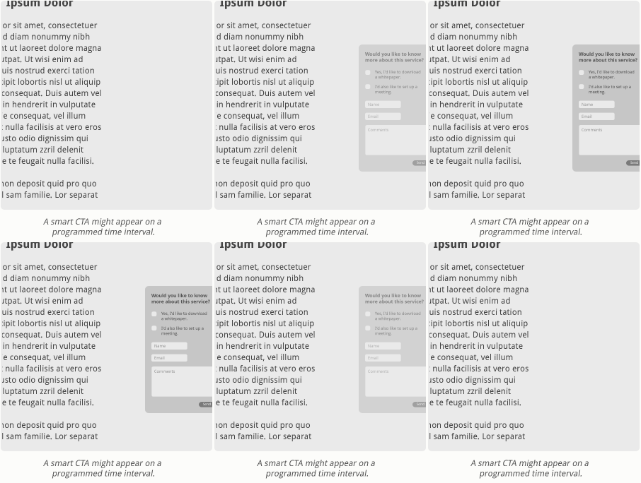
Made by Many (shown in the comparison above), in placing their links and calls to action beneath the article, follow the thinking that I attributed to the New York Times in an article on facilitating storytelling on the web, only the New York Times example actually appears, literally, only once you’ve reached the bottom of the page. It’s a nice touch. Either way, whether the content is permanently grounded or fades in, it makes sense to place it at the conclusion, where a reader is more likely to pursue the options you present without feeling rushed away from the content they were originally interested in. But what if we could make a call to action even smarter? What if we created them to appear on the page, in a way that didn’t force a redistribution of elements, after a certain interval of time? Sales chat tools have already taken this approach—they appear after a programmed period of time to offer assistance, but can easily be closed by the user. I think placing similar control over distracting content in the user’s hands would be a worthwhile experiment.
Distance to Content
Frankly, I find pagination of longer articles annoying. I think it forces the reader to cross an unnecessary distance to get to content, and it breaks the reader’s attention just when they’ve settled into “reading mode.” Now that we’re at the point of really questioning how to facilitate reader attention on the web, we must also question whether user interface conventions like pagination should be left behind. To do this, I’d like to use our own site—which does use pagination—as an example, so I hope you’ll indulge me in some self-directed criticism.
Let me first explain why we paginate and why my thinking has changed on pagination over the years. We built our site to allow our longer articles to be broken up into shorter pages for one reason: search engine optimization. We reasoned that the more opportunities we had to create unique page titles, the better we’d position our site in search engines. And actually, that has been very effective. We’ve been doing it for years and, as a result, do very well with organic search for terms directly related to both what we do and what we create content about. But at this point, our success with SEO, coupled with our ongoing committment to the creation of valuable content, affords us the ability to take a few liberties that, though they may in some ways compromise SEO, will be beneficial to our users.
If you are a regular reader, you may have noticed lately that I’ve been trying to keep these articles limited to two to three pages. The way our site is programmed, that’s the best I can do right now. If I put the entire content on one page, the “In this Article” functionality—located at the top right of the content column—won’t go away, which looks pretty odd if there is no “Page 2.” This is typical of website growing pains: We built the site with a certain expectation of how it would be used, but now that our expectations are shifting, we’re going to need to change the programming to accomodate them. We just haven’t decided exactly how to change it at this point, as there are a few viable options. The simplest would be to adapt the paginated navigation to work like anchor links—similar to how Craig Mod’s page (shown above) works. That would be my preference since I appreciate having the full article on one page and simply scrolling from top to bottom as I read, but would want to give readers the ability to hop around topically.
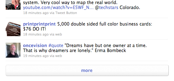
Truncating initially loaded page content works well for social media sites, but may not be the best
replacement for the pagination of longer written articles.
Another option, though, would be to make the initial page load truncated and place a “more” link at the base that, when clicked, expands the article. While this works very well for sites like Twitter and Facebook—which limit the initial load of distinct posts and give users the ability to load more—I’m not sold on this convention as a replacement for pagination of written, long-form content. Attempting to implement it would raise all kinds of functional questions, like whether the truncation is based upon a character or line limit, which might interrupt a word or thought, or whether it corresponds to unique content areas that force the writer to break up an article during the content entry process. In either approach, there would be pitfalls to readers and writers and have a significant shaping effect upon the content itself. For now, I think we’ll stick with keeping “Page 1” a place for the article’s preamble, and “Page 2” for the rest (any feedback from readers would be most welcome, by the way).
If you use pagination, particularly if you’ve been motivated by SEO to do so, I’d encourage you to give some thought to whether it remains the best solution. My sense is that reading on mobile devices will begin to solidify new conventions, in terms of user behavior and user interface design, which will replace many of the ways we handle content today, pagination included. If your content strategy leans as heavily on written content as ours does, now is the time to be thinking about issues like this in order to ensure that as conventions do change, your readers will stick with you.
Truly Respecting Attention
Everything I’ve presented here has been focused on the new rubric I opened this article by suggesting: Do the pages that we design enable attention ? If our pages aren’t designed to respect user attention—whether because the template renders much of the content illegible, or it’s overloaded with peripheral content, or calls to action distract the reader at the wrong time or place, or we ask readers to break their concentration to click on to a new page in order to continue—then we will ultimately fail to accomplish that which we’ve created the page itself to do.
