A few weeks ago, I spoke at the HOW Interactive Design Conference in Chicago. As a member of the Advisory Board, I’ve helped to shape the programming of this conference for the last three years. We’ve learned a ton, and I saw many of those learnings applied in this year’s event. It was definitely the strongest one yet — a great location, a great crowd, and fantastic content. One of the talks I gave was on usability testing, which I’d like to share with you below. As you’ll see in the agenda, a big portion of it involved doing live usability testing from stage. At some point, I think HOW will release video of this. In the meantime, I’ll provide a few big takeaways from a couple of the tests we ran.

Gamification, man. It’s getting me down! You know, someone actually said that to me the other day in a meeting, and they weren’t being sarcastic! Seriously, it was a bullet point under the heading, “THINGS WE NEED!” It was not cute. Good design used to mean finding ways to help people do things so that they could do those things and get on with their lives. Now, good design means finding ways to catch people in digital traps where they can waste their lives clicking things! Ugh.
So how are you guys doing?
Good. Well don’t worry, we don’t need to worry about gamification. In fact, the stuff I want to talk about is kind of the exact opposite of gamification. Good usability is all about removing the entropy and latency that exist when we either don’t think clearly about what we want people to do and how to make that easy, or when we are disingenuous about that and offer some sort of shiny thing that looks useful but is really just bait for some kind of sneaky other thing we really want. Since none of you are about that second thing, we’re free to talk about being helpful.
So I’ve got a pretty simple agenda.
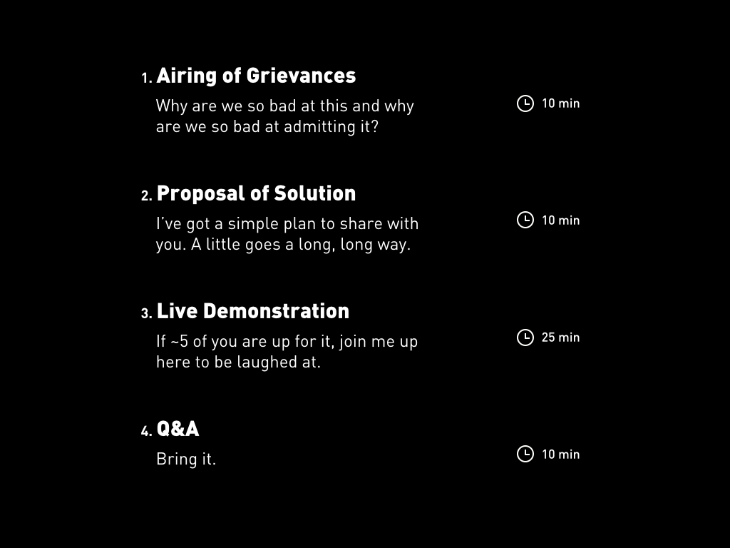
First, a brief airing of grievances. My main questions are, Why are we so bad at this, and why are we so bad at admitting it? I’ve at least got a possible answer. We’ll spend about ten minutes on this. Then, we’ll look at a possible solution in the form of usability testing. I’ve got a simple plan to share with you, which I want us to keep simple for a few reasons, one of which is that I fundamentally believe that a little goes a long, long way. We’ll spend another ten minutes on this. Next, we’ll have some fun. If around five of you are up for it, I’m going to pull you up here with me to do some live usability testing. We’ll see if this simple approach really works. That’ll take about 25 minutes, which will leave us with plenty of time — probably more than the ten minutes I planned for — to do some Q&A. So get ready to bring it!
Sound good? OK, let’s get into it.
A few weeks ago, I read a brief post from a guy I admire in the UK named Russell Davies. He was mostly recounting a lousy experience he’d had on Sony’s website, and critiquing their approach to web design. He ended with a quote that I thought was absolutely spot on, so I tweeted it immediately. He said:

My pals at Smashing Magazine ended up retweeting this, so it was seen by like a billion people quite quickly. A lot of good conversation was had. But here was a brief exchange that puzzled me.
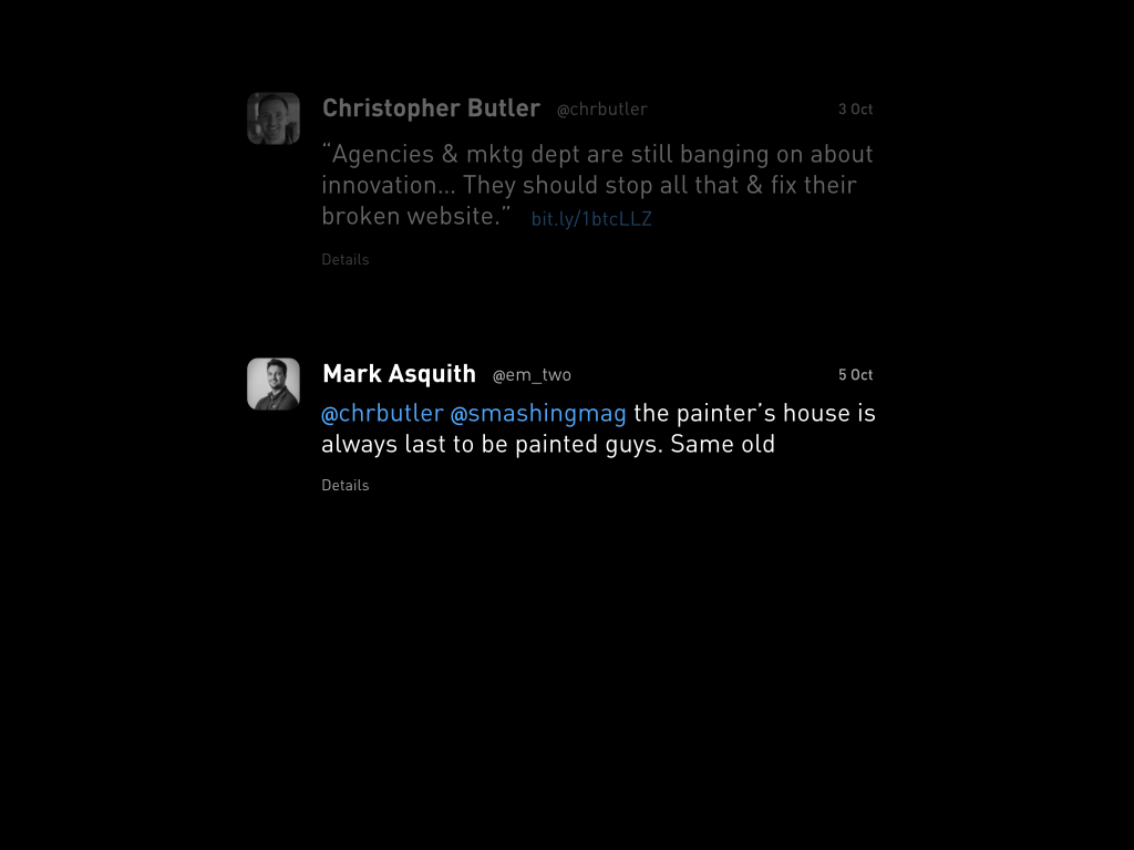
A man named Mark Asquith responded with this:
I thought about that for a moment, and replied:
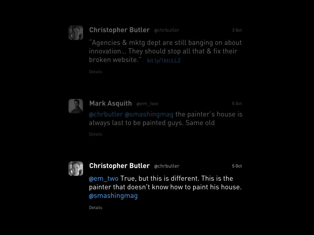
…which I think is right. But there’s a reason that the painter doesn’t know how to paint his house. It’s not simply a matter of time to do it. It’s also a matter of being able to see that it needs to be done. And obviously, Sony is not the only major brand out there lacking this insight.
So, why can’t Sony — and many others — see what Russell sees?
I think that has something to do with us. Usability isn’t a marketer’s concern, really. I mean, sure, marketing should certainly care about usability, but they should be handed usable material. By us!
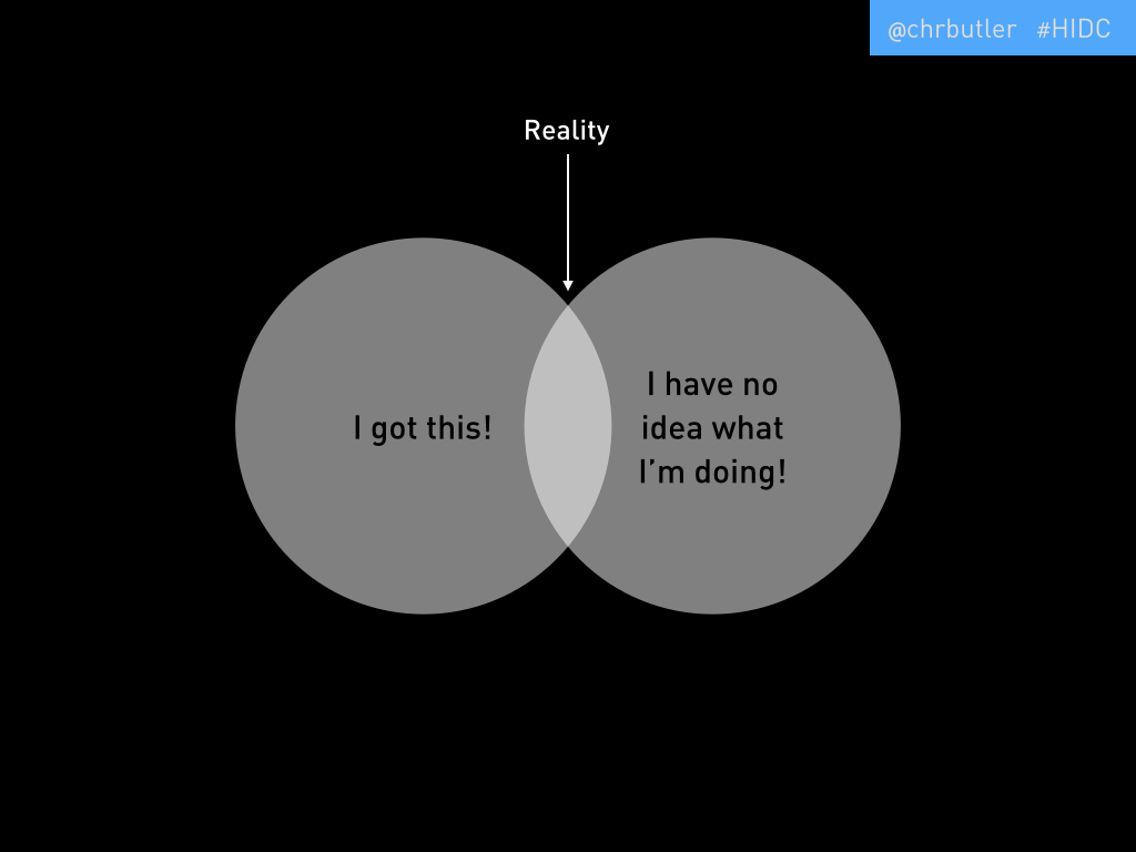
The biggest scandal in our industry is that reality for designers looks like this. We’re 50% unjustified confidence and 50% unjustified fear!
But the scandal isn’t the ratio, it’s that we pretend that this isn’t true! Our reality, of course, is someplace in the middle of these two extremes. Sometimes we’re confident — whether that’s justified or not — and sometimes we’re terrified.
Do you agree with this?
OK, well let me sanitize it for you and maybe a few more of you will raise your hands.
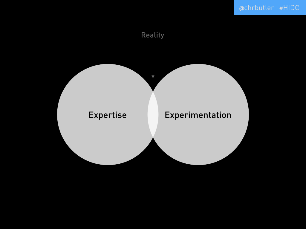
How about if I say that a designer’s working reality is 50% expertise and 50% experimentation? Yeah, see, you guys like that better. Me too.
One of my biggest complaints about our industry is that nobody really accepts experimentation. It’s true! Sure, experimenting is cool when it’s put like Google’s 20% thing — which, by the way, they’ve tossed out now — but when it comes to real, working, deliverable-based relationships, experimentation is practically anathema. Which, for any designer, is terribly annoying!
Why? Because there is a spectrum on which expertise and experimentation lie. If you imagine a graph illustrating this, you’d have that spectrum along your horizontal axis, and you’d have the severity of the problem you’re trying to solve along your vertical axis. As the severity of the problem increases, so does the necessity for experimentation. Simple!
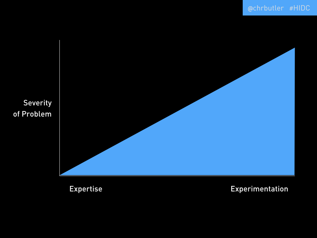
Law knows this. Science knows this. If you bring a small problem to any competent lawyer or doctor — like a small claim or the common cold — you’re going to get a pretty boxed solution, which is entirely appropriate. But once your problem gets significant, you’re probably going to start hearing more tentative responses, like “We can try this…” But marketers? Forget it. I have found that one of the best way to alienate a marketer is to say try. But we don’t have to settle for that. In fact, we shouldn’t.
Most of us in here are working with marketers, or — let’s be honest — are marketers ourselves. So our job is to reintegrate experimentation into the professional vocabulary.
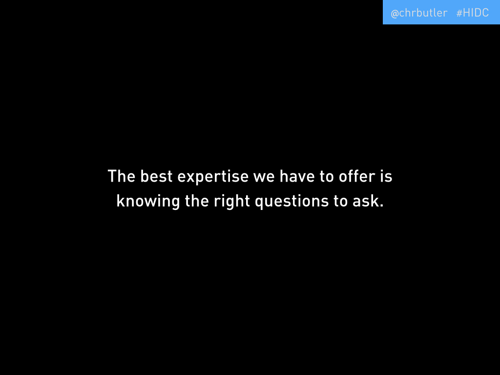
One of the best things we have to offer to account for our 50% I have no idea what I’m doing is within our 50% I got this, and that is knowing the right questions to ask.
And that’s what we’re going to work on today. That is why usability testing is so important. But not just as a discrete thing we might do sometimes, but as an integrated discipline. Usability testing should be as essential a tool to us as is Photoshop, or pencil and paper!
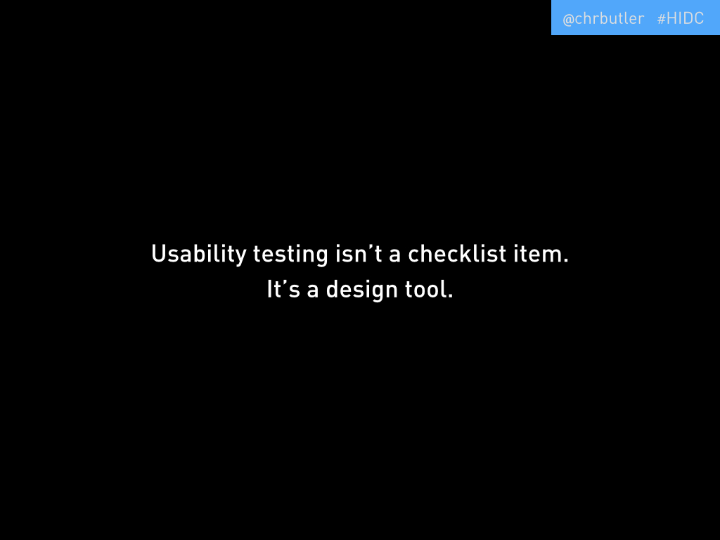
So we’re not going to just start doing usability testing. We’re going to start making testing part of our lives.
The more complicated you make it, the less likely you are to do it.
I’m advocating for a simple process here. Many people hear “usability testing” and think labs with technicians and expensive equipment. And, sure, it could be that. But it doesn’t need to be. In fact, what tends to happen when you think of usability testing on those terms is that it doesn’t end up being done at all. It’s too time consuming, and too expensive. So we need a simpler, faster way.
So how’s this for simple and fast? What you’ll need are:
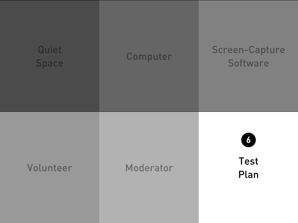
- A quiet space: Nothing fancy, just a quiet room where you and your testing volunteers can focus without being distracted by noise and movement.
- A computer: Again, nothing fancy. What you have right now will probably do the trick. As long as it can run some screen-recording software and has a built in webcam and microphone, you’re in business.
- Screen-capture software: Basically, you need something that will record what’s happening on your screen, the audio from your computer’s microphone, and what is coming through its webcam. There are many tools out there that do this inexpensively. I’d recommend Camtasia — that’s what we use — which you can download very quickly and run a free 30-day trial. Do you know how much testing you could do in 30 days? A lot!
- A volunteer: This is the important part. You need to recruit volunteers. For the most part, they don’t need any specific qualifications other than basic web literacy. They need to know how to use a computer and the web. Now, there are some instances in which further qualifications might make sense. For instance, if you are testing a site meant for a very specific industry audience — say one that makes heavy use of industry jargon that the average person would not understand — then it’s a good idea to recruit people that would fit within the persona for whom the site is intended. But otherwise, we’re going to be running pretty directed tests, so deep knowledge of the industry shouldn’t be absolutely necessary.
- A moderator: That’s you. You’re there to provide the technology, and the context, and the procedure. But most importantly, you’re there to observe and to question. You want to ask clarifying questions, but not leading ones. More like, “it looks like you’re having trouble, could you tell me what you’re thinking right now?” not, “Why didn’t you click the red button?”
- A test plan: This is the most important element. As I mentioned, we’re closely directing this experience. What we’re not doing is sitting a volunteer down and watching them surf the web. This is testing, not voyeurism! So we want to craft test plans that specifically address the strategic objectives of the site, not usability hangups we might imagine exist. The test should be made up of several simple tasks in the course of which are likely to reveal usability problems. But our focus needs to be on whether the user can do the things we’ve built the website to offer. So, a marketing site’s test plan is likely to be composed of tasks like finding information, registering for events, or subscribing to content channels. An commerce site’s plan, of course, is likely to have tasks like adding things to your cart and checking out. Pretty straightforward.
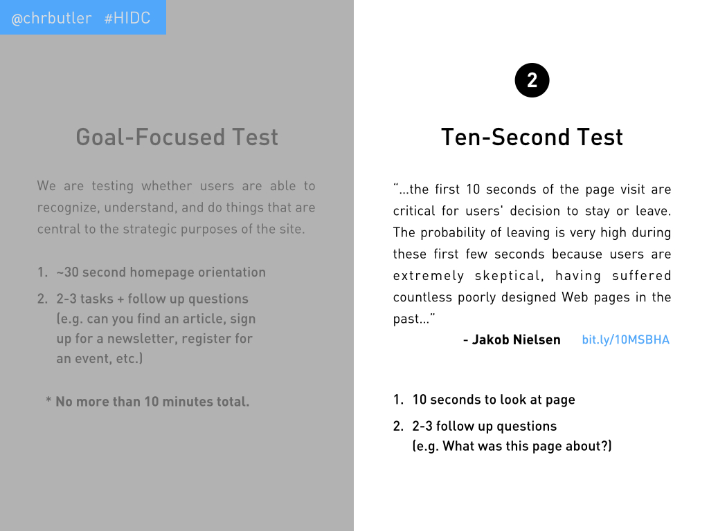
We’re going to look at two types of testing today.
The first is called goal-focused testing. The idea here is as I’ve described already: to test whether users are able to recognize, understand, and do things that are central to the strategic purposes of the site. This breaks down into this simple method, which shouldn’t exceed 10 minutes. Beyond that, fatigue sets in pretty quickly and will compromise the value you’re hoping to get from the test.
- Homepage Orientation: You want to give your volunteer 30 seconds to 1 minute to scan and review the homepage. You’ll want to ask them to outward process — verbally — what they’re seeing and thinking as they do this, but to avoid clicking any links that would take them away from the homepage. After that time has passed, you’ll ask them one simple question: “What is this website about?”
- Two to three tasks and follow-up questions (e.g. find this article; sign up for the newsletter; register for the next webinar; etc.).
The other type of test we’re going to try out is called Ten-second Testing. This comes from a study by Jakob Nielsen on page abandonment in which he concluded:
“…the first 10 seconds of the page visit are critical for users’ decision to stay or leave. The probability of leaving is very high during these first few seconds because users are extremely skeptical, having suffered countless poorly designed web pages in the past…”
So the idea is to give our volunteers 10 seconds to view a page and test what their initial impressions are. Obviously, that’s a pretty simple procedure. You open the page, give them ten seconds, ask them to close it, then ask a few questions, like:
- What was this page about?
- Did anything in particular — words, images, colors, shapes — stand out to you?
- Was your general impression positive or negative? Why?
- Would you continue reading this page?
- If you had to find this page again using a search tool, what would you search for?
These questions should draw out the user’s impression without leading them. We do want to try and avoid biases, as much as possible. On that note…
We’re all biased. This process is biased. In fact, all usability testing is biased because it tries to synthesize the experience of a user — it’s amazing how difficult it is to reproduce something as banal as using a webpage in a way that helps us make that experience better! So, we’re not going to avoid biases entirely. But it does help to understand some of the core biases:
- The Hawethorne Effect: This is simply the effect that awareness of being observed has on a volunteer’s actions. Usability testing is meant to approximate the experience of using a website, but because we’ve invited someone in to help us do that, they already know that what they’re doing is synthetic. So while they might do their best to embody the role of a typical user, the problem is just that: they’ll do their best! Everything you ask them to do will probably be done better and with more patience and effort than we could ever expect of a typical user.
- Task Selection Bias: This one’s easy. If you asked them about it, it must be important! Again, what you’ll observe is that the volunteer will try very hard to complete a task — much harder than anyone normally would. So we know that the tasks we’re asking our volunteers to complete are essential to the site. They know this too, and their efforts will scale accordingly.
- Confirmation bias: Basically, without a procedure like the one I’ve sketched out for you, we’ll be inclined to test what you already think is broken. But this, of course, is a blind spot. It’s often the unknowns that are more critical. In the course of your tasks, pay attention to things that come up that you didn’t expect, like bugs!
Live Tests
We spent the next 25 minutes or so running five live tests. I wanted to point out two quick examples from those tests.

1. The Museum of Natural History — exhibit page
I included this page in a ten-second test. After the volunteer closed the page, I asked, “what was this page about?” She didn’t know. She remembered a few details, like the color brown, the word “mud,” and that there were pictures of foreign places. She speculated that this was a page talking about travel. I asked the audience for their impressions, and most were the same. As it turns out, this is a page describing an exhibit at the museum (see the breadcrumb nav that is barely legible at the top). Nowhere else on the page is the word “exhibit” used, nor are other critical pieces of information provided that would be relevant to an exhibit, like location, dates, times, etc. All around, this is an abject failure of design.
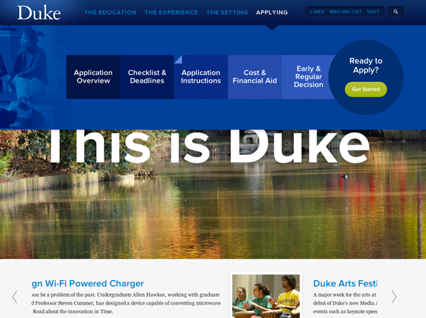
2. Duke University — Admissions page
I used this page for a bit of a hybrid version of the 10 second test. I gave the volunteer ten seconds to browse the page, then I asked her this question: “If you were an applicant, where would you go to find out when you need to submit your application?” The volunteer scanned the page and eventually clicked “Applying” in the main navigation menu. That opened a “super-menu,” from which she clicked “Application Instructions.” Incidentally, that page did not have dates included on it, but did have a small text link in the first paragraph to the “checklist and deadlines” page. I ended the test there. The main question I had about this page had to do with the usability of the super-menu. When you first click a main-nav item, the super-menu opens, which you must then scan from left to right. That typically is a tough adjustment to make quickly (going from top-down scanning to left-right scanning), so I wasn’t surprised that the volunteer clicked an item closer to the main nav button, rather than the correct option. Keep in mind, I’d asked about when, so the “Deadlines” option would have been a better choice. Additionally, the super-menu changes to rollover action once you’ve engaged it, so it becomes pretty fragile. If you mouse left from “Applying” to try and reach the first item in its menu (“Application Overview”), for instance, it’s likely that you’ll mouse-over another main nav item in the process, which will change what is displayed in the super-menu. I’ve run a few other tests of this page and every volunteer struggled with this, even going so far as to click an item in a super-menu without realizing that it had changed after they’d accidentally moused-over another main nav item. Not great.
Generally, I think people had fun with the live testing. It was a bit chaotic, but so is usability testing 😉
How Do I Convince My Boss?
I wrapped up by anticipating a common question: “How do I convince my boss?” My answer to that question is, don’t bother! If you have to do a ton of work to convince your boss that usability testing is a worthwhile use of your time, there are bigger problems at play that need to be sorted out. But regardless, I think showing what testing looks like and reveals is a far better argument for its value, so I’d suggest just going ahead and doing it. Download the free trial. Run some tests. Extract some key takeaways. Then show your boss the videos and explain what they reveal. I guarantee that she’ll be impressed and want more. But go to her office and ask her if you can do some usability testing, and you’re likely to get a lot of hemming and hawing about cost and time. Just do it!
