If you are reading this, then you are likely already convinced that sharing your expertise in the form of unique, indexable content should be a core component of your digital marketing strategy. You probably have a robust content profile — or a plan to build one — that includes blogs, white papers, and webinars, and maybe even podcasts and books. But, your “content profile” actually includes more than that. It also includes all the other content your website contains, especially the material I tend to refer to as “positioning content.”
Positioning content is the material on your website that describes what you actually do. Not what you do in the abstract — blogs, white papers, and webinars excel at that already — but what you do for money.
By the way, whenever I say that phrase — “for money” — in a conference talk or a meeting, it’s almost always met with laughter. But, it’s a kind of nervous laughter. We’ve grown comfortable with the idea of marketing our services with educational, expertise-driven content, but somehow along the way, we’ve become squeamish about talking about what we actually do. Hey folks, we call it content marketing because it helps us make money! If we’re interested in content that doesn’t make money, well then we’d just call it journalism. Ouch.
But back to the point. Positioning content is found on a website’s home page and other key pages that actually describe what the business does. That content needs to be arranged in a very particular way in order to best guide a visitor through a deliberate orientation process — of going from unawareness to a clear understanding of what your firm does and how it can help them. That isn’t done in one sentence or carousel, nor is it done in five blog posts. It’s done through what I call a purposeful user flow.
Purposeful User Flows
A purposeful user flow is an intentional, directed flow of information and choices designed into your website’s most important positioning content that does not rely upon a visitor exploring and using a navigation menu.

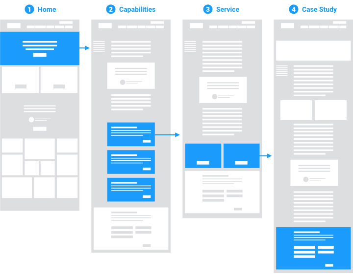
An ideal purposeful flow pattern begins at Home, directs visitors to a page focused on positioning, then to focused services pages, then case studies, and finally, to a CTA.
This method works for three reasons.
1. A purposeful user flow works by capturing first-time, uneducated visitors and deliberately guiding them through a widening funnel
Your goal is to make the best use of a visitor’s attention, which is a very limited resource. User study data show that a first-time visitor interprets the purpose of a web page and decides whether to continue to read or interact with it within ten seconds of arrival. Just ten seconds. So, it might be wise to think about that as the maximum amount of time you have to capture a visitor’s attention. If you only have ten seconds with a prospect, what would you want them to know? What would you want them to do? Those things should take high priority when you design a home page.
This is why I always recommend that an agency’s positioning be the most important information on their website’s home page, and that its priority should be abundantly clear to a first-time visitor. It should be simply and concisely articulated, and should be accompanied by a prominent and clear call to action to go deeper into the site and learn more.
By quickly and efficiently redirecting first-time visitors from a positioning-focused message on the home page to a sub-page dedicated to your agency’s capabilities, you can begin to properly orient that visitor, guiding them toward a greater understanding of your business and through a process of prospect qualification.
That process should follow a structured logic that maps directly to your website’s content.
An agency’s positioning is the most important information on its home page.
Step 1: Learning more about your firm’s capabilities
From a capabilities landing page, where they can read a more detailed explanation of your business — what you do, who you serve, why you do it — they should be guided toward one of two next steps: Either digging deeper into a discrete service, or contacting your firm to discuss working together. In many cases, a visitor won’t be ready to take such a late-stage action, but in the event that they are, you will want to make that easy to do.
Step 2: Learning more about how you work
A service landing page describes a discrete service: something you do reliably, predictably, and routinely. This may be one step in a necessary series of services that comprise your ideal client engagement, or it may be a service you offer among others on its own. Either way, a service landing page should explain a service’s purpose or goals, the process it follows, and its outcomes.
What a discrete service is not, by the way, is a particular deliverable. When I envision the list of these services on the preceding page in this purposeful flow (Capabilities, or What We Do), I have in mind 3-5 types of engagements, or 3-5 parts of a larger engagement, not a Cheesecake Factory menu of things a client can buy. Your days as a generalist, transactional, factory of side-dishes are over, remember?
From a services landing page, a visitor should be guided toward one of two next steps: Either digging deeper into a case study related directly to that service — a specific outcome — or again, contacting your firm to discuss working together.
Step 3: Learning more about the impact of your work
Your core services need to be explained by and rooted in their own landing pages, but, their value proposition needs to be proven by another piece of content. A case study (or a Success Story, the name is up to you) exists to frame the problem your service solves, describe the form the solution takes, and prove its worth by documenting the results.
The results can come in two forms. First and foremost, a data-based accounting of what came of your work. How did you move the needle? In the interests of provocation, think of this as the opposite of a grammar school arithmetic assignment: showing the outcome is, in the end, more important than showing your work. Several years ago, I wrote a persuasive piece arguing for more exhaustive case studies. And I stand by it today. Most of us in the professional services help our clients in unique and important ways, and it’s critical that a client understand how we work before they decide to work with us. However, most interested, potential future clients don’t have all the time in the world to read 4,000-word project journals. So, not every case study can be like that. Furthermore, I’m more and more convinced that a case study that prefers an accounting of outcome — one that shows, with facts and figures — what our work produced for our clients will always sell our services better than the most elegant, thoughtful, and careful description of process. Why? Because people don’t buy processes, they buy promises. They don’t buy maps, they buy destinations. So, if I were to rewrite my How-To on case studies, I’d argue for following the Problem, Solution, Outcome formula, and where possible, prioritizing the outcomes over all else. If you write them (like that), they will come.
The second form is the social proof that a good testimonial provides. So, be exhaustive in your own accounting, but, let the client have the last word. A happy, satisfied, client will always be a better salesperson than you.
And again, from a piece of content like this, a visitor should be guided toward one of two next steps: Contacting your firm to discuss working together — remember, a visitor who has followed our flow so far will have learned about the business at a high level, understood your services, and now read what your promises deliver — or, if they have landed on your site for the first time through this page, exploring the services you leveraged to make these results happen. Related content on a case study should always prefer services over other case studies. You want to avoid getting a prospect caught in a content cul de sac and ensure that they clearly understand the relationship between success stories and the services that create them.
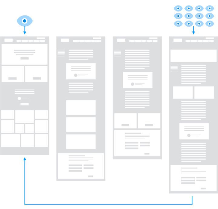
On that note, the prospect who enters at the end of our purposeful flow represents the second reason why the purposeful user flow method works.

2. A purposeful user flow works by capturing interested researchers who follow a predictable, bottom-up pattern.
The user data continue to show that visitors who enter a website on a lower-level page — like a blog post, a white paper, a webinar, or a case study — follow a predictable pattern. I call it the “orientation pattern.” Simply put, when a visitor lands on a website for the first time because they were directed there by a search engine query or a social media referral, they will scan the content of the page, decide whether it is relevant to them, then either read it or leave. If they stay to read it, they might follow links to related content or perhaps even subscribe to a content subscription, but eventually, they will ask, who is responsible for this content? At that point, the data show that they almost always return home to pursue the answer.
At that point, your purposeful user flow — which captures their attention and directs it through a step-by-step flow toward better understanding your firm — can kick in.
This flow prevents that new, previously unaware prospect from losing focus, abandoning the site, or being caught in a content cul de sac, and most importantly, helps graduate interested researchers into informed evaluators and ready buyers.
3. A purposeful user flow works by providing opportunities to accelerate the path to contact by including a voluntary call to action at every point.
This last point is the most simple. Each step of this flow should have clear calls to action that are directly related to the purpose of content (and a particular stage of the buying cycle) around them and arranged with unmistakable priority.
Each page I’ve mentioned in this flow, whether it be a capabilities landing page, a service landing page, or a case study, exists to market your firm at the evaluator or buyer level. So, the priority is directing a prospect’s attention toward engaging directly with you. While a researcher-focused call to action, like a subscribe form, is appropriate to prioritize on a blog post or Insights landing page, it isn’t on a Service page or a case study. You want to prioritize the buyer and make it easy for them to get in touch and set up a meeting with you.
A secondary option is to direct them toward the content most appropriate to them at this stage.
Digging Deeper
A purposeful user flow is more than just a particular arrangement of pages and calls to action. It also requires a specific approach to the design of the four key page templates I’ve mentioned here.
I’ll be covering best practices for each template — home pages, capabilities landing pages, service landing pages, and case studies — in several upcoming posts. If you’re ready, you can read the next article in this series here: The Four Things the Best Agency Home Pages Do.
