Ten seconds. That’s how long you have to get their attention.
They’ve got plenty of other options, you know. Millions of them.
Seriously, ten seconds at most. After all, ten seconds can be a long time.
Just so we’re all clear on how long this really is, here’s ten seconds:
and here’s ten seconds:
Does the second clip feel longer to you? The first clip has an order to it. In fact, you probably recognized the song after just a couple of seconds. And even if you didn’t, its rhythmic structure was clear right away, which gave you a sense for where it was going. But in the second clip, there was no structure—no sense for what was happening or what might happen. You’re just left hanging, which, even for just ten seconds, can feel like a long time.
Or maybe you prefer ambient drone sounds over 80’s new wave, in which case you’re probably thinking, “this dude’s so wrong.”
The point is that even though ten seconds sounds like a insignificant amount of time, it’s more than enough to grab a visitor’s attention, or—if they’re impatient, already bored, especially skeptical or just plain confused—lose it completely.
Overcoming User Skepticism
Usability expert Jakob Nielsen recently wrote an article in response to the question, “How Long Do Users Stay on Web Pages?” He had this to say:
“…the first 10 seconds of the page visit are critical for users’ decision to stay or leave. The probability of leaving is very high during these first few seconds because users are extremely skeptical, having suffered countless poorly designed Web pages in the past. People know that most Web pages are useless, and they behave accordingly to avoid wasting more time than absolutely necessary on bad pages.”
So let’s explore skepticism for a moment by doing a little mad-libbing:
Imagine you search for ________. On the search results page, you click on a link that reads ________. That takes you to a webpage titled ________. Within only a few seconds, you think, “Oh, this isn’t what I wanted. I thought this page was going to be about ________ but it looks like it’s about ________.”
Sound familiar?
Naturally, you’d leave a page that seemed like it wasn’t going to give you the information you were looking for pretty quickly, and head back to Google to search again. When you’re looking for answers, it’s good to be skeptical. But what if your first impression isn’t accurate? What if the page you just left did have what you needed, but just didn’t make that clear to you quickly enough?
A webpage can’t be everything to everyone, but that’s hardly ever really the problem. In most cases, users are looking for clarity more than comprehensiveness. If a webpage’s purpose—what it’s offering and what it’s asking for—is not immediately clear, a user won’t give it the time of day, no matter how well-written its content. So, it often comes down to issues of design that determine a webpage’s effectiveness, and whether it’s able to disarm a user’s skepticism.
In this article, I’d like to take a closer look at how design can support or obstruct content. I’m going to visually examine several examples as well as put them through a user-testing session fashioned after Nielsen’s 10-second quote—what I’m going to call ten second tests.
We all judge on appearances. When we do it to other people, it betrays our prejudices—most of them sub-conscious—and often causes us to miss out on meeting people with whom we could possibly have a great relationship.
The same thing is true with information. We judge information sources just as quickly, and just as harshly, as we do other people. Our sub-conscious kicks in and, in the blink of an eye, assesses what we are looking at on a number of levels—its perceived clarity, trustworthiness, detail, etc. The trouble is that we’re not as good at discerning this stuff as we think we are. An attractive, well-organized webpage might contain useless or even incorrect information, whereas one that is poorly designed might contain gold. But if there’s the slightest doubt cast upon information within those first seconds, we’re not going to give it the time of day, no matter how reliable it might be.
This means that the way we design content needs to anticipate how it might fail to pass a user’s first, brief judgement: Is it hot, or not?
Hot vs. Not
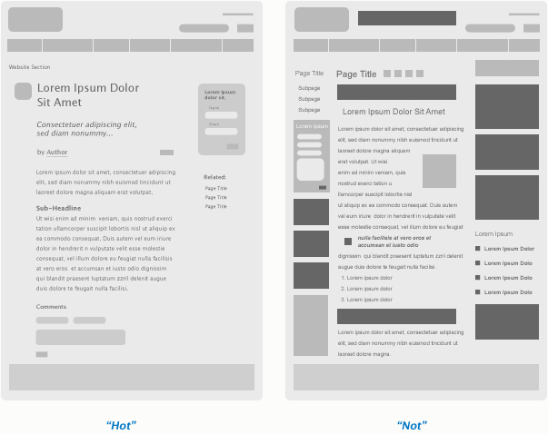
Let’s compare two common approaches to the design of content-focused webpages:

On the right is a simplified version of what is (sadly) a typical article detail page. In fact, other than the simplified header and footer (which both examples share), this is an almost exact “trace” of a real webpage—I won’t name names.
While it’s rife with problems, let me highlight a couple in particular:
- Advertising: If you hadn’t already guessed this, the dark rectangles represent advertisements. What’s immediately made clear by highlighting them in this way is that the page’s main content takes a backseat to advertising. There are 15 unique advertisements on this page, which is not an uncommon number for a mass-media website. But because this is so common, it becomes the way most people think a professional webpage should look. But what is the purpose of a webpage like this? Is it to communicate information, or to sell advertising? Right. It’s to sell advertising. Is that the point of your webpage? No. So why would you want to interrupt yourself and prioritize someone else’s content?
- Noise: Besides the advertising, this page’s design is not setting any reader up for success. Again, we know that the priority of this page isn’t the message in the content; the content is bait that is switched for ads once the site has a user on the hook. But let’s say that the publisher of this page was interested in it being read. The first thing to do would be to order the information intentionally and hierarchically. That would give the user the ability to ease into reading it. Unfortunately, this is not happening.
On the left is an greatly improved version that prioritizes the user’s ability to read the page, which again, I assume is its purpose. Here’s what’s working:
- Typography: Don’t get too hung up on the typeface. What we are more interested in here is the hierarchy within the page’s text. The page title is the largest text style on the page. From there, the other styles are distributed in a prioritized way—from sub-title, to author credit, to headings, to the body text. It’s very easy to scan, which gives users the chance to quickly verify whether the content is relevant to them. This is one of the things that happens in a user’s first 10 seconds on the page.
- Intentions: This page is clear about what it’s offering: content. It’s also clear about what it wants: user engagement. A user can either share the content, comment on it, or respond to a call to action. To do this right, you need to ask yourself what action you want a user who has read your content to take. The call to action is prioritized and isolated, and as has been heavily discussed in other articles on our website, clear, concise, and compelling.
How a Good Design Works
Looking at the two simplified examples provides a great rubric for how design should serve content. Here, in order of importance, are the four most important aspects of a webpage’s design:
- Purpose: Is the page’s title the most important text on the page? Does it clearly explain the purpose of the content? If it takes a more editorial slant—which is definitely ok—is there a subtitle or heading that clarifies it?
- Clarity: Is it immediately clear what is primary content (e.g. the article, video, etc. that the page contains) and what is secondary (e.g. related content, promotions, etc.)? Is the main content column designed to be easy for a user to scan as well as have a deeper, more focused reading experience? The content area is sacred. Don’t interrupt yourself, even to promote your own content from elsewhere on the site (this will come up in a usability test later).
- Action: Identify and prioritize the actions you want a qualified user—one who has read the page’s content—to take. The most important action should be easily identifiable and follow the conventional geography—users expect CTAs to be on the right side of the page, and are likely to miss or misinterpret them if they are located somewhere else. Too many CTAs is an indicator of a lack of intention and stability.
- Social: Is it easy for a reader to help you spread the word by sharing the page’s content on the networks you care about? Be selective. Again, overloading a page with social media icons shows a lack of intentionality.
With this rubric in mind, I’d like to share two examples. Both are from websites we’ve launched recently with agency partners. Also, both are actually much longer pages, but I’ve truncated them here in order to show the full page template of each:
Example 1: ReCourses.com
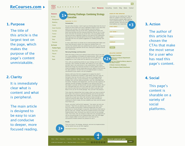
ReCourses.com is the website for David Baker’s agency consultancy. It was designed by the talented team at Milkshake.

Using the same four-point rubric, here’s a rundown of what’s working on David’s article:
- Purpose: The title of this article, Positioning Challenge: Combining Strategy & Execution, is the largest text on the page, making it clear that it is the title and the most important idea to understand right away. David is saying that he’s going to discuss three easily identifiable and important concepts: positioning, strategy, and execution.
- Clarity: Because the design of the site keeps peripheral content to a minimum—really, the only additions to this page are the call to action and “related content” widget—it’s extremely clear to a user what is the primary content of the page. David has formatted it in a way that makes it easy to scan, and the content column is optimized—by it’s width and text size—for long-term, focused reading.
- Action: David has chosen two calls to action for this article. On the top right of the page, he has included a simple form to subscribe to his content. At the bottom of the page, he has included a link to download the article in PDF format.
- Social: Smart social links in the page’s footer make it easy to share this particular page on all the networks that David cares about.
You can view David’s original article, Positioning Challenge: Combining Strategy & Execution, here.
Example 2: CallahanCreek.com
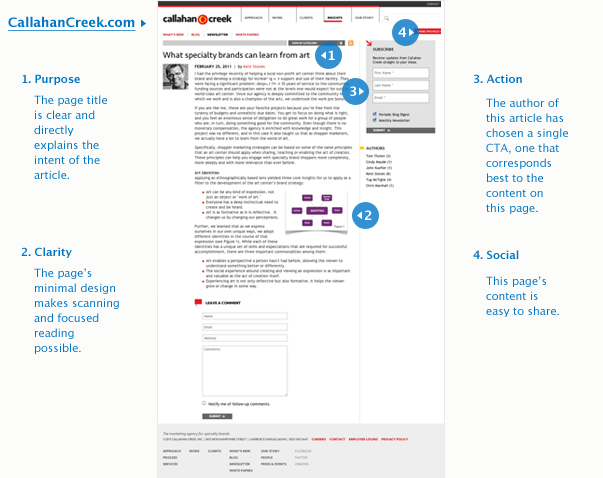
Callahan Creek is a Kansas-based agency focused on working with specialty brands. They provided their own design. The screenshot I’m showing is from an article by Kent Stones.

Here’s a rundown of what’s working on Kent’s article:
- Purpose: The title of this article, What Specialty Brands Can Learn From Art, is the largest text on the page, making it clear that it is the title and the most important idea to understand right away.
- Clarity: This webpage also has a pretty minimal design. Other than the content column, there is only one call to action and no other widgets serving up peripheral content. This makes it clear what the user should read. Kent has formatted his article with headings and lists that make it easy to scan for an overview.
- Action: Kent has selected one call to action for this article—a content subscription form—which is located at the top right of the page.
- Social: At the top right of the page, there is an expandable tool that gives the user the ability to share this article on Facebook, Twitter, LinkedIn or via email.
You can view Kent’s original article, What Specialty Brands Can Learn From Art, here.
Now let’s take this evaluation approach and make a reproducible test out of it.
How to Do Ten-Second Webpage Testing
There are, of course, many methods for evaluating a webpage’s design. What I’m about to describe is just one of them, and is by no means the most scientific process you could follow or the only form of usability testing you should do. A ten-second test is essentially a shortened version of our approach to simple website usability testing for individual webpages. Here’s the basic process:
- Set up a computer with a webcam and screen-capture software.
- Choose a single webpage to test and open it in your browser. Expand the browser to fill the screen so there are no distractions for your volunteer.
- Instruct your volunteer that they will have 10 seconds to view a webpage. They may scroll the page up and down but may not click any links.
- When your volunteer is ready, begin recording.
- After ten seconds have passed, instruct your volunteer to stope and minimize the browser window.
While still recording, ask the volunteer the following questions:
- Based upon your short scan, what was the page about?
- Would you continue reading this page? Why or why not?
- What stood out to you most from the page?
- What would you search for in order to find this page?
Example Ten-Second Tests
I recorded eight ten-second test sessions and have included four of them as examples in this article. Each video below includes two sessions testing two different content-focused webpages. I’ve included the instructions in an introduction at the start of each one except the third where I edited them out due to sound interference.
Observations:
- In the first test, Lisa remembered the website name, ReCourses, but did not remember the words of article title. She mentioned the colors as an attribute that stood out to her.
- In the second test, Lisa remembered the domain name, the exact title of the article, as well as other keywords. She specified the clean design and title/subtitle distinctions as things that stood out.
Observations:
- In the first test, Chris was not able to remember any words from the page he viewed. He noticed a subscribe call to action, as well as general page structure attributes.
- In the second test, Chris also did remember specific words from the page. He also noted the page’s design.
Observations:
- In the first test, Lindsey was very disoriented by the page’s design. She was able to recall specific terms from the page, but had difficulty discerning what was content and what was not. One way this could be improved would be by not including advertisements within the content area.
- In the second test, Lindsey was able to recall the exact title as well as other key terms from the article. She noted that the page’s design and responded to it positively.
Observations:
- In the first test, Chris was able to recall the domain and the general subject of the page’s content. He noted that the blog’s banner image—Threat Level—stood out and distracted him from scanning the rest of the page.
- In the second test, Chris recalled the title incorrectly.
General Testing Observations
This kind of testing is obviously not a scientific method. One issue that became clear after doing many testing sessions is that each volunteer’s recall improved after their first test. The effect was relatively minor—there were some volunteers who were not able to recall exact words in any of their sessions—but it’s still something to consider when evaluating the volunteer’s feedback. Also, the webpages I selected for the volunteers were somewhat arbitrary. Aside from including the two client sites I evaluated earlier in this article, I randomly chose other pages that were content-focused. Out of the eight sessions I recorded, only two did not include the two client websites I evaluated above; I left these out because those volunteers were already familiar with each website. Ideally, the entire volunteer pool would evaluate the same pages so that a wider breadth of data could be collected. In this case, I was more interested in demonstrating how the testing sessions would work and what kinds of issues would arise from them.
Interestingly, Craig Mod’s article, Books in the Age of the iPad, repeatedly demonstrated the advantages of its design. It’s title was large enough to demand attention from each volunteer and was easily recalled later by just about every volunteer. In addition, each one commented on the design of the page, both how aesthetically pleasing it is as well as how intentional it felt—one volunteer describe the design as “important.”
Though Craig’s webpage didn’t have some of the same considerations that the two examples I evaluated earlier had—namely, the focus on generating leads through calls to action—the consistency with which volunteers were able to recall important information and details after their ten-second tests demonstrates the ways in which design plays a major role in user engagement with content.
