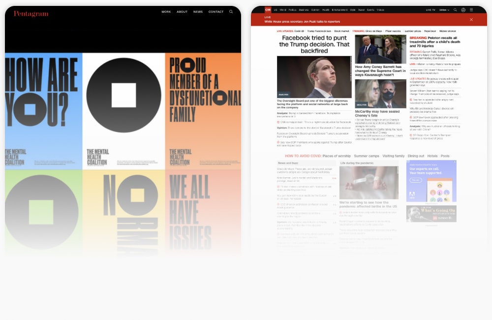
There are two websites pictured below.
It’s likely that you know them both quite well. One is a place where millions of people keep up with the news; the other is a place where a tiny portion of those people keep up with the goings-on of a very accomplished design firm. Other than the possible overlap in audience, these two website surely have little else in common…right?
Well, perhaps not.

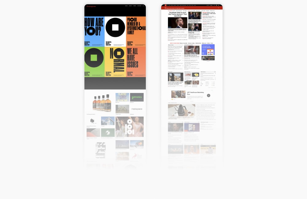
Ordinarily, to fully understand how these two websites work, I might say that we need to take a closer look. This time, I think we need to do the opposite. Once we zoom out on them, some critical similarities will come into clearer view.
But before we take that step back, let’s discuss why we’re doing it, and why you should stick with me.
How to Look (More Carefully) at Other Websites
Most expert firms — whether they are also experts in interaction design or not — tend to make a common mistake when it comes to designing their own websites: They look at the wrong examples. More importantly, they also draw the wrong conclusions about what guidance they should derive from them.
I chose the two websites above not just because they represent the kinds of design choices and patterns that are most commonly emulated, but because the connection between how they are designed and how they work is commonly misunderstood. As promised, that connection will become clear once we get some distance and look again. What you’ll get from doing that is not just a better understanding of outcome-oriented design, but a renewed clarity about how to apply that understanding to your own design choices.
Zooming Out Makes the Website Structure Clearer
Though no one can actually use a website when viewing it from this perspective, it’s still useful to zoom out.

Designers, of course, zoom out all the time. The default views of all our composition programs are at a distance that virtually no browser will ever replicate ordinarily. Most designers typically have to include a hidden viewport layer to toggle on and off, just to remind them of what a visitor will actually see when the website is eventually built and deployed. But there’s a good reason for this.
At this view, a designer can maintain better control over the way the visual language joins with the page’s structure. And for those of us examining a website — analytically reverse-engineering its design — it helps us to perceive its visual patterns and their underlying logic. Every designer does this and internalizes many sub-conscious directions; few stop to think about the corresponding logical conclusions they’d also have to make about business realities. We are about to do just that.
Zooming out is step one toward understanding structure and visual language. Abstraction is next.
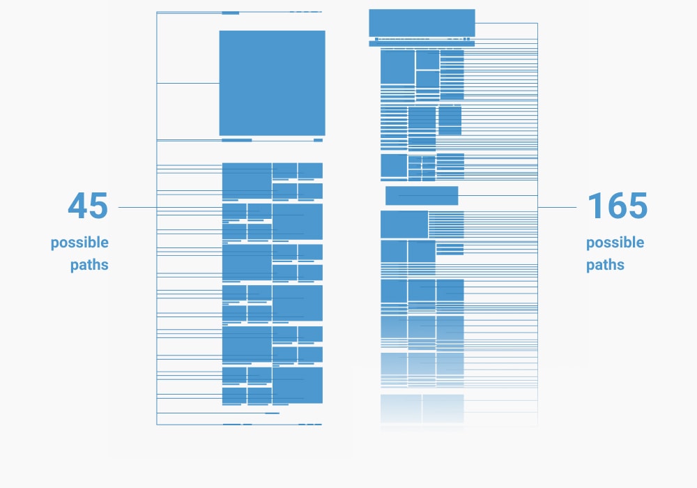
By abstracting these pages — reducing them to symbols that represent their content — we can even more accurately perceive what’s going on. Because I want to dial in on the idea of outcome-oriented design, I am most interested in how these pages are structured to facilitate user actions.
Website Structure Indicates Intent
Every blue box and line shown in the image below (Pentagram on the left, CNN on the right) represents something a visitor to these websites can click. Or, in other words, a path a visitor can take.

Pentagram’s home page presents 45 possible paths. CNN’s home page offers at least 165. Bearing in mind the vast difference in volume each of these websites can expect, something about this should already be sounding some alarms in your head.
Even for all its obvious notoriety and acclaim, Pentagram.com is still a relatively niche website compared with CNN.com. And yet, it’s providing dozens of paths from its home page. Let’s think on that for a bit. The number is of interest, but so is the nature of the paths.
Every path provided on these two pages has its root in a strategic question. Namely, where should a visitor go next? In both cases, the answer to that question comes in multitudes of the same type of content. At Pentagram, it comes in the form of work samples. At CNN, the paths are to news stories.
User Paths Provide Control
The more possible paths there are, the less control a website is able to maintain over a visitor’s journey. The number of possible paths offered by both Pentagram and CNN suggests a clear point on their part. It’s reasonable to conclude here that the creators don’t really care which path you take, so long as you click something.
Websites like these follow an inside-out strategy. They’ve put all the insides on the outside. These websites are a piñata…after the death blow. Now, in the world of advertising-supported editorial content, the piñata strategy makes perfect sense.
Every page has advertising on it, so the faster the website moves a visitor through its pages, the more impressions and clicks those ads will get. Everyone gets candy!
Intent Indicates Value
But why would a website that is not supported by advertising be structured in the same way as one that is? Shouldn’t Pentagram care where its home page visitors go next?
Let’s follow the logic that connects structural choices, intent, control, and value. CNN.com, after all, earns money from advertising, and structures itself accordingly. Their content has been directly monetized. But what about Pentagram?
Pentagram does not make money directly from Pentagram.com. However, Pentagram.com could be a marketing tool for Pentagram. But, it’s clear that Pentagram doesn’t actually rely upon its website to create new business opportunity, either. How do we know that? There isn’t a single lead-generating interaction point on the site. Instead, they develop, nurture, and close new business almost entirely offline. Good for them! That gives them license to do whatever they like on their website.
Remember the Purpose of Your Website
Unfortunately for the rest of us, we do not have Pentagram’s freedom. We do rely upon our websites to create opportunity for us. And so we must care – deeply – about what our prospects do when they visit our websites.
We may admire the Pentagram.coms of the world – they are, after all, beautiful – but we should only aspire to and emulate those websites which actually share the same conditions as ours.
Never assume that the website another firm creates is doing effective marketing work for them. It may not have even been created for that purpose!
That, in a nutshell, is the difference between good user experience design and good Prospect Experience Design (PX). Good UX makes it easy for users to do what they want to do. CNN.com does a great job of monetizing that ease. Good PX, on the other hand, makes it easy for prospects to do what you need them to do. Pentagram.com, while containing great examples of design, is not itself a good example of a functioning marketing website.
Aligning Purpose and Design
But what if Pentagram did need its website to perform as a marketing tool? It would certainly need a different kind of home page.

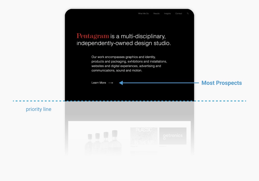
I’ve taken the liberty of altering Pentagram’s home page according to that purpose. Of course, Pentagram doesn’t need design advice from me. But anyone looking at Pentagram’s website and emulating its design when creating a website on which they will depend for new business does. All that would be needed to do that for Pentagram is a minor change in priority of information.
Notice the “priority line.” Everything above that line is what we want most prospects to see and do on this page. Everything below it is secondary.
If Pentagram cared about the marketing efficacy of their website, they would care about making their position in the market clear and designing the page so that most prospects that ever saw it would take one action. The most valuable action a prospect could take here would be to navigate to a landing page focused on their offering.
While their work is beautiful and invites curiosity, it is secondary to understanding what Pentagram actually does, who it benefits, and the results a future client can expect.
Clarity of Intent is Not Just the Home Page’s Job
The home page is just one page of a website composed of many, all of which much take their design cues from the marketing function of the site itself and the paths its creators want to control for prospects.
If you are interested in understanding the many other pages of website designed with good prospect experience, take a look at our full series on Prospect Experience Design.

