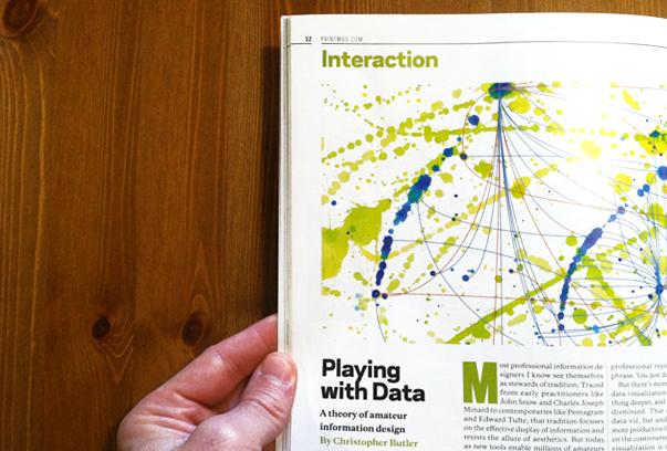
I love the fusion of infoaesthetics and abstract expressionism that Holly Gressley put into her illustration for my column in June’s issue of PRINT. It’s exactly what I was trying to get at with this piece — that much of today’s infoviz is an expression of something, not an analysis, and that if we are willing to look at it that way, we might better understand ourselves rather than turn against each other as we’ve been doing in many small, professional vs. amateur controversies.
But read it for yourself and let me know what you think. I’ve reposted it below…

Most professional information designers I know see themselves as stewards of tradition. Traced from early practitioners like Snow and Minard and on through contemporaries like Pentagram and Tufte, it is one purely focused upon the effective display of information and resistance to the allure of aesthetics. But in design culture, aesthetics play an important role, one that is particularly relevant today as new tools enable millions of amateurs to visualize just about anything. Rather than seeing this as a good thing — a potential innovation explosion of Cambrian proportions — many professionals instead perceive their tradition as under attack.
If you’re not up to date on this drama, a very brief summary of a recent conflict should help: After publishing an earnest yet naive piece by Amy Balliet on the “dos and don’ts of info graphic design,” Smashing Magazine was hit by a debate among commenters over the purpose and practice of information design. Asked to respond in his own article, Nathan Yau offered a classically professional rejoinder, which I’ll paraphrase: You just don’t get it.
But there’s more at work here. Amateur data visualization is the product of something deeper, and it shouldn’t be so easily dismissed. That doesn’t exonerate bad data-viz, but understanding its roots is more productive than continuing to dwell on the controversy. If you look at how data visualization is used today, you’ll find something essential to the human experience: play.
Play is our first tool for making sense of the world. This insight was central to the work of L. S. Vygotsky, an early-20th-century developmental psychologist who theorized that play is uniquely used by human beings to bridge the inner landscape of the mind and the external world. In a famous example, children too young to ride a horse will instead use their imagination and a prop — a broomstick, for example — to access the experience of horseback riding. The prop, Vygotsky wrote in Mind in Society, is a pivot for “severing the meaning of a horse from a real horse.” Play isn’t simply about flights of fancy. It’s a method for safely investigating experience—a process we internalize after childhood.
But how does that relate to data visualization? Technological change — in particular, navigating an endless flood of data — is disorientating and pervasive. Surely, the experience of dealing with it shapes our unconscious mind just as much as our deliberate behavior. There are traces of that response everywhere. In the early days of the internet, for example, pixelation became ubiquitous. An artifact of low-resolution displays, it had no business appearing in magazine spreads. And yet, there it was. Similarly, the aesthetics of web 2.0 — glassy surfaces and app-style icons — have shown up far out of context; more recently, people have been spotted with QR-code tattoos.
When we aestheticize technology, it can simply be because there’s a new visual element in the air. But it can also reflect a deeper uncertainty. Collections like EyeBombing.com and the “Hello Little Fella!” Flickr group play with modern afflictions like pareidolia (finding meaning in inanimate objects) and paranoia. They riff on the legion of machines whose job it is to identify faces, looking out from almost every surface. Techno-aesthetics don’t work rationally; they spread emotionally, reflecting our feelings about the experience of technology before we’re fully comfortable with them.
Just as the aesthetics of technology have taken on a life of their own, so too have the aesthetics of data. The phenomenon is not limited to ill-conceived or superfluous infographics — or whatever other complaints the professionals may level at the amateurs. It has also surfaced in contemporary art. In the overtly data-aesthetic work of artists like Golan Levin, Josh On, and Jason Salavon, repetition, organization, and even glitches are used to intentionally process imagery in a pseudo-algorithmic way. In more sculptural work, like Margaret Boozer’s “Swept Away” exhibition and David Bowen’s Tele-Present Water installation, the artists attempt to measure and synthesize natural phenomenon with technology.
In all of this analysis, there remains a role for what the professional finds so frustrating — the proliferation of amateur infographics — but that is not a sufficient explanation for the larger, sprawling fascination with data. Vygotsky believed that playing with a broomstick could help a child explore the idea of horseback riding. In the same way, our data-aesthetics — earnest though they may be — are props, too, which stand in for a truth obscured by the noise of too much information. The world of information in which we are desperate to orient ourselves is a world of machines, and as our cognitive abilities place limits on what we can understand, we will continue to turn sense-making into a technological process. And so, quite beyond the grasp of the data, we do exactly what any child would do: play with it.
