Author’s Note: The following is a relatively unedited diary of the design process for project that I worked on this past year. It’s a fairly long read so feel free to skim. In addition to the diary entries I’ve also included some sketches as well as finished work. Enjoy.
At our 2013 company retreat, Mark (our CEO) revealed a new business model that Newfangled would be adopting called the Triple Bottom Line. You can read about it in much greater detail here but, in brief, it holds the business accountable to three separate “bottom lines” – people (employees), profit, and community. For the community portion, Mark explained, Newfangled would donate a pro-bono website each year to a non-profit organization. After nominees were submitted and an employee vote was taken, TABLE NC was chosen as our inaugural recipient.
Founded in 2006, TABLE NC provides healthy, emergency food aid to elementary school children living in Chapel Hill and Carrboro, NC. One of our developers, Lisa Smith, has volunteered at TABLE for the past two years and nominated them for Triple Bottom Line consideration.
I decided to keep a diary of the design process, as I had done for a previous client a few years back. I find documenting the process reveals certain patterns in my thought process and allows me to more objectively evaluate my working style (and make any necessary changes).
The Newfangled team: Page Laubheimer and Mitch Rothrock (Project Managers), Lisa Smith (Developer), and myself as the designer.
The TABLE NC team: Ashton Tippins (Executive Director), Angela Mascenik (Director of PR), and James Dougherty (TABLE’s IT Consultant)
2/6/14
Received notification that TABLE NC was on the production schedule. Need to review their current site before kick-off call on the 20th.
2/10/14
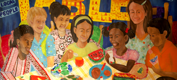
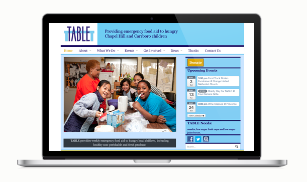
Reviewed the TABLE site as well as their Twitter and Facebook page. The site is very basic, both in design and structure. Their Facebook page is a good overview of their activities and culture, and I’ll probably use it as a source for images. I especially like the mural that’s painted on one of the interior walls of their facility.
One of the first things I noticed was their logo, which could use an upgrade, as well. I realize it’s not in scope, but I can’t help but experiment a bit. An organization like TABLE deserves something that matches who they are and what they do more closely. Their current logo doesn’t say anything about what they do, which is to provide food for hungry local children. I want to keep the table element in the logo since it’s their name, but it doesn’t have to be a literal table. I’ve experimented with incorporating it into the name; stretching out the crossbar of the T over lowercase letters a, b, l, and e. I’ve also tried a place setting with a plate and fork, with the table implied. The heart symbol keeps showing up in their Facebook page so I’ll try to incorporate that as well, playing off the slogan, “Food is Love.” I’ve spent about an hour making sketches and will come back to it later.
2/20/14
Had a project kickoff call with client including Ashton Tippins, the executive director, Angela Mascenik, the PR Manager and TABLE’s IT consultant, James Dougherty. We used a video conference but I didn’t speak much. I was there mostly to put a face with my name.
2/21/14
Followed up with Chris B. about the TABLE logo. He suggested I approach them about a redesign. I plan to do it during the design kick-off call and offer the work gratis. I showed Chris some of my sketches. Our discussion sparked a new idea for the logo: an above view of a table with the word “table” incorporating a plate in the “b” and substituting the “l” with a spoon.
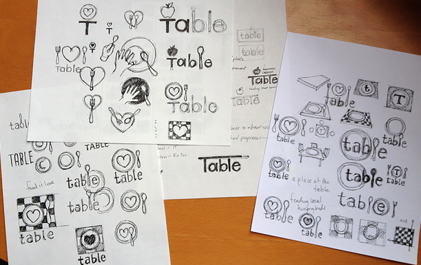 Early logo sketches. I really wanted the heart symbol to work, but it simply was too much of a disconnect from TABLE’s name.
2/28/14
Reviewed TABLE’s feedback from their design survey. They cited a few other “feed the hungry” sites like Feed America, No Kid Hungry, and a promotional site for a film called “A Place at the Table.” TABLE’s branding consists of their logo and two colors: a light Carolina blue and a navy blue. I really like the mural they provided of all the kids around a table, and I definitely want to work that into the site design, if possible. I think it’s a strong piece of branding.
We had a design kick-off call with TABLE in which I attempted to pull more information from them and expand on their design input. We talked about their colors, and I explained that the addition of the yellow to their current site was in line with what other “hunger” sites have done. That makes sense given that yellow and orange have strong psychological influence in regards to food marketing. We also talked about their image assets and, unfortunately, at this point we aren’t able to use any of the kids’ faces. Ashton said they were going to revisit the legal issues at their next board meeting and see if they could figure out a way to obtain permission to use them. I told her that I would not use any recognizable faces in non-editable areas of the site, but that they would be able to populate the site with images of kids during the content entry phase (provided they had permission by that point).
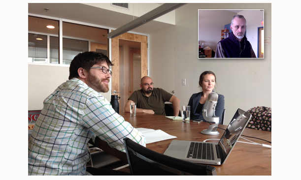 I know my face doesn’t show it, but I’m really happy to be in this meeting!
Before we ended the call, I made the proposal to update their logo. I tried to be as sensitive as possible in making the pitch. After all, working with an organization’s logo is very personal, and I didn’t want to step on any unforeseen toes. I offered to do the design work on my own time as a bonus to the scope of the job. Angela (their PR director) asked if the revised logo would look similar to their existing one or be something completely different. I told her that we could do it either way, whatever was most comfortable for them. I certainly didn’t want them to feel we were forcing them to make a change that didn’t match their own goals. They said they would think about it and get back to us. Page congratulated me after the call for being diplomatic. I guess I’m getting better at that, at least with clients.
3/5/14
Started mood boards today. Mostly collecting bits and pieces (images, fonts, colors) and pushing them around the page. A few interesting things are happening. Playing around with “food is love” in different fonts and arrangements, trying to use it as a mask for the mural of the kids. So easy for me to get distracted with minutiae like this.
I also can’t stop messing with the logo. Started “sketching” a new version in PS using the elements from the original (table, logotype, and the tag line). Found some table silhouettes online. I want to use something more recognizable as a table that contains some detail, like a nice farm-style kitchen table. Placed the logotype below the table to make a lockup (instead of overlapping them) with the tagline below. I think it’s an improvement already.
 The original TABLE logo and an early version of the redesign.
3/6/14
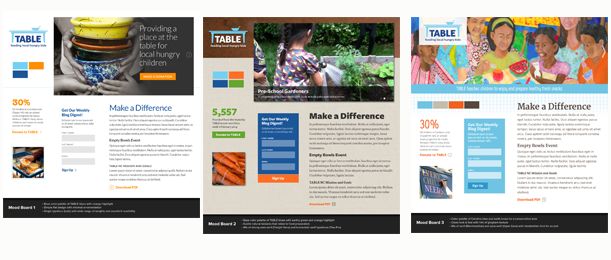
Really need to get down to business on the mood boards. Decided to use a format that I made for a previous client, in which I created one mood board “template” and changed the style for each board. It’s more of a system and not as loose as some of my other boards, but it will expedite the process.
I was able to put together a minimalist version in fairly short order (a lá No Kid Hungry website) but was running out of steam by the time I had put together a more whimsical second board. Left the office pretty drained but am optimistic about hitting it again tomorrow.
Continuing to tweak the logo. Trying a different font, Aller Display, which has a nice roundness to it, more friendly-looking than the Museo Slab I’ve been using. Added a bowl to the tabletop to help it look more recognizable and introduce some humanity to it. Jim (one of our developers) suggested a spoon sticking out of it, which I dismissed at first but then included anyway. I really hope the client is agreeable to the new logo because I’m going to include it in the mood boards as a means of pitching the idea and helping them see it in context. Towards the end of the day I came up with a new version that eliminated the legs of the table and just used the table top with the bowl and spoon. It’s simpler, and I like it, but it may be too much of a departure from the original logo.
 The table-only version of the logo was nice and clean, but the addition of the bowl (and eventually, spoon) humanized it and cemented it as a visual reminder for how TABLE serves the community.
3/7/14
Spent most of the work day rounding three mood boards into shape.The first one is a little too sterile for the client and the second one a bit predictable, but the third one has some promise. I plan to have Chris B. review them early next week. I’m basically happy with them but think they would benefit from another day of work. Creativity is rather elusive sometimes — not something you can turn on and off like a faucet. It requires lots of time, punctuated by breaks. It may indeed take several days to come up with a solid concept, but those three days are usually spread out over a week, during which time you come up with ideas, discard them, come up with new ones, discard those, and eventually something starts to emerge that you can work with. I’m kind of burnt out as I write this so that may be fueling the creativity rant.
3/10/14
Chris B. reviewed the boards and only had a few small things to critique. He told me to present the boards with their current logo before revealing the new logo. I think that’s a good idea.
3/13/14
Just presented the mood boards to the client. They seemed pleased with all of them. My biggest concern, of course, is that they understand what they’re supposed to do with these and what type of feedback will be the most useful to us. Ashton and Angela’s initial responses were that they liked certain elements from each. I told them that, after they sit with them for a few days, they will be in a better position to give coherent feedback.
After walking them through the boards, I showed them the proposed new logo. The first words out of Ashton’s mouth were, “Oh, it’s adorable!” I was relieved. I had no idea how they’d respond, especially since they hadn’t been expecting to choose a new logo in the first place. I think they were a little overwhelmed with how much of an upgrade the new logo is over their current one. I’m glad to be able to provide them with something that serves them better. In some ways it’s better than getting paid for the work because I enjoy helping out an organization like TABLE that may not normally have access to professional services.
3/18/14
Ashton provided feedback on the mood boards. They like the second one (with the textures) but didn’t like how dark it was. There were some other comments but, for the most part, they were minor. I talked it over with Page and we decided to proceed with page layouts instead of producing a second round of mood boards. They still love the logo but won’t be able to put it before the board for approval until April. The time delay isn’t ideal, but this is a big decision and it makes sense that they’d need to wait to put it through official channels. Waiting on that won’t hold back the design process, though. In the meantime, we’ll be using the new logo in the page layouts and, if necessary, will replace it with their current logo for production.
3/26/14
Posted three page layouts today: home page, list page and modular page. I ended up with a marriage between mood board #2 and mood board #3 (more so than I thought would be the case, originally).
Aston and Angela liked the wood grain of mood board #2 but were concerned about the overall darkness of the layout. So I decided to lift the white content area with the gingham texture from mood board #3 and incorporate it. The dark blue in the second board was troubling me, it just kept sitting there, a huge dark spot on the right side. On the second day of working with the layouts, I jettisoned the dark blue altogether from the palette and used the Carolina blue instead; I think it much improved the overall look.
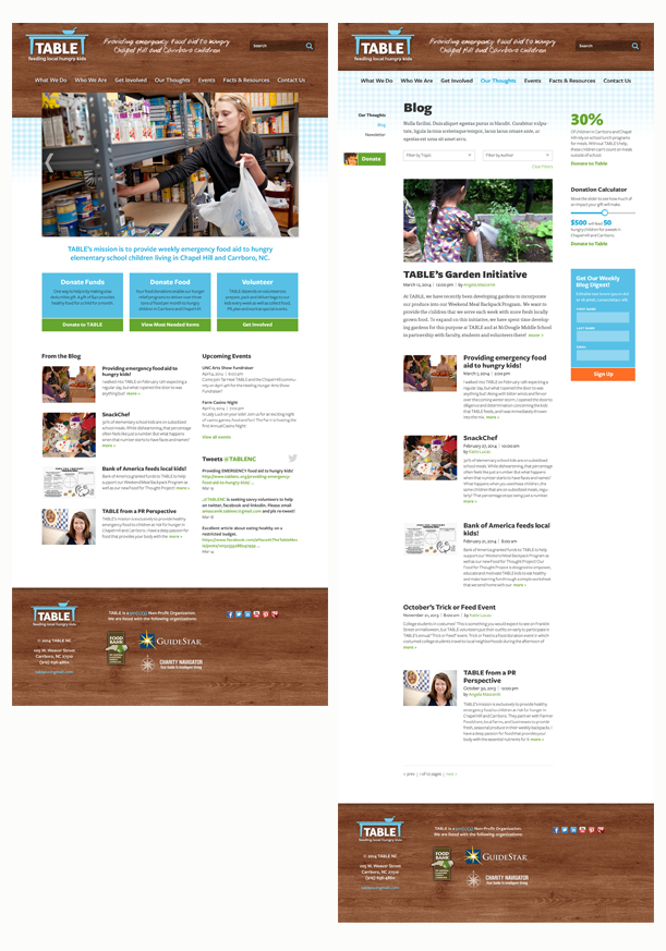 With both a right-hand side bar and a left-hand navigation column, we don’t have a ton of real estate for the page content, but I’ve decided this will be expandable (up to a point), with the side columns being a fixed width.
The biggest change from the prototype was the “how you can help” feature on the home page. The prototype called for a two-column widget, with a general description on the left and a slide show feature on the right that would carousel through three methods of helping: donate money, donate food, or volunteer. After thinking about it (and realizing that the left side description was all dummy copy) I reworked the widget to something more direct. Why hide the ways to help in a slide carousel? And the left-side description was unnecessary, especially if the “ways to help” descriptions were strong enough. So I created three boxes, each with a large headline, a short description, and a prominent call-to-action button.
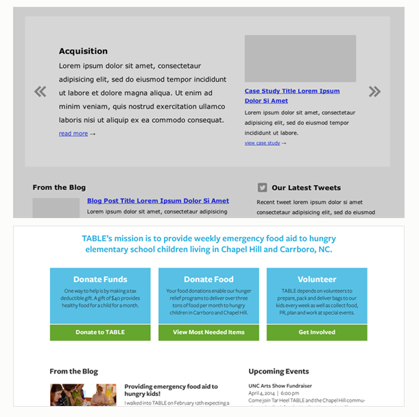 Always looking for ways to simplify, I redesigned the “How You Can Help” widget from a two-columned slideshow (shown in prototype, top) to three conspicuous callouts with clear calls-to-action.
The prototype also called for TABLE’s positioning statement to live in the header next to the logo. Because I try to make all website text editable (for SEO purposes), I first just set it in the Effra font and left it at that. But it looked flat and boring. It didn’t have any personality. I played around with some hand-drawn fonts and even tried embossing it into the wood texture so it would look like someone carved it into the table. Not only did this make it hard to read, but it also felt kind of creepy, like the kids are some kind of juvenile delinquents. So in the end I used a very legible hand-drawn script called Tom’s Hand, with a large x-height and thick, mono-weight strokes. Then I “roughed it up” a bit so it looks like someone wrote it on the table in chalk or paint (much less creepy than carving it). Now it had the personality it needed. The only downside is that it would not be editable. I suggested to Page that we could repeat the positioning statement as editable text in the footer.
July 2014 Update: As the site was nearing completion, we had to make the positioning statement editable, so some of the “chalk effects” had to go away. In the end, it was more important for the text to editable than for it to score style points.
As another small touch, I added a thumbnail image to the global “donate” button in the left-hand column. I thought it added some personality and we even made it editable so the client could swap it out if needed.
 Small details (like the addition of a child’s face) can make the difference between a generic button and a personalized call-to-action.
I’m pretty pleased with the way these layouts have come out and I hope TABLE feels the same way next week when we present.
This will be one of the first projects in which we attempt to suppress the proliferation of multiple Photoshop page layouts and rely more on a massive style sheet for the production phase. The only other template we will post for approval will be a responsive layout for mobile devices.
4/1/14
Presented the second round of page layouts today. Ashton and Angela were on the call. It seemed to go very well. The overall response was, “we love it.” Even the changes I made to the homepage were well received. Page asked for their feedback by the end of the week, so I suppose that will be the next milestone, at which we will have either smooth sailing all the way through or the project will slow down as a result of design iteration or waiting for key people to sign off.
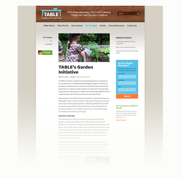 The second round of layouts included subtle changes, like fixing the width of the site, adding a background, and replacing the gingham texture underneath the header with a burlap texture.
4/7/14
We got TABLE’s feedback last week but I didn’t have time to review it until today. The first thing that stood out to me was “more warm and friendly.” My first reaction was disappointment. But I understand that there’s a gap between seeing something that resonates with you and being able to articulate it into words. I didn’t realize how much Ashton liked the color palette from mood board #2. I had jettisoned the dark blue from the page layouts because I thought it was too heavy, but now that I know a bit more about how Ashton’s leaning color-wise, I should probably find a way to work it back in. And they’ve also requested more of the orange. I’m hesitant to use more of it, though, because it’s such a strong color, especially playing off of the blue. Being so saturated and bright, this orange is really better used for highlighting. But I wonder if Ashton would be comfortable with a muted or darker orange, something that was more of a burnt orange or reddish tan? She also asked for a lighter wood texture. I plan to try a blonde wood to see if it can work for the header, but I have my doubts. I think the header needs to be darker than the body of the page to anchor it. I hope it doesn’t sound like I’m whining. As far as client feedback goes, this is pretty positive overall.
4/10/14
I revised the page layouts and think I’ve successfully incorporated as much of TABLE’s feedback as possible. Limiting the width of the content area and reintroducing the dark blue into the background with a gingham texture accomplishes several points of feedback. I also reintroduced the canvas texture into the content area which helps “warm up” the look and feel.
The two points I pushed back on the most were the requests to use more orange and lighten the wood texture at the top. I experimented with a blonde wood header but it caused more problems than it solved. There was no longer any contrast between the header and the body of the page, and the lighter wood actually made the page feel cooler instead of warmer. And arbitrarily applying orange to the layout would work against the plan to use orange as an action color (links, buttons, etc.). All in all, I think these layouts will be well received, but we’ll know more on Tuesday.
4/11/14
Showed the third round layouts to Chris B. this morning. His reaction to the dark blue background was not positive. He explained why he thought it was incongruous to the rest of the look and feel and didn’t really “warm up” the layout at all. In addition, the gingham texture felt superfluous. My initial reaction was to be defensive, but thankfully I’ve been doing this long enough to know that Chris knows what he’s talking about and has my best interests at heart, so I should shut up and listen. After a while I began to see what he was talking about and realized I was so interested in accommodating the feedback punch list that I’d missed the bigger picture.
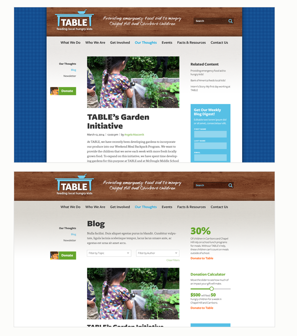 Too focused on reintroducing the dark blue, I lost sight of the big picture and created an ill-advised version with a dark blue gingham background (top). After reviewing it with a collegue, I decided extending the wood texture indefinitely was a better (and less visually jarring) solution.
So I revised the layout and sent Chris some new versions to look at. I ditched the dark blue and the gingham and made the background a solid warm gray color. It’s enough of a color to look intentional but not so strong it gets in the way.The second option is to extend the background wood texture indefinitely left and right. Not my favorite option but it has its merits.
4/15/14
Presented the third round layouts to Ashton and Angela this morning. Call went well, and both Ashton and Angela seemed to agree that the changes we made moved the look and feel towards a warmer tone overall. The big question for them from this round was whether they wanted the background textures to span the full width of the browser window or whether they want the content area to be limited, with a solid color background. We also walked them through the responsive layouts.
I asked about the logo and when we might get approval from the board. Ashton said she would be presenting the logo to the board that night but that she had already spoken to several board members individually and they’d responded positively to the idea of an updated logo. So, now we wait.
4/22/14
Received Ashton’s feedback today. There were two minor changes that Page and I agreed we could handle in the production phase and three design change requests, two of which seemed to come out of nowhere (a few days before the design phase is scheduled to be completed).
4/23/14
After the latest bit of feedback, we realized that not everyone on the board had been able to weigh in on earlier reviews. That’s put us in a challenging position of figuring out how to best integrate their feedback so late in the process. There are some pretty straightforward changes they would like to see, and after reviewing them, Page and I told Ashton that we could entertain an exploratory design phase to pursue these requests but that it would change their production schedule and push back their go-live date. Ashton replied that she was willing to forgo any further design changes if we provided some insight on the canvas texture and why we had used it to replace the gingham texture that was there in an earlier round. I wrote a rationale on Basecamp for Ashton and now we’re waiting to get the final approval on design. I’m glad we offered to accommodate TABLE’s request rather than simply push back. It’s impossible to predict what kind of surprises will pop up last minute due to a client’s personality or internal politics, even in the best-case scenarios.
4/28/14
We’ve received approval on the visual design and the new logo, and I’m preparing production files for our developer, Lisa. The goal of reducing the number of templates required for design approval was met. We only produced three layouts (plus mobile versions) for approval, and I will be creating an additional two layouts for production. This is a far cry from previous projects in which we produced upwards of 15 layouts for approval.
6/24/14
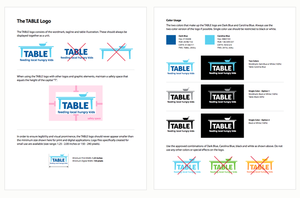
I prepared a branding package for TABLE’s new logo so Ashton can create marketing materials both in print and online. I kept the guidelines very simple, just two pages.
7/8/14
The drumbeat on Twitter begins as TABLE prepares to unveil their new website and logo. I don’t think we’ve ever had a client so excited about a new website. It’s a pretty cool feeling.
Get ready! We are launching our new website and logo on July 16th! A huge thanks to everyone at @Newfangled_web for their tremendous work!
— TABLE (@TABLENC) July 8, 2014
7/16/14
The site goes live! TABLE invited the team to a launch party at their Carrboro headquarters, complete with a new signage and a TABLE-branded cake. Unfortunately, I could not attend the party because I’m five states away, but Chris B. sent me some photos.
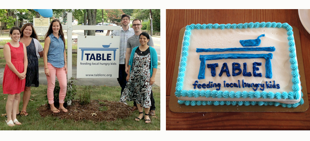 Launch party! The new sign and TABLE logo done up in frosting. Awesome.
7/23/14
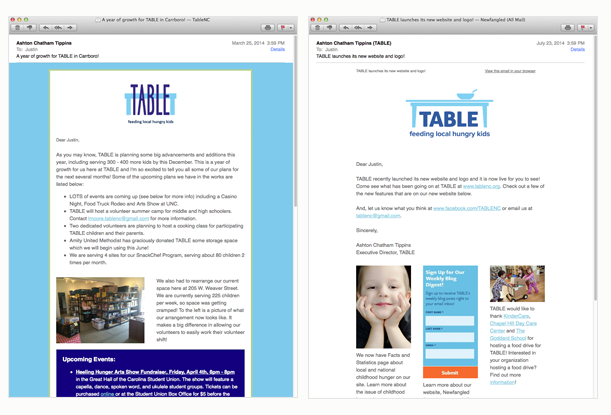
When I began the project, I signed up for TABLE’s newsletter as part of collecting materials for the design phase. Today I received their redesigned newsletter and the improvement is clear.
Conclusion
The cross-promotion between Newfangled and TABLE NC on Twitter and Facebook has reached almost shameful levels but it’s great to see an organization like TABLE have a professional-looking marketing presence. And the first project from Newfangled’s Triple Bottom Line business model seems to have been a great success.
Not every project I’ve worked on has been as smooth or rewarding as working with TABLE, but the experience has reinforced my belief that a good relationship with the client based on mutual respect and trust is essential to a successful project; and that the collaborative problem-solving process is as important as the finished product itself.
