Like many people, we at Newfangled have been using Git, the popular, open-source version control system, in various ways for years. Using *any* type of revision/source control is critical for any development team. Individual branches of code can be maintained as needed, allowing for changes to the “main” codebase to be carefully documented at a very detailed level. As our workflow rarely requires multiple developers to share the codebase of a site at any given time, we aren’t using Git to its full advantage, but what we have done has proven to be quite valuable when code (occasionally, sometimes) goes wrong.
Recently, inspired by the work of the Git/PHP library, PhantomCSS/Resemble.js, and the BBC News Wraith projects, I started playing with our existing Git workflow, trying out ways to improve our overall communication and QA process. Specifically, I’ve set up a very simple graphical user interface (GUI) as part of each site install, to provide a centralized place to view ongoing changes and commits. Developers are still free to use whatever tools they prefer, but now project managers can review and monitor progress, as well. This system also provides a rather convenient foundation on which to automate the ‘screenshot comparison’ functionality so brilliantly developed by James Cryer and the Huddle development team. Now, in addition to monitoring code changes, we can compare what each commit impacted *visually* to make sure specific code changes haven’t caused unintended layout changes.
Below is a simple proof of concept showing some of these ideas. Note that this is just that — a simple example. There are tons of powerful GUI apps available already. Harry Wolff wrote a nice comparison of mac clients. Individually, we use a lot of them ourselves. There are also lots of powerful screenshot-debugging tools out there — many of which are browser based — such as PerfectPixel and even CrossBrowserTesting. Again, we use many of these during our entire development process. My goal, then, in this proof of concept, was to see if these various elements could be combined into our core development site installs to streamline the entire process and make it available to the whole team in a single, unified way.
It’s also important to note that the simplicity of this approach by its very nature excludes a lot of the powerful, flexible functionality inherent to Git itself. As an experiment, and for our particular internal workflow, that’s fine, but obviously there’s a lot more that could be added.
Visualizing the Git Experience
Utilizing the Git/PHP library, we’ve build a visual source control system that is available to all of our development sites. Accessible by every developer and project manager, this interface provides a quick and detailed overview of what work is taking place, and what has been committed.
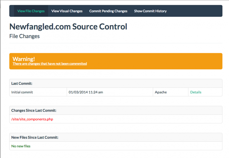
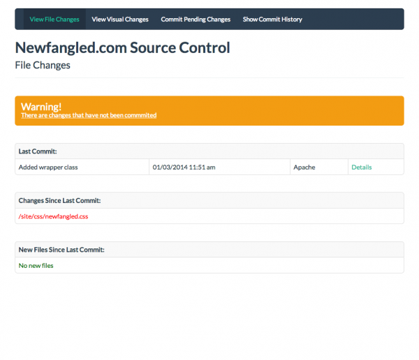
For instance, here is the overview for the newfangled development site. It shows that one file has uncommitted changes.
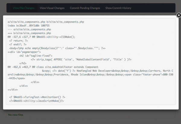
Clicking the file will show the specific outstanding changes.
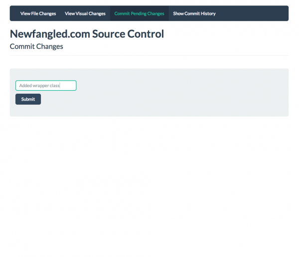
Using the Commit Pending Changes interface, we can approve these outstanding changes, naming the snapshot for future reference.
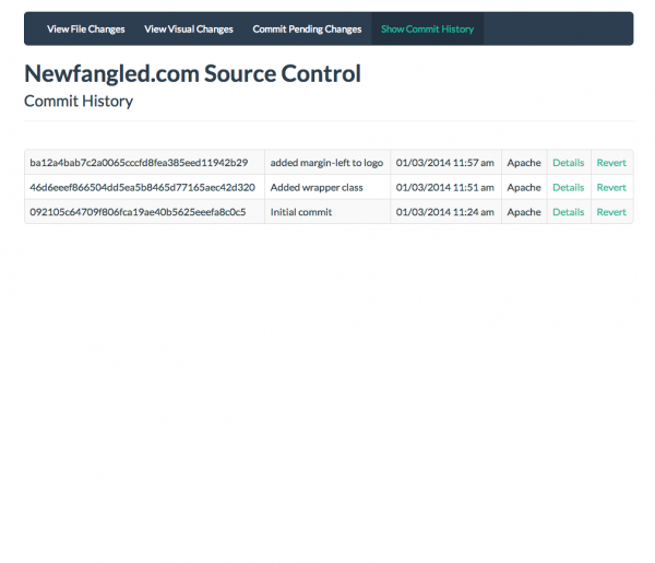
This creates a snapshot of the site with all current changes, which can be seen on the Commit History screen.
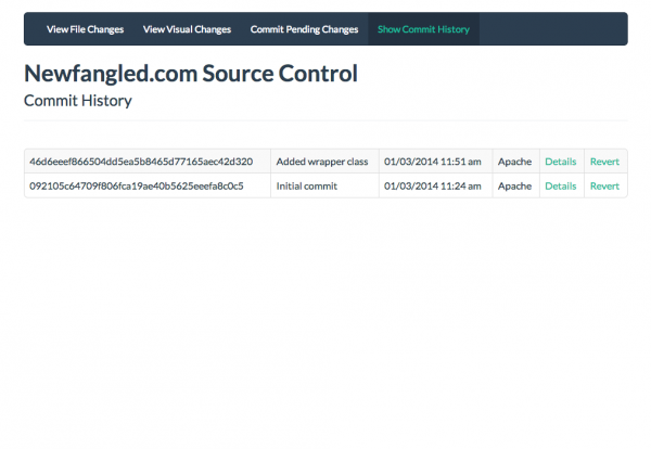
Clicking details shows a list of all changes associated with the given commit.
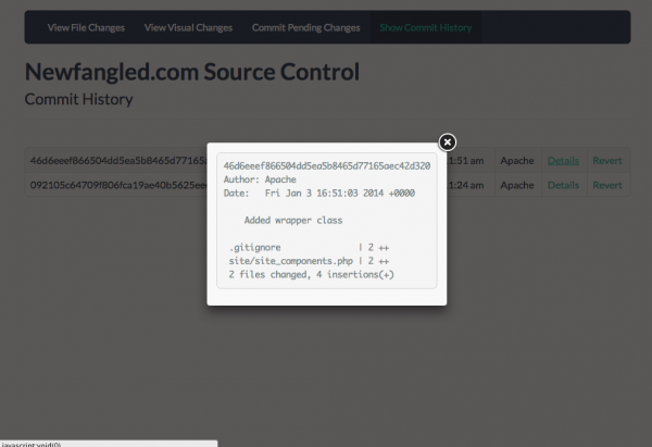
And, were the need to arise, we could easily roll back to any previous milestone, with the click of a button.
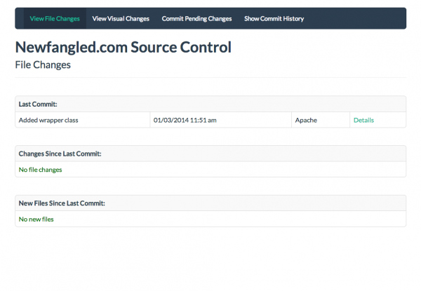
Returning to the overview screen shows that everything is now committed and accounted for. Our most recent commit is indicated, and no file changes are detected. Now would be a good time to, say, send the changes to QA for review, or review the changes with the client.
Layout Comparisons
Taking this approach one step further, we’re also able to account for visual differences. Using PhantomCSS and Resemble.js as a foundation, we’re able to auto-generate screenshots of key pages, and compare the curent render against the previous commit. From these screenshots, an added layer of accountability is added to the QA process, for both developers and project managers. We’re able to quickly see if our changes have had any unintended consequences.
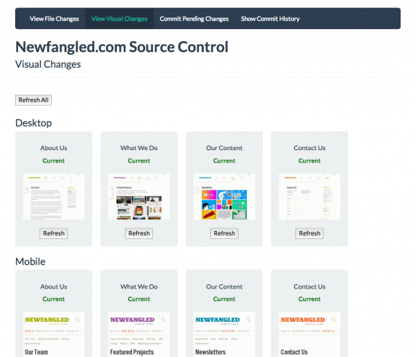
For instance, here’s our screenshot overview page, immediately after a commit.
Then, we update a css file to add a margin-left to the logo.
As before, we can see our file changes, here indicating that the ‘newfangled.css’ files has been modified.
By viewing our visual comparison page, we’re able to see the impact this change had on multiple pages of the site, by alerting us if any page has changed, and highlighting the difference in pink in the screenshot.
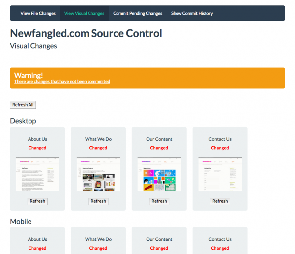
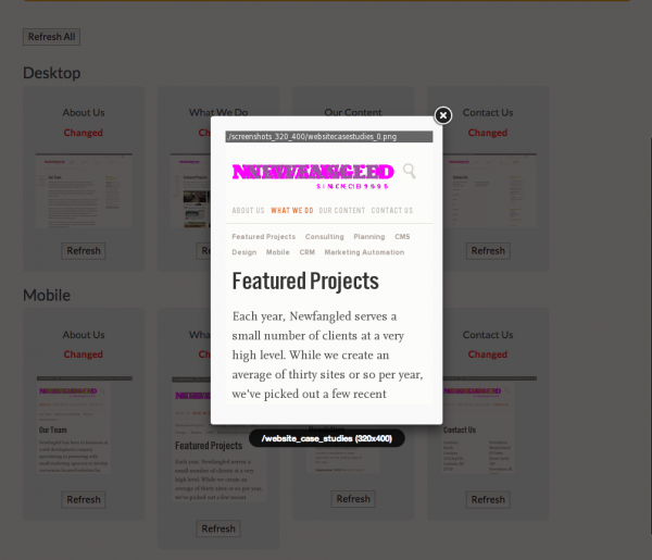
Clicking a screenshot shows a larger view of the change.
Once we’ve approved the ramifications of this change, we commit again, adding another snapshot to our history.
Impact
How does this impact our process?
Visual screenshot debugging is great in that it can catch inadvertent layout bugs quickly, before they’re compounded by additional changes. That is, no matter how well-planned your CSS structure is, it will always be possible to make a change to one site element and have it also change some completely separate element, often in subtle and not easily noticeable ways. Having a system compare a before-and-after and show exactly *what* has changed (down to the pixel) can help catch these bugs.
As for the overall system, and how we use source control at Newfangled in general – that is an ongoing process. We’re constantly working to improve our development and deployment processes, and I’m optimistic that a system like this will further that cause.


