In June, Chris Butler posted an article entitled, “The Two Things and Content Strategy.” The concept of “two things” is, that for every subject, there are really only two things you need to know. Everything else is the application of those two things, or just not important.
Chris’ article on content strategy was followed by other “two things” posts covering the topics of content creation, lead generation, SEO and scheduling. Now it’s my turn to tell you what I think are the two most important things about web design.
There are some design principles that are universal, such as “form follows function,” “the client is always right” and never use Comic Sans for anything. But in this post I’ll address design aspects that are unique to the web.
1. Web Design is Not Print Design
This can’t be emphasized enough, especially for those designers making the transition from print to web, as well as marketing and advertising agencies that include web design as part of their provided services.
Our president, Mark, wrote in his latest book, “A Website That Works,” that web design is like jazz (fluid and malleable) as opposed to print design (fixed and permanent). Since I’m not a musician, I’ll use an analogy closer to home. Print design is like a bachelor’s loft, in which he has complete control over his living environment. Something put in a particular spot (say, the TV remote) will stay there until moved by said bachelor. Web design is more like my house, occupied by two adults, six children and a cat. A particular item doesn’t stay in one place very long because other people are exercising their own view on where it should be. And your plans for the day may change at a moment’s notice and so, to retain your sanity, you learn to go with the flow.
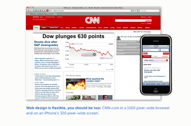
 Both web and print designers create containers for content, but web content is constantly changing so the container needs to accommodate this dynamic nature. Printed materials are produced and distributed in a fixed size and format. You could buy a copy of USA Today in New York and someone buying that day’s edition in Los Angeles would be holding the exact same thing. But if you check cnn.com at 9:00 am and again every two hours until 9:00 pm, your experience will change; not only because the content is constantly being updated, but the format may be as well. You might be using a laptop in the morning, a tablet during lunch and a smart phone on the way home.
2. Know Your Client
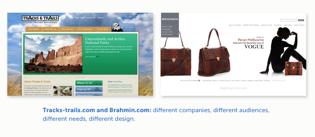
Web design is not about decorating a 1024 x 768 square with the latest trends in slab serif fonts, javascript animation or full-screen photo backgrounds. It’s about understanding who your client is and how their website can best reflect their personality and business plan. A tour company that offers RV adventures in the Southwest has very different needs from a company that manufactures high-end women’s handbags and accessories.
 We ask our clients three basic questions to assess their needs: Who is your audience? What do they want from you? What do you want from them? These questions form a framework on which we can begin to establish a theme and direction for the site design.
A Word About Process
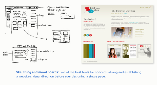
Sketching (putting pencil to paper) is still the best place to begin the concept process. Sketches are quick, loose and you can eliminate bad ideas right away. They allow you to think about the big picture and not get bogged down in details too soon.
 Mood boards are a great first step (prior to page layouts) to help the client visualize a design direction for their site. They are essentially “sample boards” that establish a site’s overall look and feel including typography, imagery, color palette and other design elements. Mood boards have prevented many headaches in the design process since they can be produced relatively fast and don’t deal with any specific site content or architecture— which allows the client to focus solely on design.
————————————————————————-
“Two Things” Bonus: Since my wife and I are celebrating our 20th wedding anniversary this month, I think it’s fitting to share two things I’ve learned about marriage: 1) Your spouse is not the enemy, and 2) Marriage is wonderfully hard work, but the rewards are priceless.
