At Newfangled, we’ve written a lot about content. Content strategy, content marketing, content creation, content styling. And if you’ve been reading our blog posts and newsletters, you’ve come to understand that we value content. It’s not the only component of a dynamic marketing web platform, but it’s a key component.
Today, though, I want to talk about the container: the object you use to present your content (ideas, thoughts, knowledge) to the world via the web. In other words, your website. I want to talk about your website as a container because it’s important to understand how its purpose has changed over time in relationship to how content is delivered.
The Past
Ten years ago, there were only a few ways to view web content. The most common was through a web browser on a desktop monitor or laptop. Accessing a website on a mobile device in 2004 was limited to very few devices with screen resolutions so low it wasn’t practical for daily use. As such, websites were designed as fixed systems, optimized for screens with a limited range of sizes and resolutions.
Today, web content is delivered to smartphones, tablets, watches, flat-panel TVs, and home appliances, in addition to the more traditional platforms of laptop and desktop screens. Because content is being served up to multiple devices, each with a different screen size and resolution, it’s only logical to try to make that content lightweight, flexible, and modular. Chris Butler has written extensively about modular content in our January newsletter, “The way you design web content is about to change.”
Unfortunately, many web designers and their clients seem to be stuck in the past. Designers are asked to create pixel-perfect containers (websites) that are built more for wowing an audience with decoration than delivering content to multiple platforms. There is nothing wrong with designing an attractive website — in fact, it’s an imperative — but it shouldn’t come at the cost of functionality. Web design, like all design disciplines, should follow the rule of form follows function.
The Metaphor
I’m a visual learner and perhaps you are, too. As I was thinking about the idea of the modern marketing website as a container, a picture formed in my head that I think will help illustrate the point.
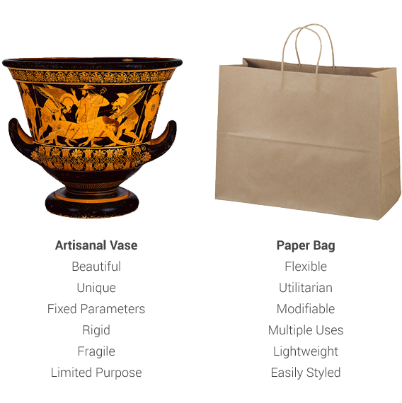
Imagine an artisanal vase. A beautiful piece of pottery, hand-crafted and finished with skillful care. It is a pleasure to behold, unique. Now imagine a paper bag, the kind you might use to carry home your new shirt from the mall. Fairly unremarkable, utilitarian. Not something you’d find in an art gallery (unless you live in Portlandia).
The vase represents a highly stylized, pixel-perfect website, each page a unique experience. While a lot of time and effort is invested in its creation, the result is rather limited in its functionality as a container. You could use it to carry things, but the practicality of it would be limited. What if you dropped it?
The paper bag is like a modern responsive site, containing device-agnostic, flexible content. A paper bag can be reshaped by folding or rolling it up, depending on what’s inside. It’s a lightweight container that can be styled or branded. It can hold many different types of content — even other containers.

The Conclusion
No metaphor is perfect, but I think the vase vs. paper bag comparison is effective in underlining the idea that, when it comes to designing a modern marketing website, it’s about the content, not the container. You want the visitors to your website to focus on your ideas and knowledge and respond to your propositions and calls-to-action. While the aesthetics of your site’s design may provide a pleasurable user experience (which is important), you want the viewer to engage with your content rather than the container.
I’m not saying that a website with an emphasis on content has to be spartan, the aesthetic equivalent of vanilla ice cream. Nor does the container have to be minimal in design to allow for responsive functionality. There are many websites that achieve a good balance between attractive container and flexible content. Here is a sampling:
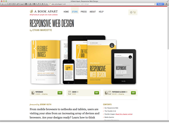
A Book Apart, one of a trio of websites from the people at Happy Cog, balances stylish design with modular content that easily reflows for mobile devices.
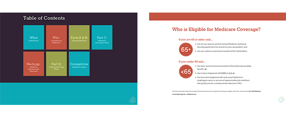
Navigating Medicare, is a single-page responsive site that uses a warm and inviting color palette along with large, readable typography to explain a rather complex healthcare insurance program.
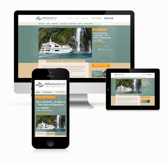
AdventureSmith Explorations, designed by Newfangled, is a content-heavy travel website that is as accessible (and attractive) on a smartphone as it is on a 30-inch monitor.
Are there any other examples of websites that you think strike the balance of container vs. content particularly well? Let us know in the comments!


