It may be excessive and unneccessary, but I’ve been closely observing and measuring the content of my web reading for almost a year now. It’s taken me a while to figure out just what to do with the data I gather—deciphering what story it tells me and deciding how to let it influence my decisions—but I’ve come to the conclusion that it has been worthwhile. Sure, doing the analysis and making the charts is fun, but I actually think it’s saved me time. Seeing the data plotted out in this way compels me to continually refine my subscription lists to ensure that what stays is worth reading. Here’s an overview of what I found…
What you see above (click it to view it in actual size) are the titles of 732 articles that I read on the web over the last ten months. In my last post, I outlined the process by which I aggregate and organize web content, which, since I adopted it last August, has filled my “Read” folder with these 732 articles. With this amount of reading, figuring out the value of it becomes even more important.
“Zooming In”
By the time Fall had arrived, I had become even more interested in observing the topical patterns in my web reading, not just the numbers of articles. Again, this was partly just because I like that kind of thing, but also because I thought it might have some practical benefit. There was a lot of really good material that I wanted to read, but I was also feeling pretty overwhelmed by much of what came in to my Google Reader—particularly because I sensed that much of it wasn’t worth my time. I needed a way to differentiate between the good stuff and the not-so-good stuff. So I started to keep a closer eye on what I was actually taking the time to read and literally charting it out in a notebook. The image to the left (click it to view the full-size version) is the first chart I made from that data of the material I read over just one week— the week ending on September 21, 2009. The topics that represent the peaks were no surprise to me, but seeing the pattern visually made me want more, so I decided to track the following week, too. Here was my comment on this first set:
I noted about 25 articles over the past week, and rather than describing each one, I thought I’d take a different approach and see if there were any overarching trends in subject matter. There were 6 random topics that did not recur, but also 2 or 3 that recurred quite a bit among the full list. I have 126 feeds in my Google Reader, so I’m used to seeing articles over a wide variety of categories, but the prevalence of articles about architecture and literacy-and-tech was unusual this week. It’s in the zeitgeist.
This second image is the chart comparing the material I read over that first week with what I read the following week—the week ending on September 28, 2009 (again, click it to view the full size version). While some new categories popped up (and some of the random ones from the previous week went away), the thing that I noticed was that the material I categorized as “tech trends” still was higher than I wanted it to be. It’s not that this is a bad category, but I know that the material that I put in this category tends to be the kind of fleeting rumor stuff that doesn’t really matter in the long run. Tech trends are important to me and this company, but this stuff is the “wow, a new netbook” kind of stuff. I’d seen enough here to take action and begin pruning my subscriptions. Again, from my Tumblr comments on this chart highlight the changes:
…less architecture, more futurism…
Dominant Trends
I did a few more “what I read this week” charts, which all showed similar things: much of the content I read (and want to continue reading) tends to fall in the categories of “design,” “architecture,” and “technology and literacy” (something I later began referring to as “digital literacy”). This last category became more and more important to my technological point of view. After all, what I was doing was evaluating my own digital literacy—the degree to which my reading activity was online or offline. I was trending toward more and more of the online material, and was meanwhile interested in this trend in general, wondering what cultural impact are devices like e-readers and other online media really having? More and more of the articles that I’d move to my “read” folder fell in this category. The commentary on the second generation Kindle, the Nook, the iPad, and the since-canceled HP Slate and Microsoft Courier certainly contributed to this.
“Zooming Out”
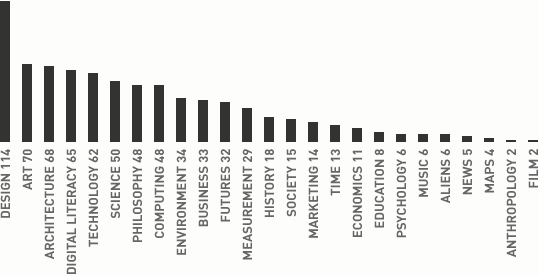
Ten months later, I’ve accumulated a ton of material. As I already mentioned, I’ve read 732 articles since I started organizing and keeping track of my reading in this way. The general trends that are clear from the graph below—which shows the number of articles read in 25 categories over the course of ten months—are similar to what was shown by visualizing only one week of material. “Design” had the highest number of articles—over 60% more material than the next top categories. Based upon my own memory, I wouldn’t have guessed this. I knew that “design” would be high, but thinking back over the material I read this year, the “digital literacy” material stands out the most.

So what’s the point of all this? Well, the pruning I did over the past months probably reduced a lot of the tech trend noise that would have been included in the “computing” and “technology” categories. But they’re still dominant, which, after all, makes sense. I work at a tech company. But the long tail here is diverse. I also cut down on a lot of the marketing stuff that came in to my Reader. Marketing is important to my role, but honestly, a lot of it was junk.
By the way, I’m not one of those crazy self-trackers! I don’t measure my sleep patterns, the number of haircuts I get, what I eat each day, or anything like that. I do a lot of measuring for Newfangled, though…


